
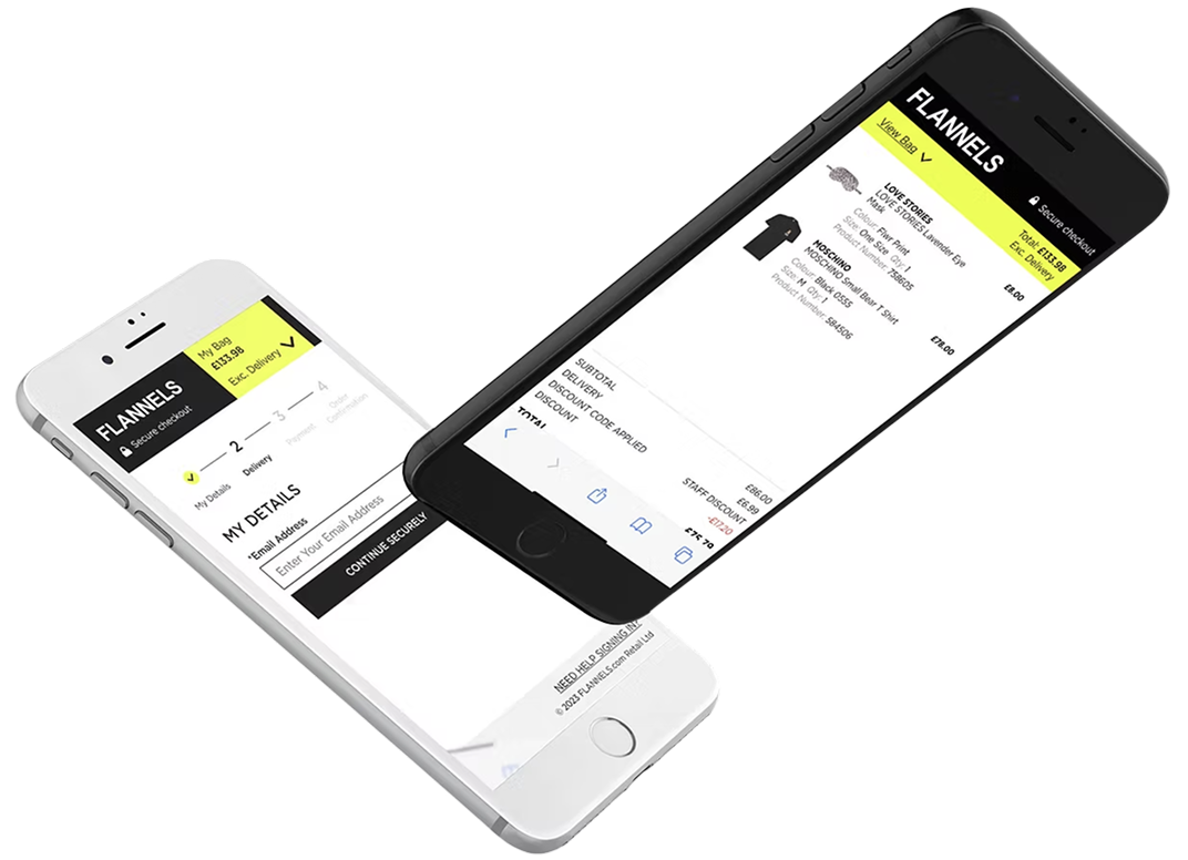
Checkout Optimisation
This project involved designers from multiple fascias (brands) across Frasers Group, where I acted as a design advocate for FLANNELS.
Optimising the checkout UX boosts conversion rates, reduces cart abandonment, builds trust, and increases customer satisfaction and profits.
Team
4x Design Team members
4x CRO Team members
Stakeholders across the buisness
Timescale
Overall: 1 month
Discovery & Research: 2 weeks
Design & testing: 2 weeks
Tools Used
Figma
Content Square
User Testing platform
My Design Process
1/ Discover
- Content Square
- Competitor analysis
- User interviews
2/ Define
- Crafted problem statements and hypotheses
- Stakeholder workshop
3/ Design
- Wire framing
- High-fidelity prototypes
- Created user flows
- Conducted design reviews and iterating on ideas
4/ Deliver
- Quality assurance (QA) and usability testing
- Tested multiple outcomes with CRO team
05 Deliver
- Monitored user feedback, performance, and analytics
- Planed for future iterations based on user data
Discover
Before the workshops, we gathered data from Content Square and User Testing, reviewed the current user experience, and formulated hypotheses and problem statements. During the workshop, we presented our findings to key stakeholders, helping to focus the design process on solving the most critical issues. We concluded the day with test ideas and quick-win action points.
Stakeholder Requirements
When conducting the end-to-end test of the previous app, my team and I monitored 15 users as they engaged with the platform. Our goal was to understand what we do well and identify areas for improvement.

Speed
What is the shortest number of steps to complete an initial screening process to determine eligibility for the WCC process?
Speed
What is the shortest number of steps to complete an initial screening process to determine eligibility for the WCC process?
Speed
What is the shortest number of steps to complete an initial screening process to determine eligibility for the WCC process?
Speed
What is the shortest number of steps to complete an initial screening process to determine eligibility for the WCC process?
Define
Day Of The Workshop
1. CRO & UX Lightning Talks
We divided into groups from various areas of the business and presented the data mentioned above. In total, there were eight problem statements.
2. Crazy 8 Sketches & Dot Voting
We formed teams, sketched out our ideas, and voted on our favourites. (In the next session, we did this in Figma to save paper.)
3. Group Presentations
Everone shared their favourite design with the team and received feedback.
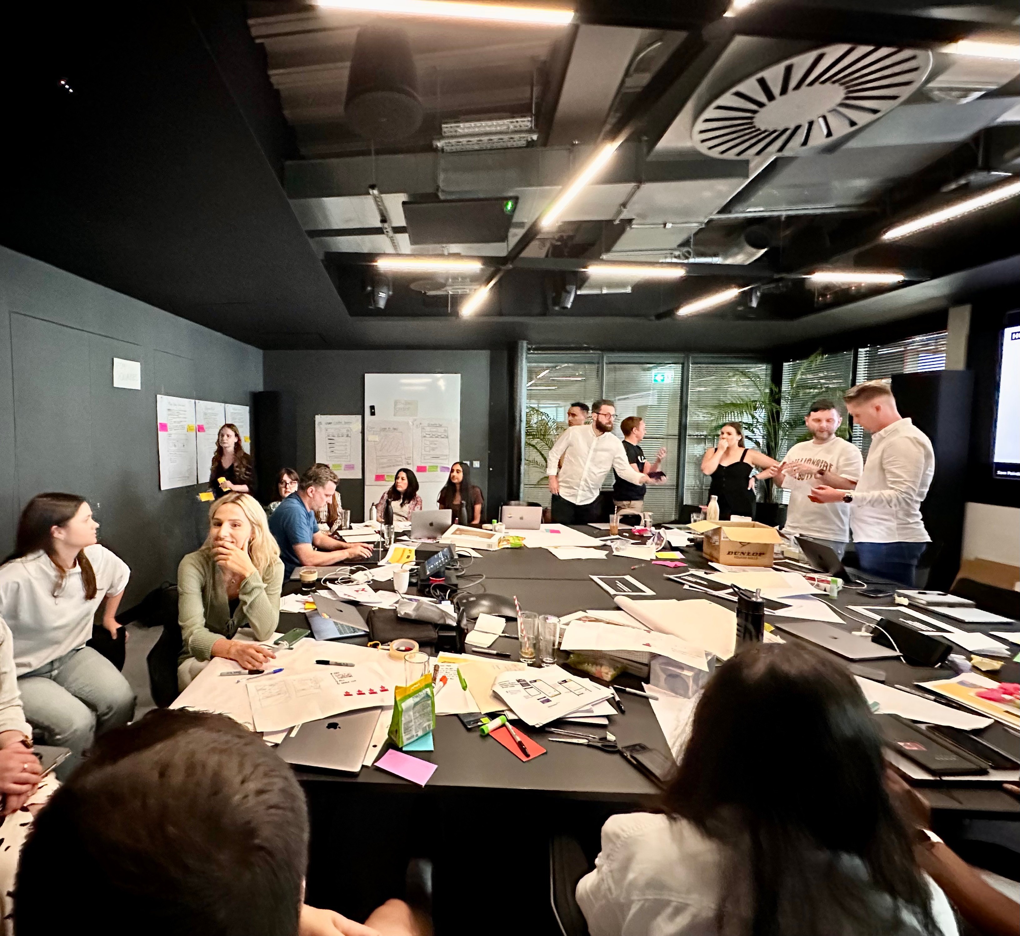
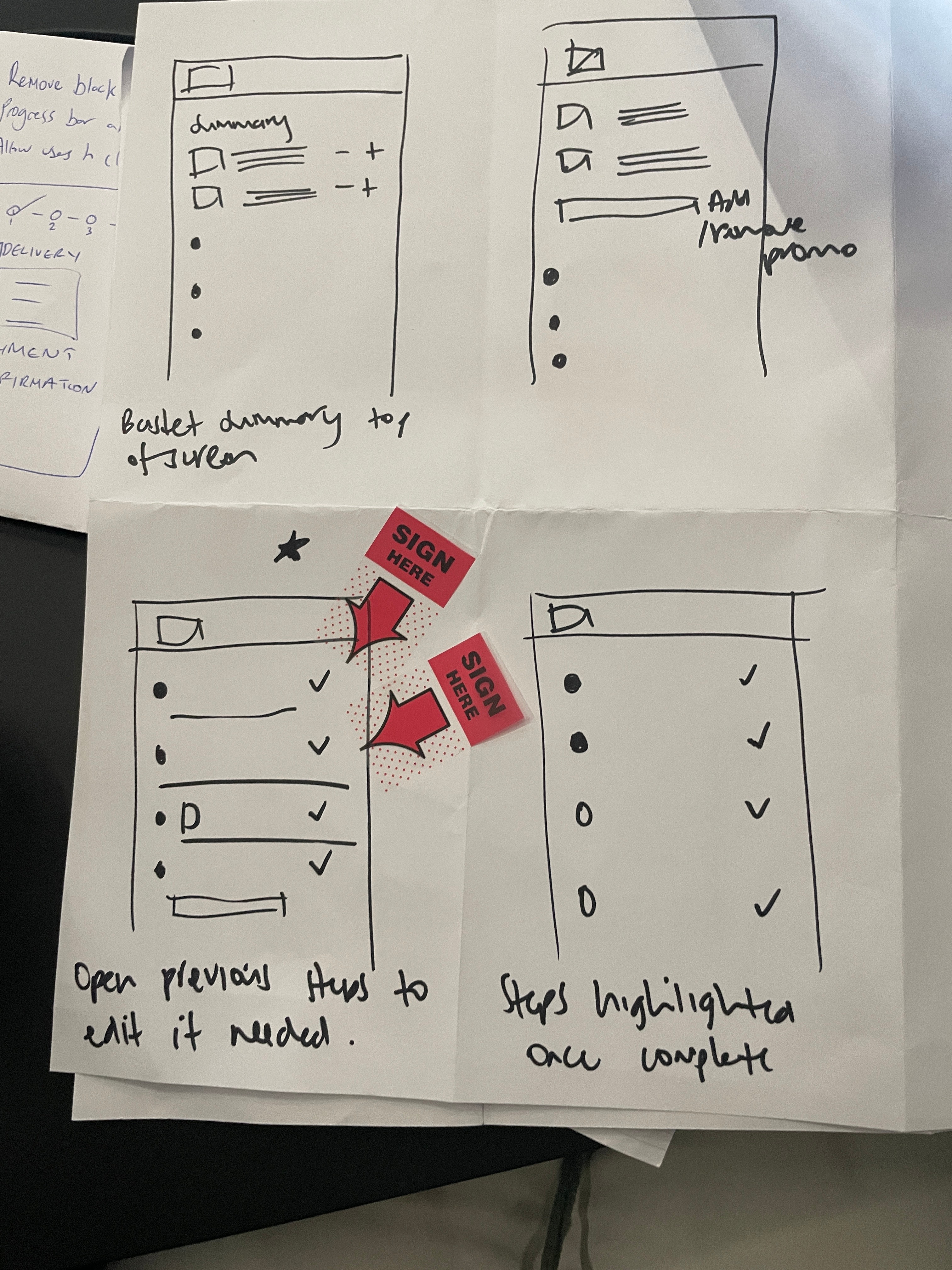
Crazy 8 Sketches and voting
“It’s generally something you do for love, not just financial gain, but a little bit of financial gain might motivate "
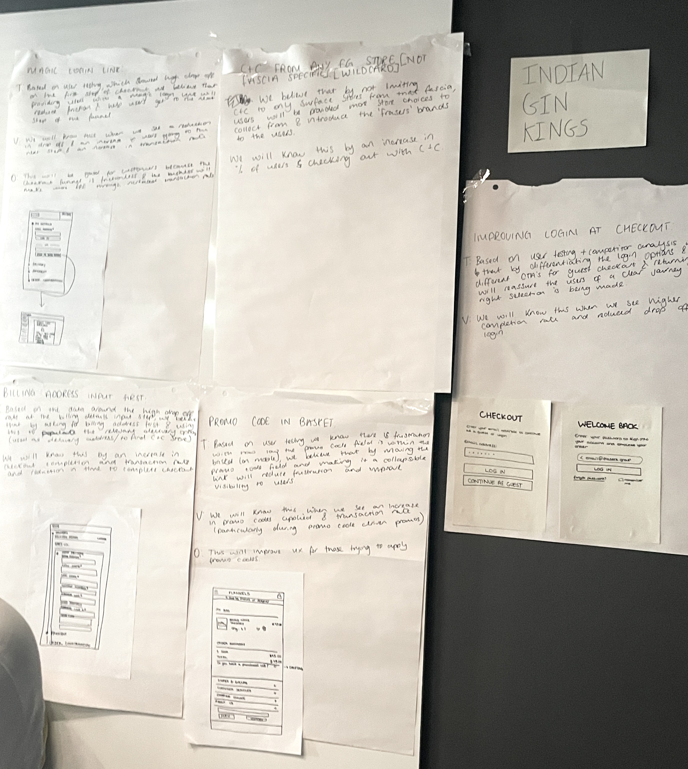
Presented our favourite designs
“It’s generally something you do for love, not just financial gain, but a little bit of financial gain might motivate "
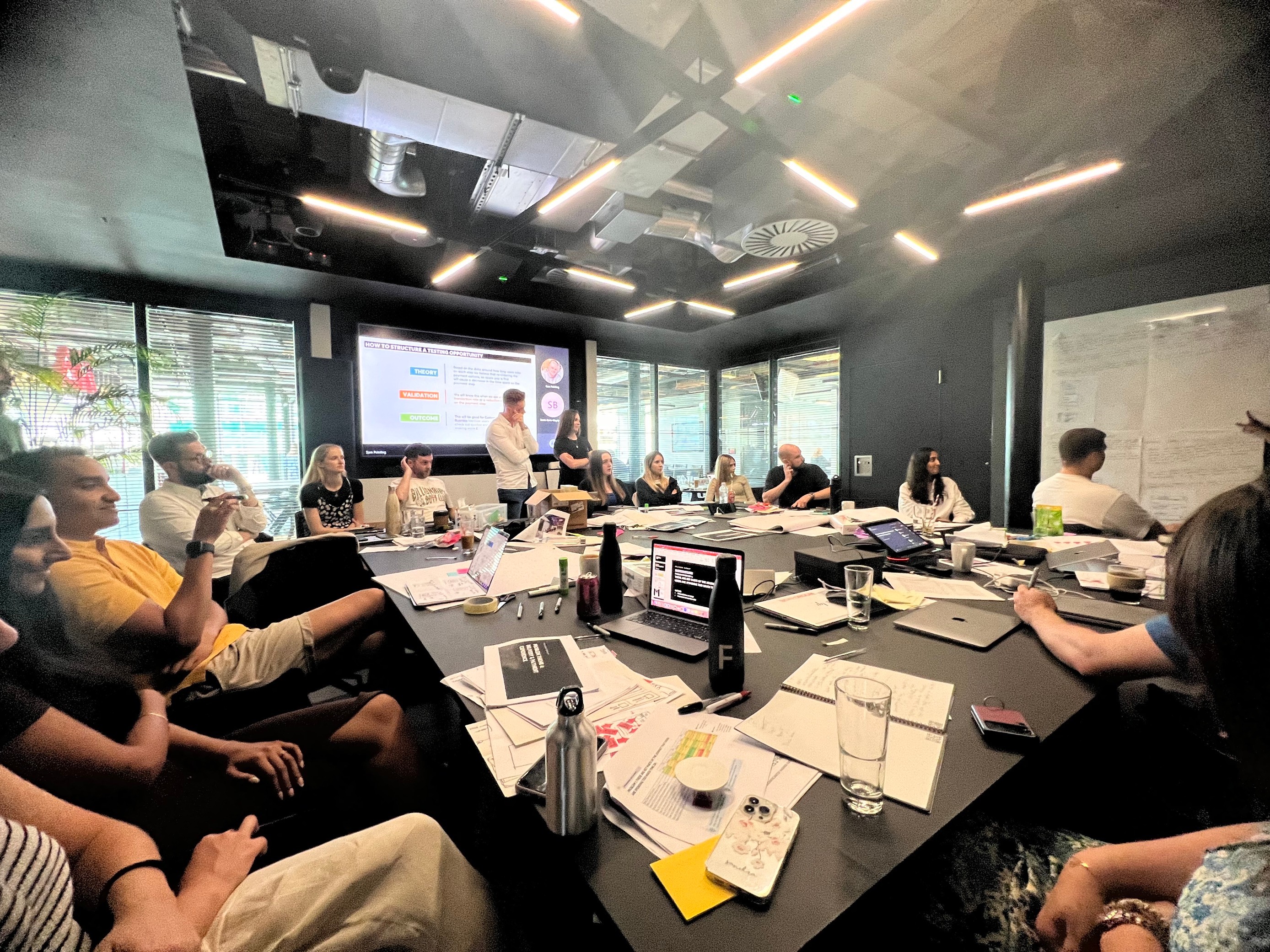
Presented our favourite designs
“It’s generally something you do for love, not just financial gain, but a little bit of financial gain might motivate "
Design
Problem Statement 1:
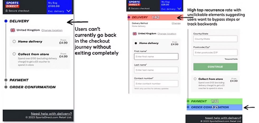
Users are trying to use the checkout
flow in a non-linear fashion.
Insights and Observations
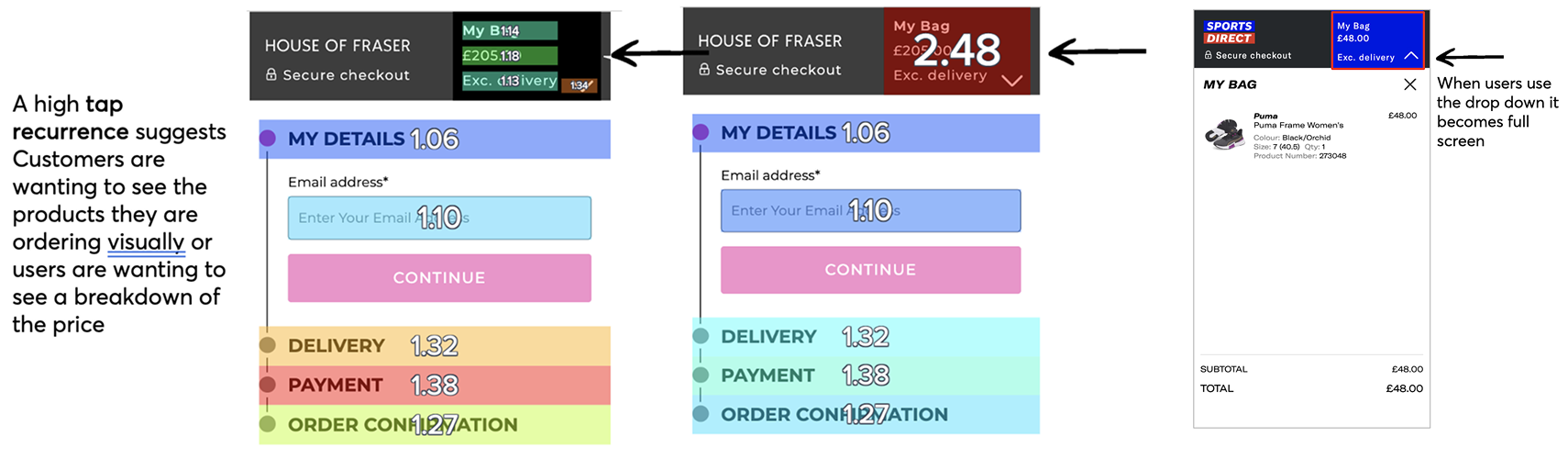
By adding areas that users are tapping on clickable, then users will be able to navigate more effectively, reducing frustration and potentially increasing transaction completion rates.
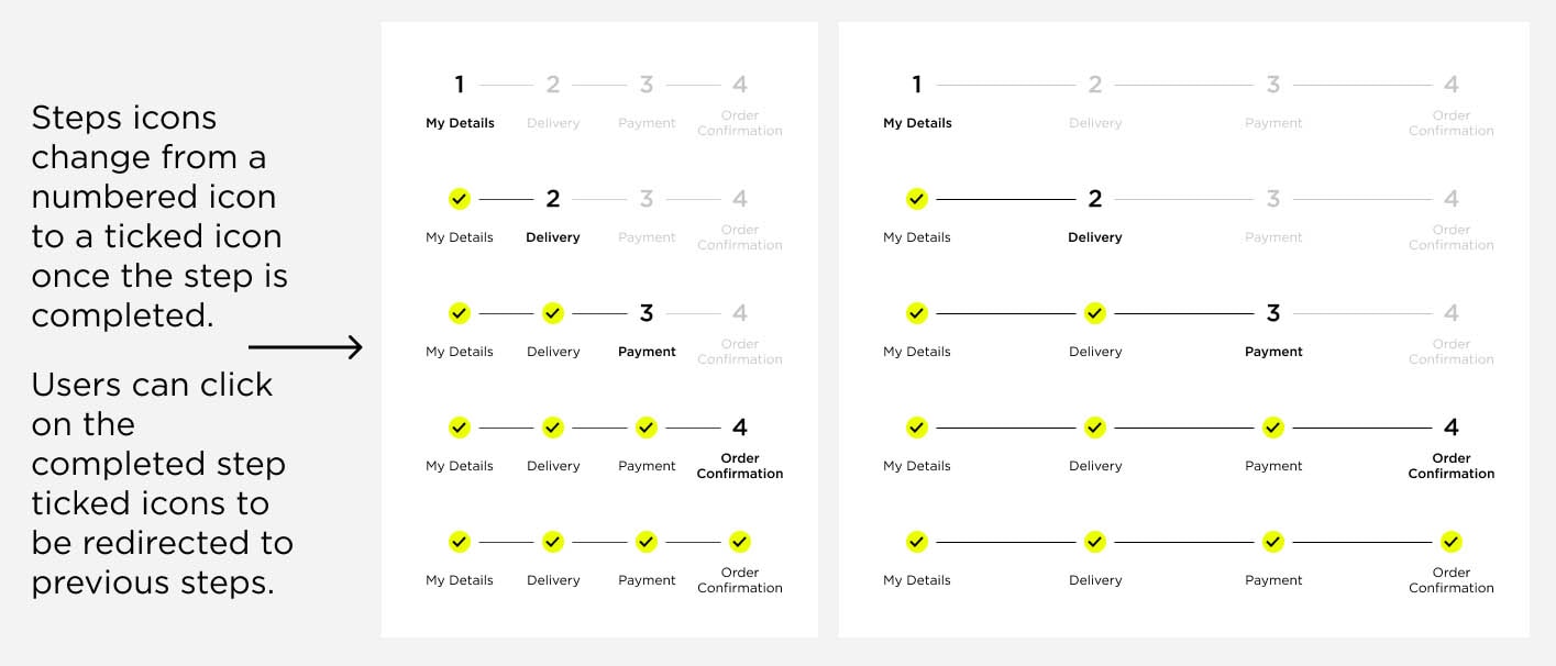
Test - Horizontal Progress Bar
Hypothesis
Based on the data around high click reoccurrence on un-clickable elements, such as delivery and payment, we believe that adding a progress bar to the top of the checkout will cause a decrease in rage clicks.
We will know that this test is successful when we see an increase in transaction rate or a reduction in time spent at checkout. This will be good for customers and our business because more customers will convert.
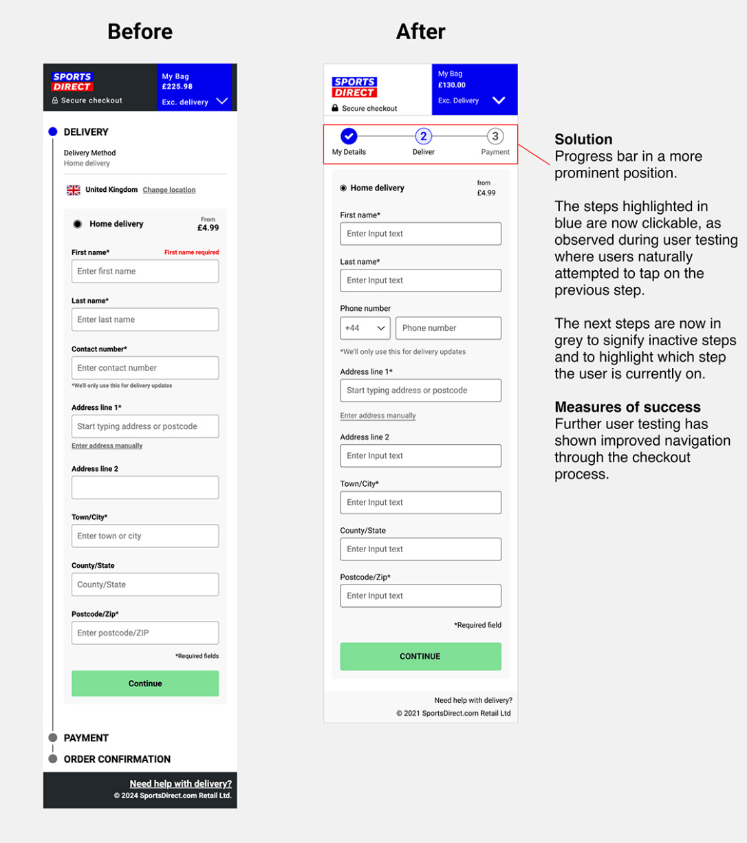
Solution
Subtitle
https://josha53f239.myportfolio.com/sports-direct
Problem Statement 2:
How might we make it easier for
users to view their orders?
Insights and Observations
If we make the action to view the contents of the bag clearer, then users will engage more effectively with their cart, because competitors with clearer actions see better user interactions.
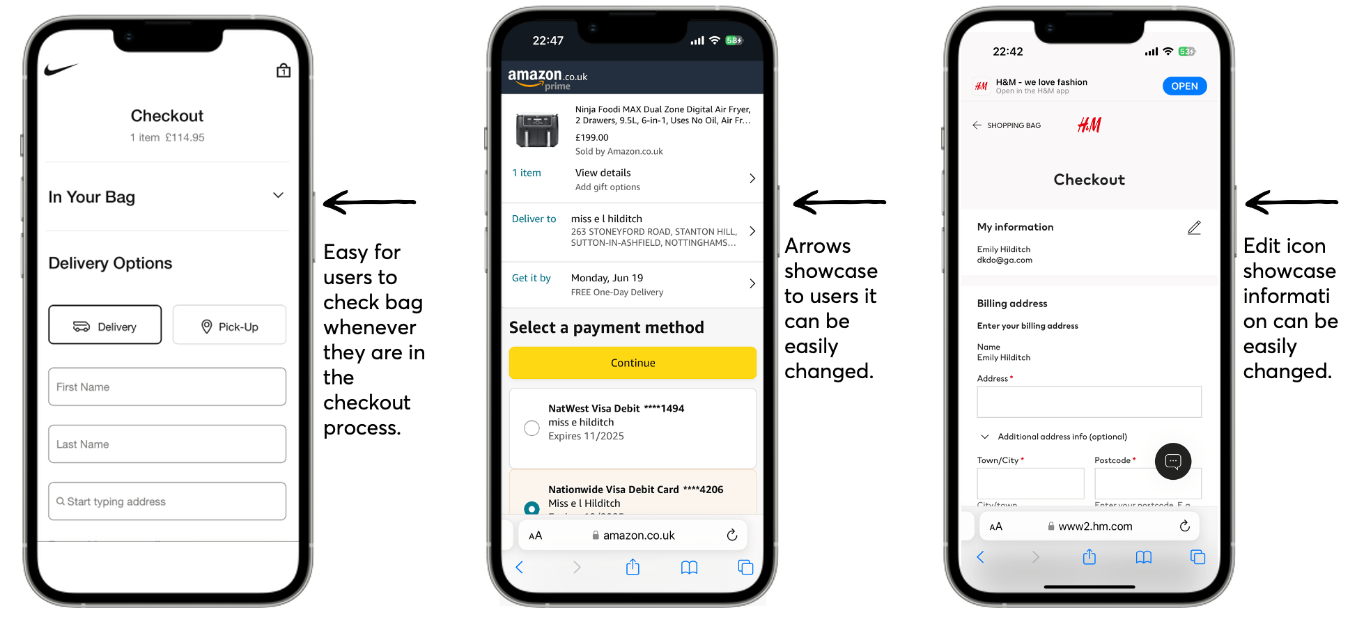
Competitor Research
At this stage in the process we didnt want to solutionise too much, but to keep design options open.
Test - Product Carousel at Checkout
By adding earlier prompts and 'quick' sign-in options, more users will log in earlier in the buying process, which will increase conversion rates, because logged-in users are more likely to complete purchases.
Hypothesis
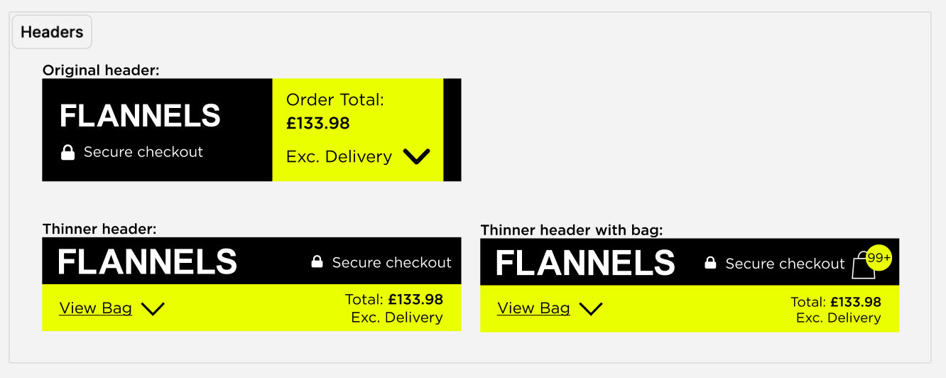
Based on the high click re-occurrence on the basket accordion, we believe that if we amended the mini-bag accordion to a carousel, displayed within an accordion at the top of each checkout step, the customer will be able to view and amend their basket more easily.
This will cause a decrease in the checkout exit rate. We will know this is successful when conversion per click and overall CR increases. This will be good for customers and our business because we will decrease abandonment in checkout.
Solution
Problem Statement 3:
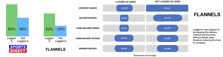
Visitors who are 'logged in' to the site transact at a greater rate.
By adding earlier prompts and 'quick' sign-in options, more users will log in earlier in the buying process, which will increase conversion rates, because logged-in users are more likely to complete purchases.
*Quantitative data has been provided by the CRO team but it informs my later deisgns
Competitor Research
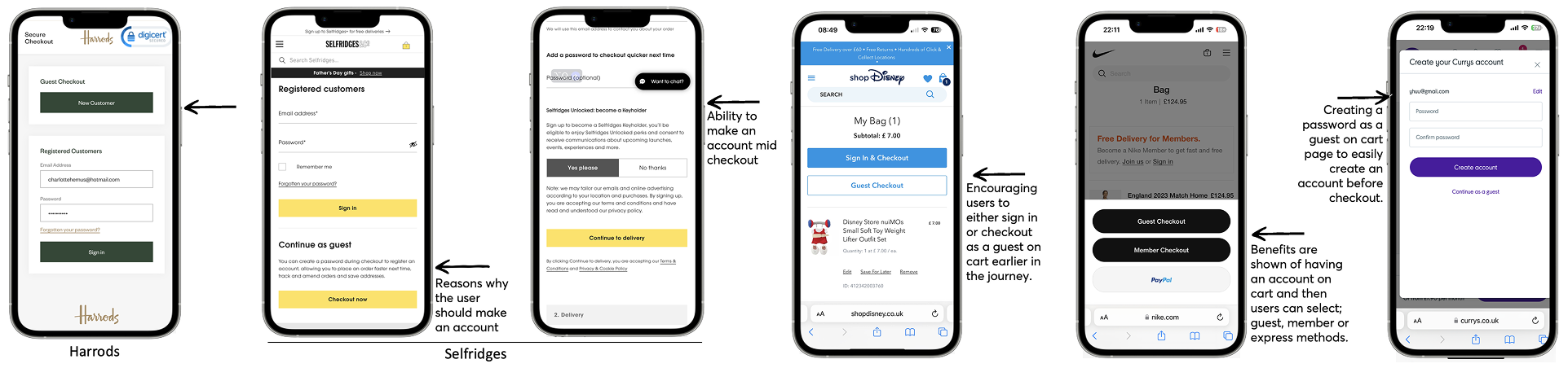
Here are some options to show how our competitors make it easier for a user to check out while logged in.
I learnt X
Test - Log in VS Guest CTA
Hypothesis
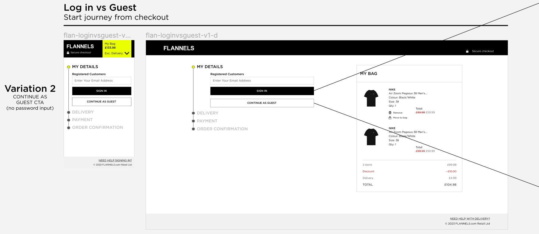
We believe that by clearly differentiating the login options and introducing different certification authorities for guest checkout and returning users, we can clarify the two user journeys and ensure the appropriate selection is being made.
We will confirm this when we observe a higher checkout completion rate and a reduction in drop-offs during the login process.
Solution
Key Features
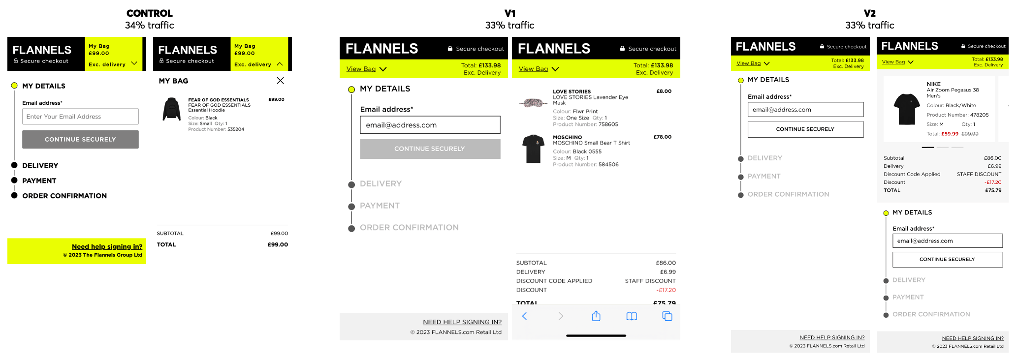
Horizontal Progress BarThe progress bar is now in a more prominent position and is a clickable component, enabling users to navigate backward and forward in the checkout journey.
Editable 'My Bag'Users can remove products, change sizes, and adjust quantities while in the checkout journey. They can also move items to their wishlist by clicking the heart icon, allowing for future purchases. The 'My Bag' section is sticky, displaying the total price at all times for user convenience.
Login PromptUsers are now prompted earlier in the journey to log in using express checkout if they have an account. Additionally, new messaging explains the benefits of creating an account, with an option to create one after completing their purchase.
Frasers Group won the 'E-commerce Game Changer' Award at the Retail Gazette.
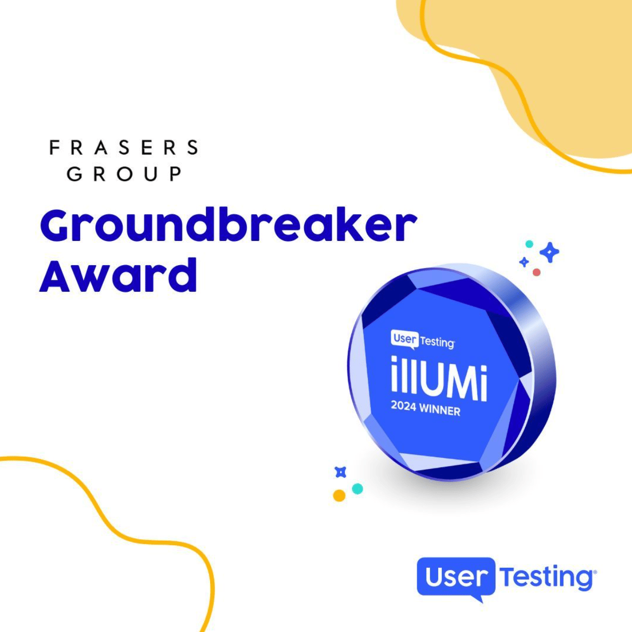
Proud to share that Frasers Group have won the ‘Groundbreaker’ award at the Human Insight Submit in Austin, Texas, receiving global recognition from UserTesting. We received this award for leveraging human insights to enhance the user experience across our products such as App, Checkout, and Frasers Plus. At Frasers Group, we are committed to understanding our customers and actively integrating customer insights into our product roadmap to create experiences they truly value.
View Linkedin post

View more projects
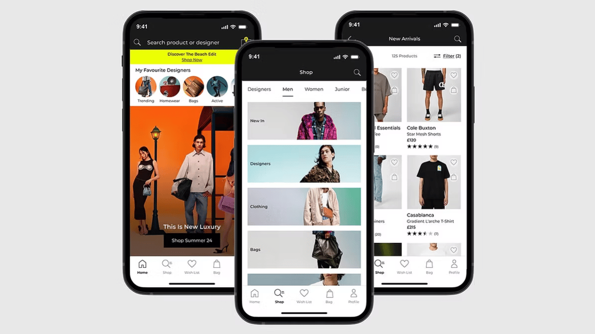
End-to-end case study of the FLANNELS app. Enhancing luxury shopping experience with personalised features and overall user experience.
Read case study

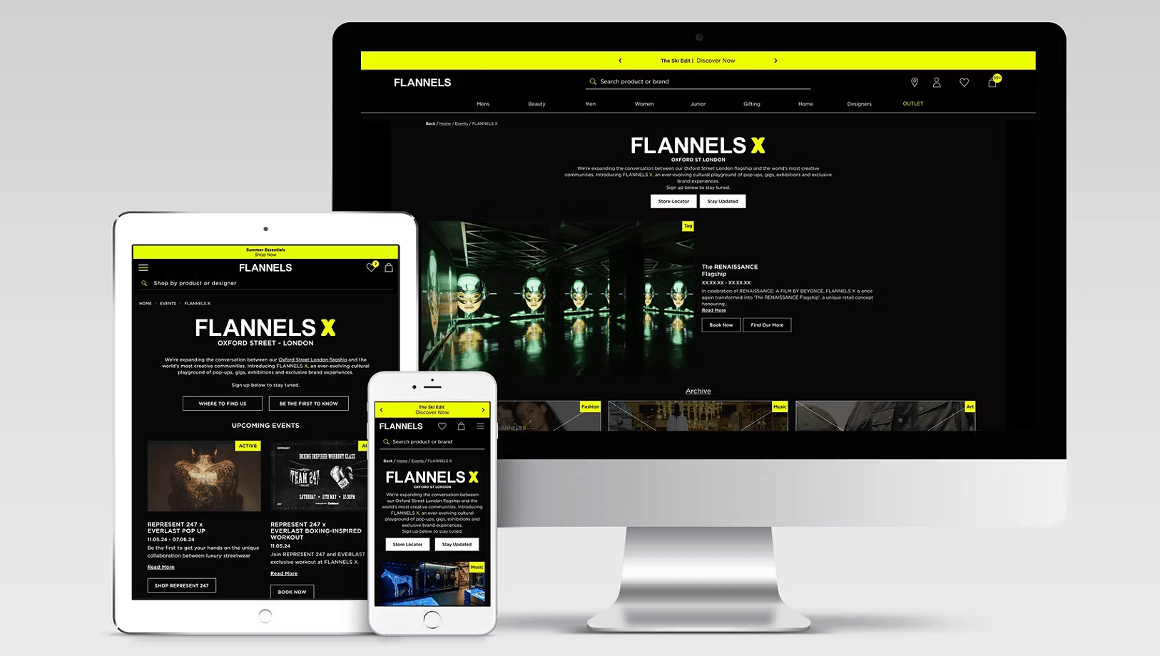
Elevating the experience of a digital hub for exclusive events, brand takeovers and cultural moments at FLANNELS X.
Read case study
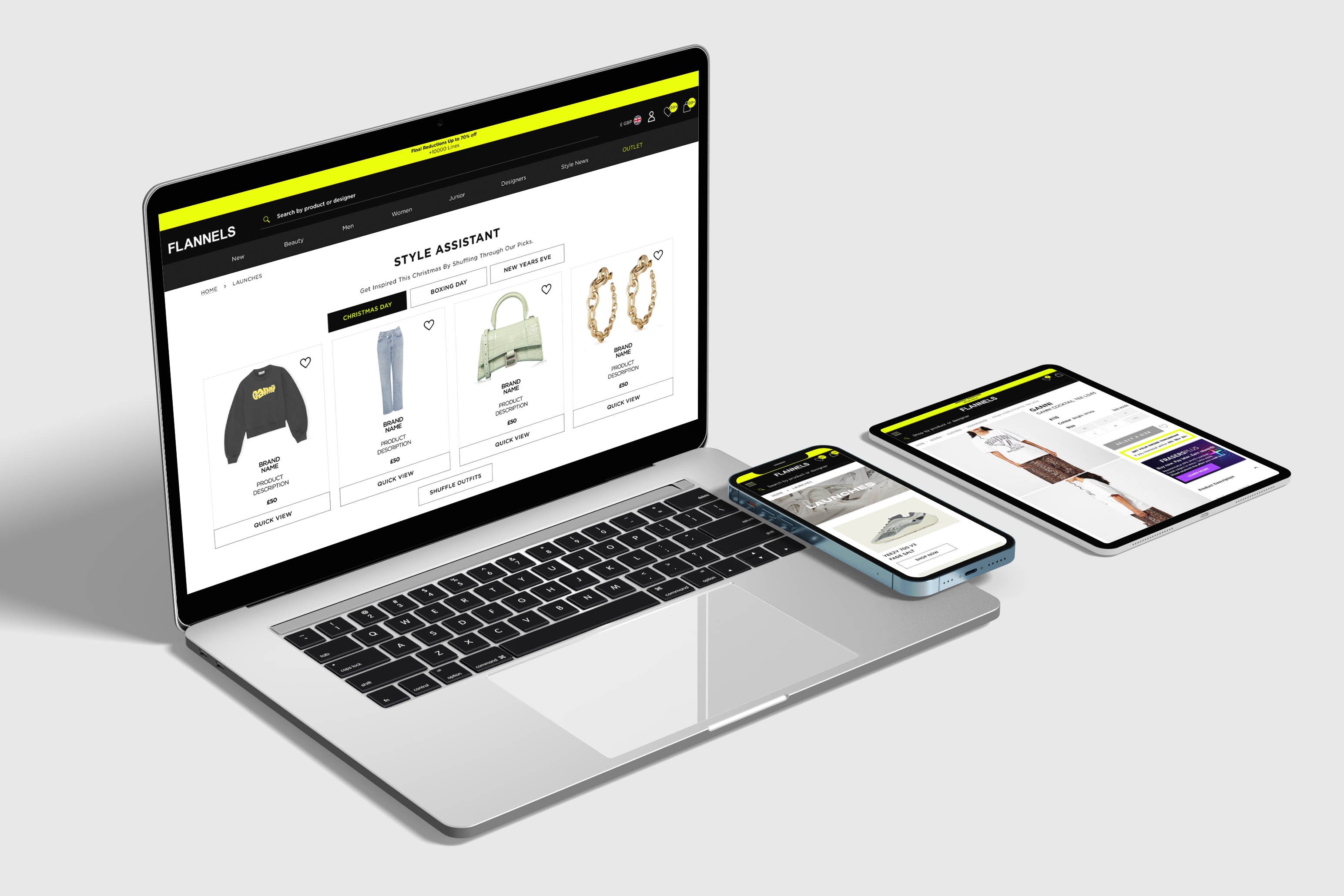
At FLANNELS we are constantly improving and testing the site, here are a few highlights.
Read case study
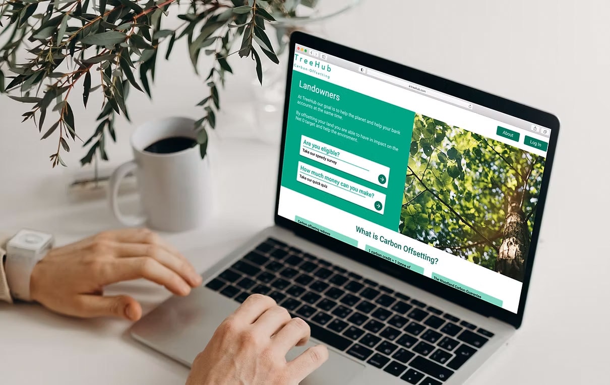
Partnering with TreeHub, I designed a platform helping landowners fund reforestation through carbon offsets.
Read case study
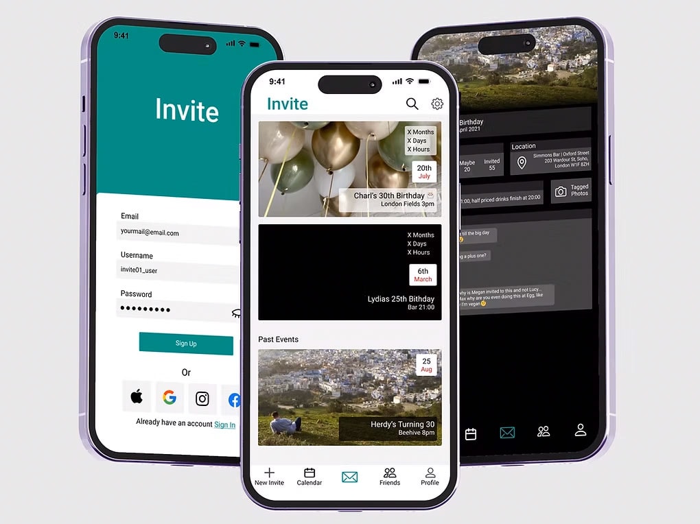
Invite is a design passion project and I use to improve and refine my design skills.
Read case study
Thank you for visitingmade with 💚 and ☕
Let's chat
charlottehemus@hotmail.com


Checkout Optimisation
This project involved designers from multiple fascias (brands) across Frasers Group, where I acted as a design advocate for FLANNELS.
Optimising the checkout UX boosts conversion rates, reduces cart abandonment, builds trust, and increases customer satisfaction and profits.
Team
4x Design Team members
4x CRO Team members
Stakeholders across the buisness
Team
Overall: 1 month
Discovery & Research: 2 weeks
Design & testing: 2 weeks
Tools used
Figma
Content Square
User Testing platform
My Design Process
4/ Deliver
- Quality assurance (QA) and usability testing
- Tested multiple outcomes with CRO team
3/ Design
- Wire framing
- High-fidelity prototypes
- Created user flows
- Conducted design reviews and iterating on ideas
2/ Define
- Crafted problem statements and hypotheses
- Stakeholder workshop
1/ Discover
- Content Square
- Competitor analysis
- User interviews
05 Deliver
- Monitored user feedback, performance, and analytics
- Planed for future iterations based on user data
Discover
Before the workshops, we gathered data from Content Square and User Testing, reviewed the current user experience, and formulated hypotheses and problem statements. During the workshop, we presented our findings to key stakeholders, helping to focus the design process on solving the most critical issues. We concluded the day with test ideas and quick-win action points.
Stakeholder Requirements
When conducting the end-to-end test of the previous app, my team and I monitored 15 users as they engaged with the platform. Our goal was to understand what we do well and identify areas for improvement.
Speed
What is the shortest number of steps to complete an initial screening process to determine eligibility for the WCC process?
Speed
What is the shortest number of steps to complete an initial screening process to determine eligibility for the WCC process?
Speed
What is the shortest number of steps to complete an initial screening process to determine eligibility for the WCC process?
Define
Day Of The Workshop
1. CRO & UX Lightning Talks
We divided into groups from various areas of the business and presented the data mentioned above. In total, there were eight problem statements.
2. Crazy 8 Sketches & Dot Voting
We formed teams, sketched out our ideas, and voted on our favourites. (In the next session, we did this in Figma to save paper.)
3. Group Presentations
Everone shared their favourite design with the team and received feedback.
Crazy 8 Sketches and voting
Presented our favourite designs
Presented our favourite designs
Design
Problem Statement 1:
Users are trying to use the checkout
flow in a non-linear fashion.
Insights and Observations
By adding areas that users are tapping on clickable, then users will be able to navigate more effectively, reducing frustration and potentially increasing transaction completion rates.
Test - Horizontal Progress Bar
Hypothesis
Based on the data around high click reoccurrence on un-clickable elements, such as delivery and payment, we believe that adding a progress bar to the top of the checkout will cause a decrease in rage clicks.
We will know that this test is successful when we see an increase in transaction rate or a reduction in time spent at checkout. This will be good for customers and our business because more customers will convert.
Solution
https://josha53f239.myportfolio.com/sports-direct
Problem Statement 2:
How might we make it easier for
users to view their orders?
Insights and Observations
If we make the action to view the contents of the bag clearer, then users will engage more effectively with their cart, because competitors with clearer actions see better user interactions.
Competitor Research
At this stage in the process we didnt want to solutionise too much, but to keep design options open.
By adding earlier prompts and 'quick' sign-in options, more users will log in earlier in the buying process, which will increase conversion rates, because logged-in users are more likely to complete purchases.
Hypothesis
Based on the high click re-occurrence on the basket accordion, we believe that if we amended the mini-bag accordion to a carousel, displayed within an accordion at the top of each checkout step, the customer will be able to view and amend their basket more easily.
This will cause a decrease in the checkout exit rate. We will know this is successful when conversion per click and overall CR increases. This will be good for customers and our business because we will decrease abandonment in checkout.
Solution
Problem Statement 3:
Visitors who are 'logged in' to the site transact at a greater rate.
By adding earlier prompts and 'quick' sign-in options, more users will log in earlier in the buying process, which will increase conversion rates, because logged-in users are more likely to complete purchases.
*Quantitative data has been provided by the CRO team but it informs my later deisgns
Here are some options to show how our competitors make it easier for a user to check out while logged in.
I learnt X
Test - Log in VS Guest CTA
Hypothesis
We believe that by clearly differentiating the login options and introducing different certification authorities for guest checkout and returning users, we can clarify the two user journeys and ensure the appropriate selection is being made.
We will confirm this when we observe a higher checkout completion rate and a reduction in drop-offs during the login process.
Solution
Key Features
Horizontal Progress BarThe progress bar is now in a more prominent position and is a clickable component, enabling users to navigate backward and forward in the checkout journey.
Editable 'My Bag'Users can remove products, change sizes, and adjust quantities while in the checkout journey. They can also move items to their wishlist by clicking the heart icon, allowing for future purchases. The 'My Bag' section is sticky, displaying the total price at all times for user convenience.
Login PromptUsers are now prompted earlier in the journey to log in using express checkout if they have an account. Additionally, new messaging explains the benefits of creating an account, with an option to create one after completing their purchase.
Frasers Group won the 'E-commerce Game Changer' Award at the Retail Gazette.
Proud to share that Frasers Group have won the ‘Groundbreaker’ award at the Human Insight Submit in Austin, Texas, receiving global recognition from UserTesting. We received this award for leveraging human insights to enhance the user experience across our products such as App, Checkout, and Frasers Plus. At Frasers Group, we are committed to understanding our customers and actively integrating customer insights into our product roadmap to create experiences they truly value.
View Linkedin post
View more projects
End-to-end case study of the FLANNELS app. Enhancing luxury shopping experience with personalised features and overall user experience.
Read case study
Elevating the experience of a digital hub for exclusive events, brand takeovers and cultural moments at FLANNELS X.
Read case study
At FLANNELS we are constantly improving and testing the site, here are a few highlights.
Read case study
Partnering with TreeHub, I designed a platform helping landowners access funding to reforest their land through carbon offset initiatives.
Read case study
Invite is a design passion project and I use to improve and refine my design skills.
Read case study
Thank you for visitingmade with 💚 and ☕
Let's chat
charlottehemus@hotmail.comCheckout Optimisation
This project involved designers from multiple fascias (brands) across Frasers Group, where I acted as a design advocate for FLANNELS.
Optimising the checkout UX boosts conversion rates, reduces cart abandonment, builds trust, and increases customer satisfaction and profits.
Team
4x Design Team members
4x CRO Team members
Stakeholders across the buisness
Team
Overall: 1 month
Discovery & Research: 2 weeks
Design & testing: 2 weeks
Tools used
Figma
Content Square
User Testing platform
My Design Process
1/ Discover
- Content Square
- Competitor analysis
- User interviews
2/ Define
- Crafted problem statements and hypotheses
- Stakeholder workshop
3/ Design
- Wire framing
- High-fidelity prototypes
- Created user flows
- Conducted design reviews and iterating on ideas
4/ Deliver
- Quality assurance (QA) and usability testing
- Tested multiple outcomes with CRO team
05 Deliver
- Monitored user feedback, performance, and analytics
- Planed for future iterations based on user data
Discover
Before the workshops, we gathered data from Content Square and User Testing, reviewed the current user experience, and formulated hypotheses and problem statements. During the workshop, we presented our findings to key stakeholders, helping to focus the design process on solving the most critical issues. We concluded the day with test ideas and quick-win action points.
Stakeholder Requirements
When conducting the end-to-end test of the previous app, my team and I monitored 15 users as they engaged with the platform. Our goal was to understand what we do well and identify areas for improvement.
Speed
What is the shortest number of steps to complete an initial screening process to determine eligibility for the WCC process?
Speed
What is the shortest number of steps to complete an initial screening process to determine eligibility for the WCC process?
Speed
What is the shortest number of steps to complete an initial screening process to determine eligibility for the WCC process?
Define
Day Of The Workshop
1. CRO & UX Lightning Talks
We divided into groups from various areas of the business and presented the data mentioned above. In total, there were eight problem statements.
2. Crazy 8 Sketches & Dot Voting
We formed teams, sketched out our ideas, and voted on our favourites. (In the next session, we did this in Figma to save paper.)
3. Group Presentations
Everone shared their favourite design with the team and received feedback.
Crazy 8 Sketches and voting
Presented our favourite designs
Presented our favourite designs
Design
Problem Statement 1:
Users are trying to use the checkout
flow in a non-linear fashion.
Insights and Observations
By adding areas that users are tapping on clickable, then users will be able to navigate more effectively, reducing frustration and potentially increasing transaction completion rates.
Test - Horizontal Progress Bar
Hypothesis
Based on the data around high click reoccurrence on un-clickable elements, such as delivery and payment, we believe that adding a progress bar to the top of the checkout will cause a decrease in rage clicks.
We will know that this test is successful when we see an increase in transaction rate or a reduction in time spent at checkout. This will be good for customers and our business because more customers will convert.
Solution
Subtitle
https://josha53f239.myportfolio.com/sports-direct
Problem Statement 2:
How might we make it easier for
users to view their orders?
Insights and Observations
If we make the action to view the contents of the bag clearer, then users will engage more effectively with their cart, because competitors with clearer actions see better user interactions.
Competitor Research
At this stage in the process we didnt want to solutionise too much, but to keep design options open.
Test - Product Carousel at Checkout
By adding earlier prompts and 'quick' sign-in options, more users will log in earlier in the buying process, which will increase conversion rates, because logged-in users are more likely to complete purchases.
Hypothesis
Based on the high click re-occurrence on the basket accordion, we believe that if we amended the mini-bag accordion to a carousel, displayed within an accordion at the top of each checkout step, the customer will be able to view and amend their basket more easily.
This will cause a decrease in the checkout exit rate. We will know this is successful when conversion per click and overall CR increases. This will be good for customers and our business because we will decrease abandonment in checkout.
Solution
Problem Statement 3:
Visitors who are 'logged in' to the site transact at a greater rate.
By adding earlier prompts and 'quick' sign-in options, more users will log in earlier in the buying process, which will increase conversion rates, because logged-in users are more likely to complete purchases.
*Quantitative data has been provided by the CRO team but it informs my later deisgns
Competitor Research
Here are some options to show how our competitors make it easier for a user to check out while logged in.
I learnt X
Test - Log in VS Guest CTA
Hypothesis
We believe that by clearly differentiating the login options and introducing different certification authorities for guest checkout and returning users, we can clarify the two user journeys and ensure the appropriate selection is being made.
We will confirm this when we observe a higher checkout completion rate and a reduction in drop-offs during the login process.
Solution
Key Features
Horizontal Progress BarThe progress bar is now in a more prominent position and is a clickable component, enabling users to navigate backward and forward in the checkout journey.
Editable 'My Bag'Users can remove products, change sizes, and adjust quantities while in the checkout journey. They can also move items to their wishlist by clicking the heart icon, allowing for future purchases. The 'My Bag' section is sticky, displaying the total price at all times for user convenience.
Login PromptUsers are now prompted earlier in the journey to log in using express checkout if they have an account. Additionally, new messaging explains the benefits of creating an account, with an option to create one after completing their purchase.
Frasers Group won the 'E-commerce Game Changer' Award at the Retail Gazette.
Proud to share that Frasers Group have won the ‘Groundbreaker’ award at the Human Insight Submit in Austin, Texas, receiving global recognition from UserTesting. We received this award for leveraging human insights to enhance the user experience across our products such as App, Checkout, and Frasers Plus. At Frasers Group, we are committed to understanding our customers and actively integrating customer insights into our product roadmap to create experiences they truly value.
View Linkedin post

View more projects
End-to-end case study of the FLANNELS app. Enhancing luxury shopping experience with personalised features and overall user experience.
Read case study
Elevating the experience of a digital hub for exclusive events, brand takeovers and cultural moments at FLANNELS X.
Read case study
At FLANNELS we are constantly improving and testing the site, here are a few highlights.
Read case study
Partnering with TreeHub, I designed a platform helping landowners access funding to reforest their land through carbon offset initiatives.
Read case study
Invite is a design passion project and I use to improve and refine my design skills.
Read case study
Thank you for visitingmade with 💚 and ☕
Let's chat
charlottehemus@hotmail.comCheckout Optimisation
This project involved designers from multiple fascias (brands) across Frasers Group, where I acted as a design advocate for FLANNELS.
Optimising the checkout UX boosts conversion rates, reduces cart abandonment, builds trust, and increases customer satisfaction and profits.
Team
4x Design Team members
4x CRO Team members
Stakeholders across the buisness
Team
Overall: 1 month
Discovery & Research: 2 weeks
Design & testing: 2 weeks
Tools used
Figma
Content Square
User Testing platform
My Design Process
1/ Discover
- Content Square
- Competitor analysis
- User interviews
2/ Define
- Crafted problem statements and hypotheses
- Stakeholder workshop
3/ Design
- Wire framing
- High-fidelity prototypes
- Created user flows
- Conducted design reviews and iterating on ideas
4/ Deliver
- Quality assurance (QA) and usability testing
- Tested multiple outcomes with CRO team
05 Deliver
- Monitored user feedback, performance, and analytics
- Planed for future iterations based on user data
Discover
Before the workshops, we gathered data from Content Square and User Testing, reviewed the current user experience, and formulated hypotheses and problem statements. During the workshop, we presented our findings to key stakeholders, helping to focus the design process on solving the most critical issues. We concluded the day with test ideas and quick-win action points.
Stakeholder Requirements
When conducting the end-to-end test of the previous app, my team and I monitored 15 users as they engaged with the platform. Our goal was to understand what we do well and identify areas for improvement.
Speed
What is the shortest number of steps to complete an initial screening process to determine eligibility for the WCC process?
Speed
What is the shortest number of steps to complete an initial screening process to determine eligibility for the WCC process?
Speed
What is the shortest number of steps to complete an initial screening process to determine eligibility for the WCC process?
Define
Day Of The Workshop
1. CRO & UX Lightning Talks
We divided into groups from various areas of the business and presented the data mentioned above. In total, there were eight problem statements.
2. Crazy 8 Sketches & Dot Voting
We formed teams, sketched out our ideas, and voted on our favourites. (In the next session, we did this in Figma to save paper.)
3. Group Presentations
Everone shared their favourite design with the team and received feedback.
Crazy 8 Sketches and voting
Presented our favourite designs
Presented our favourite designs
Design
Problem Statement 1:
Users are trying to use the checkout
flow in a non-linear fashion.
Insights and Observations
By adding areas that users are tapping on clickable, then users will be able to navigate more effectively, reducing frustration and potentially increasing transaction completion rates.
Test - Horizontal Progress Bar
Hypothesis
Based on the data around high click reoccurrence on un-clickable elements, such as delivery and payment, we believe that adding a progress bar to the top of the checkout will cause a decrease in rage clicks.
We will know that this test is successful when we see an increase in transaction rate or a reduction in time spent at checkout. This will be good for customers and our business because more customers will convert.
Solution
Subtitle
https://josha53f239.myportfolio.com/sports-direct
Problem Statement 2:
How might we make it easier for
users to view their orders?
Insights and Observations
If we make the action to view the contents of the bag clearer, then users will engage more effectively with their cart, because competitors with clearer actions see better user interactions.
Competitor Research
At this stage in the process we didnt want to solutionise too much, but to keep design options open.
Test - Product Carousel at Checkout
By adding earlier prompts and 'quick' sign-in options, more users will log in earlier in the buying process, which will increase conversion rates, because logged-in users are more likely to complete purchases.
Hypothesis
Based on the high click re-occurrence on the basket accordion, we believe that if we amended the mini-bag accordion to a carousel, displayed within an accordion at the top of each checkout step, the customer will be able to view and amend their basket more easily.
This will cause a decrease in the checkout exit rate. We will know this is successful when conversion per click and overall CR increases. This will be good for customers and our business because we will decrease abandonment in checkout.
Solution
Problem Statement 3:
Visitors who are 'logged in' to the site transact at a greater rate.
By adding earlier prompts and 'quick' sign-in options, more users will log in earlier in the buying process, which will increase conversion rates, because logged-in users are more likely to complete purchases.
*Quantitative data has been provided by the CRO team but it informs my later deisgns
Competitor Research
Here are some options to show how our competitors make it easier for a user to check out while logged in.
I learnt X
Test - Log in VS Guest CTA
Hypothesis
We believe that by clearly differentiating the login options and introducing different certification authorities for guest checkout and returning users, we can clarify the two user journeys and ensure the appropriate selection is being made.
We will confirm this when we observe a higher checkout completion rate and a reduction in drop-offs during the login process.
Solution
Key Features
Horizontal Progress BarThe progress bar is now in a more prominent position and is a clickable component, enabling users to navigate backward and forward in the checkout journey.
Editable 'My Bag'Users can remove products, change sizes, and adjust quantities while in the checkout journey. They can also move items to their wishlist by clicking the heart icon, allowing for future purchases. The 'My Bag' section is sticky, displaying the total price at all times for user convenience.
Login PromptUsers are now prompted earlier in the journey to log in using express checkout if they have an account. Additionally, new messaging explains the benefits of creating an account, with an option to create one after completing their purchase.
Frasers Group won the 'E-commerce Game Changer' Award at the Retail Gazette.
Proud to share that Frasers Group have won the ‘Groundbreaker’ award at the Human Insight Submit in Austin, Texas, receiving global recognition from UserTesting. We received this award for leveraging human insights to enhance the user experience across our products such as App, Checkout, and Frasers Plus. At Frasers Group, we are committed to understanding our customers and actively integrating customer insights into our product roadmap to create experiences they truly value.
View Linkedin post
View more projects
End-to-end case study of the FLANNELS app. Enhancing luxury shopping experience with personalised features and overall user experience.
Read case study
Elevating the experience of a digital hub for exclusive events, brand takeovers and cultural moments at FLANNELS X.
Read case study
At FLANNELS we are constantly improving and testing the site, here are a few highlights.
Read case study
Partnering with TreeHub, I designed a platform helping landowners access funding to reforest their land through carbon offset initiatives.
Read case study
Invite is a design passion project and I use to improve and refine my design skills.
Read case study
Thank you for visitingmade with 💚 and ☕