
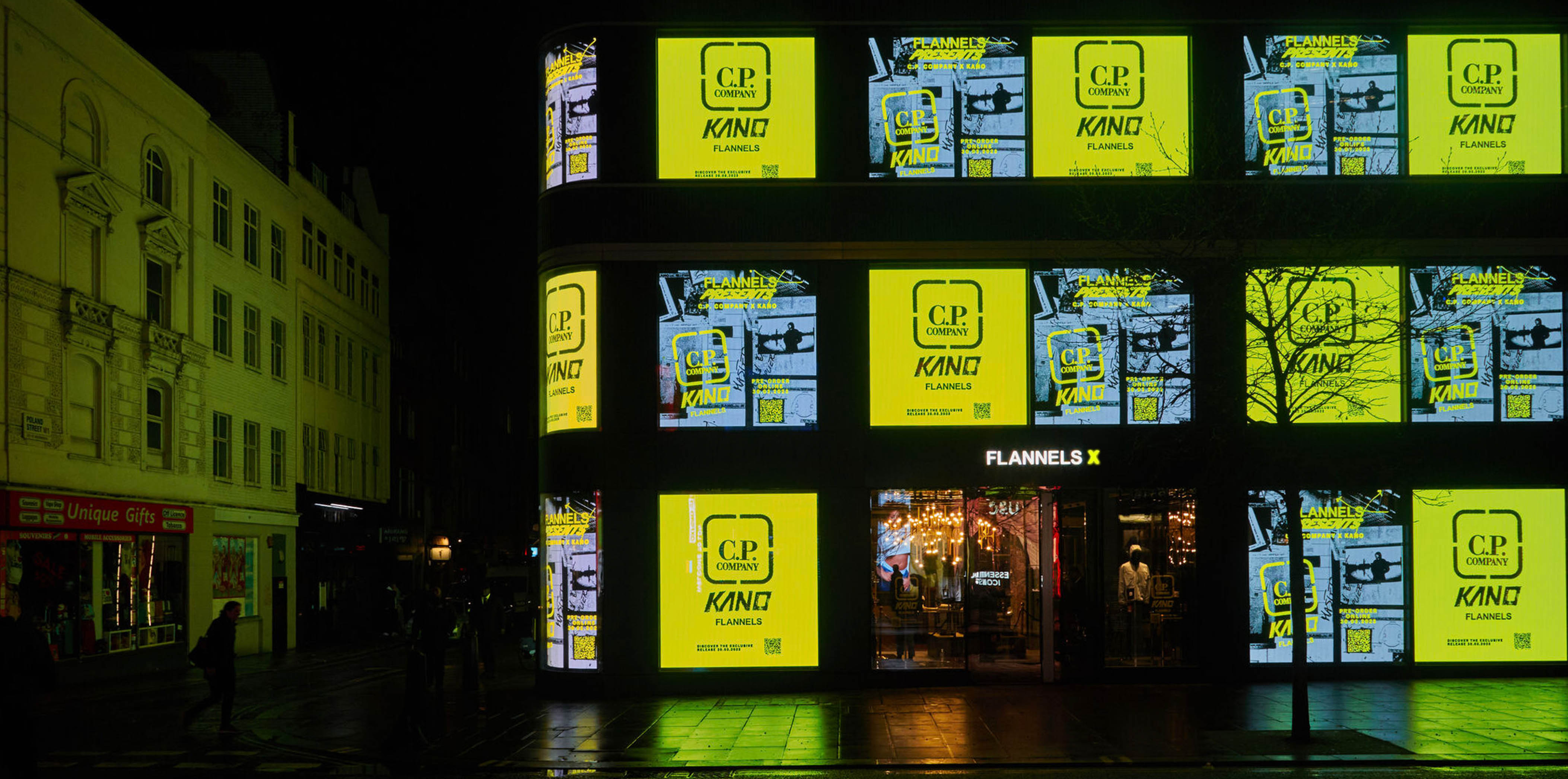
FLANNELS X
FLANNELS X is a dedicated space located in the basement of our Oxford Street store, designed to host pop-ups, gigs, exhibitions, and exclusive brand experiences. It plays a key role in our omnichannel strategy by driving customers towards in-person, experiential retail events that complement our digital offering.
Project Overview
The FLANNELS X app is an innovative digital experience created to elevate the luxury fashion shopping journey. The project aimed to deliver a seamless, engaging, and immersive experience that blends high-end aesthetics with intuitive, user-friendly functionality.
This initiative supported the wider business goal of integrating digital and physical retail experiences in a meaningful way.
My Role
As Lead Product Designer, I was responsible for defining and shaping the overall user experience, conducting user research and usability testing, and creating wireframes, prototypes, and high-fidelity UI designs.
I worked closely with developers and stakeholders throughout the product lifecycle to ensure every design decision aligned with user needs and upheld the premium positioning of the FLANNELS brand.
My Design Process
1/ Discover
- Content Square Analysis
- Stakeholder Interviews
- User Testing
- Empathy Mapping
2/ Define
- Empathy map
- Problem statements
- How might we statements
- Competitor Analysis
3/ Design
- High fidelity prototyping
- Conducting design reviews/ iterating on ideas
- Designing solutions
4/ Develop
- Collaboration between designers, developers, and stakeholders
- Quality assurance and usability testing
05 Deliver
- Final testing and debugging
- Monitoring user feedback on performance, and analytics
Discover
Content Square Analysis
I started by using Content Square to review data on how users were currently engaging with the Flannels X webpage. This provided valuable insights into user behaviour and revealed a number of pain points:
- Only 60% of users were seeing the details of our upcoming events when landing on this page.
- Over 98% were not scrolling down far enough to see the email signup button.
- A high number of users attempted to tap/click on 'Past Events,' expecting it to be interactive, but it’s currently an un-clickable element.
- 796 users tried to tap on the event image, which is also un-clickable.
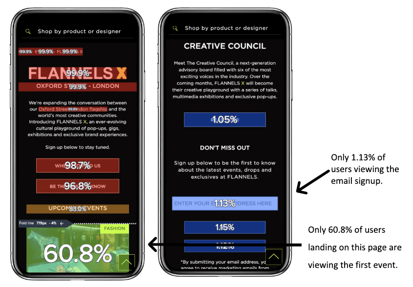
Exposure Rate
The percentage of page views where at least half of the area is visible on the screen, which indicates how far users scroll.
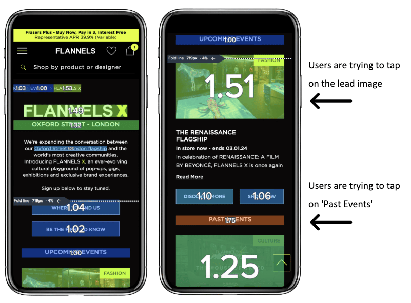
Tap Recurrence
The average number of taps in an area for page views. A rate higher than 1 may suggest user frustration or a strong interest in a feature.
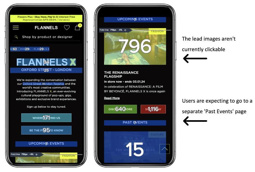
Number of taps
High volume of taps on non-clickable assets can indicate opportunities to remove friction from the customer journey.
Stakeholder Requirements
I spoke with key stakeholders from different areas of the business, including trade and marketing teams, to get a better understanding of their current pain points and opportunities. The feedback was consistent across departments:

Pain Points
- Page length
- Slow load time
- Page doesn't excite customers

Opportunities
- Omnichannel integration
- Enhanced video content
- Personalisation

KPIs
- Site speed
- Engagement
- Page views
User Testing and Empathy Mapping
Using the User Testing platform, I was able to monitor 10 users as they engaged with the platform.
- Income - 20k -> 60k
- Age - 25-54
- Gender - 5 x female / 5x male
- Device - 6x mobile / 4x desktop
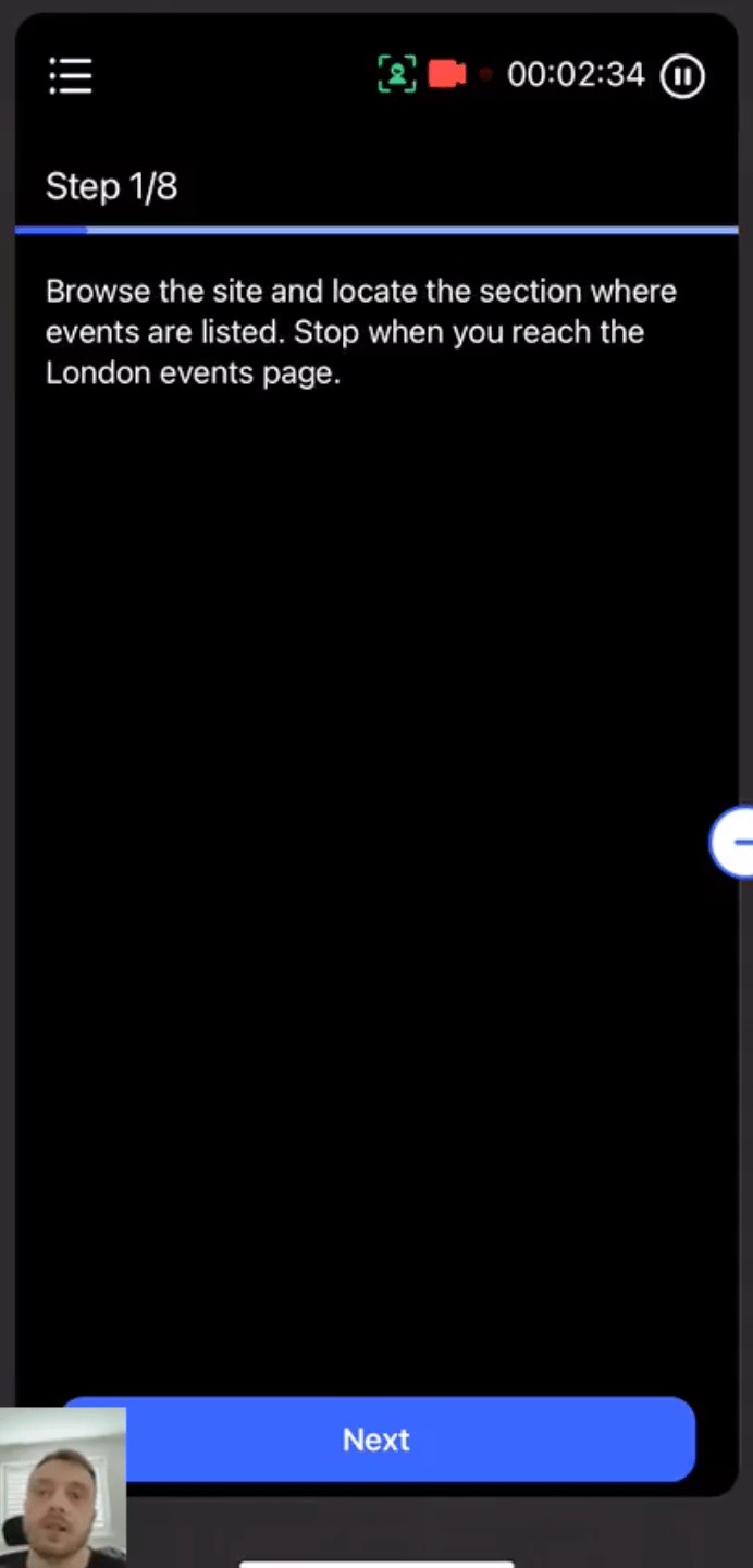
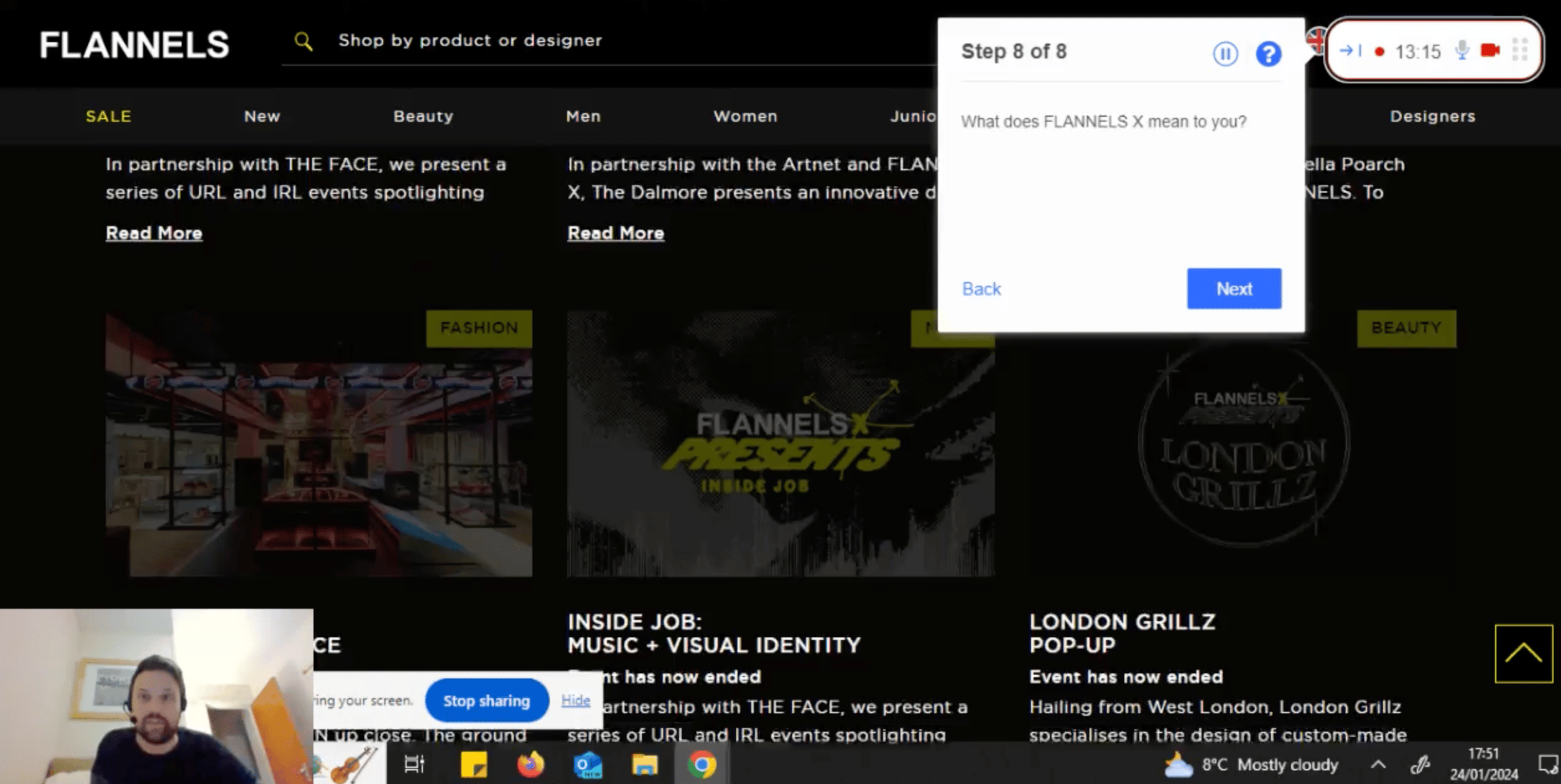
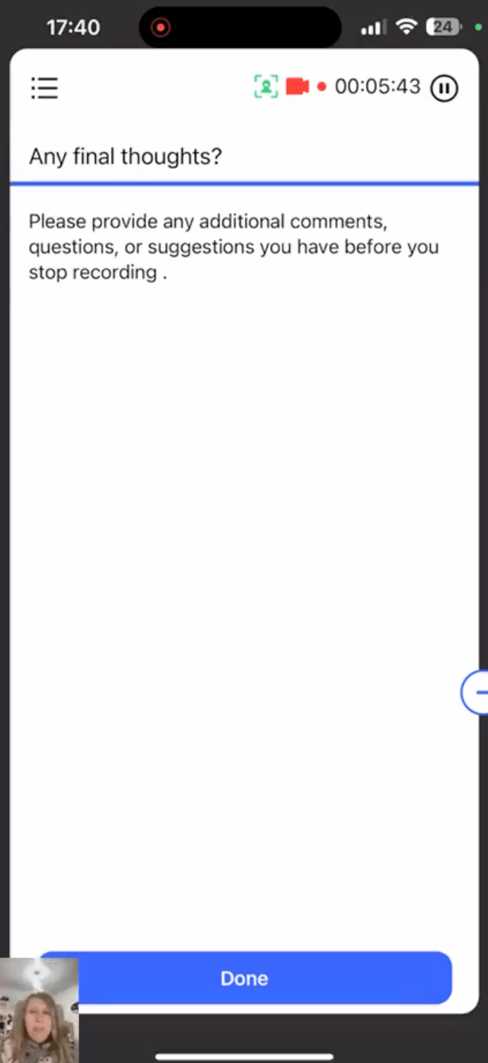
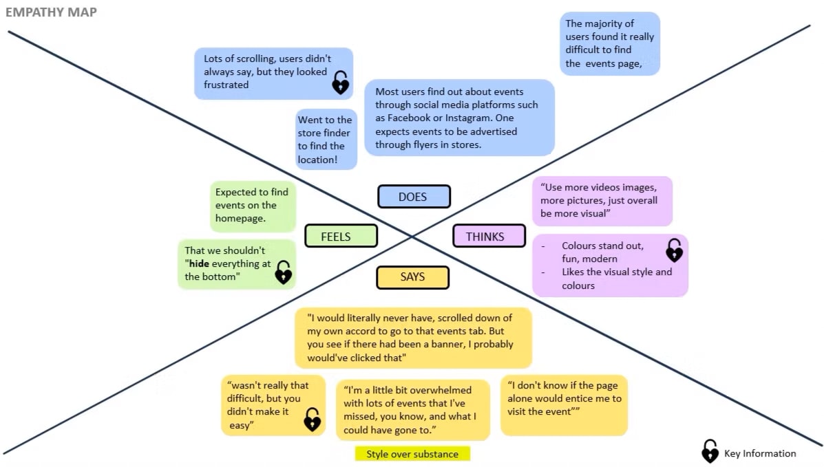
I decided to map the findings from our user testing onto an empathy map. This made it easier to summarise the findings and identify the key insights. Organising the findings this way also created a clear visualization to help communicate with stakeholders.
We discovered the landing page focused more on style than substance. While users liked the design, there were noticeable usability issues, which aligned with the initial concerns raised by stakeholders.
Define
Problem statements
After gathering site data, understanding my users, and speaking with stakeholders, I then broke down my findings into problem statements. This helped keep the designs focused and ensured the user stayed at the heart of the process.
User Problem 1:
Page Length
Problem
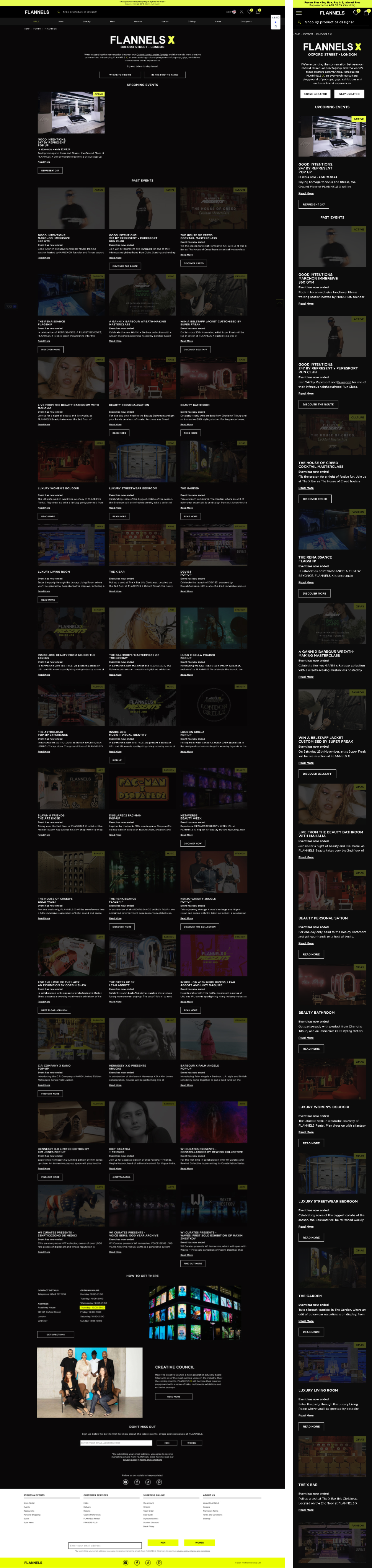
The page itself acts an archive, so it's currently heavy, long and loads very slowly.
How might we?
Make the page short and easy to navigate, while keeping it engaging during times when there are less upcoming events.
User Problem 2:
Navigation
Problem
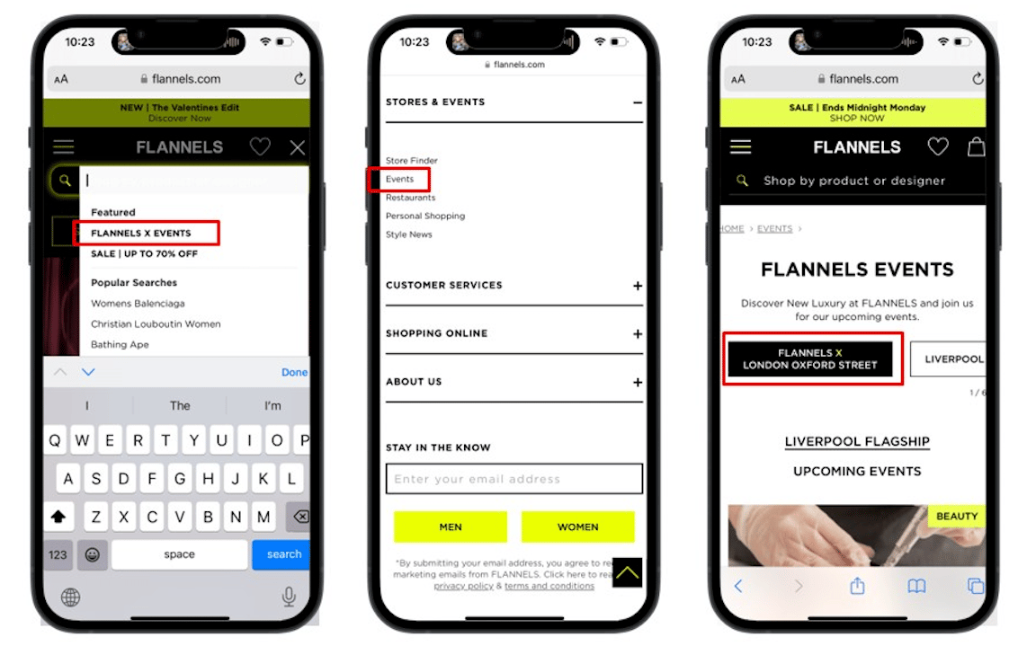
Currently the only way to access the FLANNELS X page is via the search bar, or in the footer.
How might we?
Make not only the webpage navigation easier, but also enhance the omnichannel experience.
User Problem 3:
Visability (What is FLANNELS X)
Problem
Users are not reading the copy at the top of the page. When asking users "What does flannels X mean to you?", one person asked if it was our twitter account...
How might we?
Improve brand awareness of FLANNELS X and clearly communicate its purpose to users.
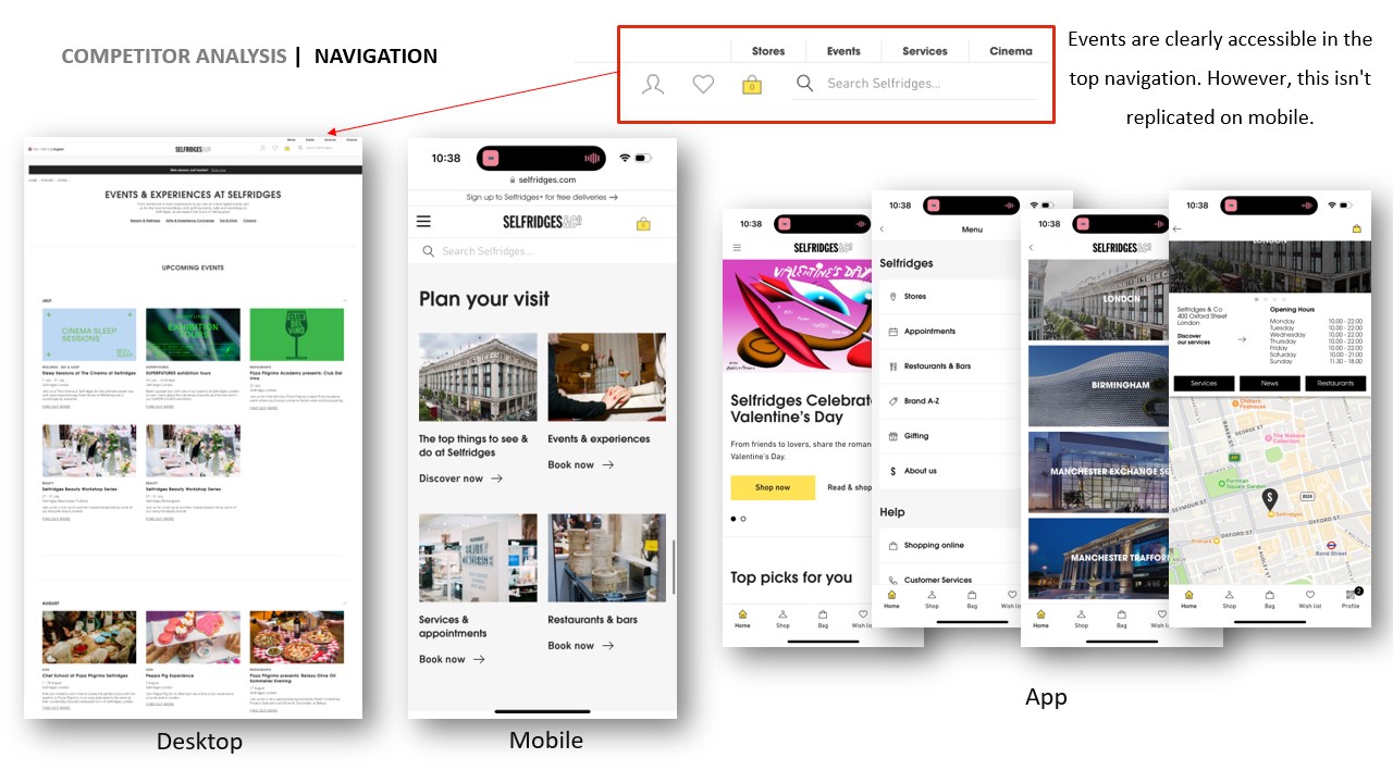
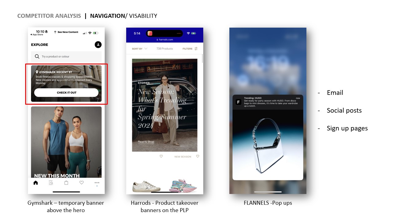
Competitor Analysis
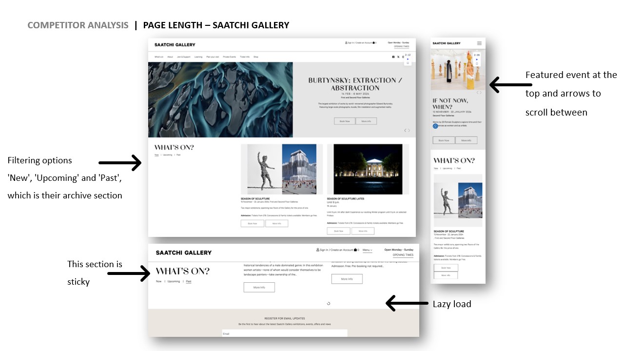
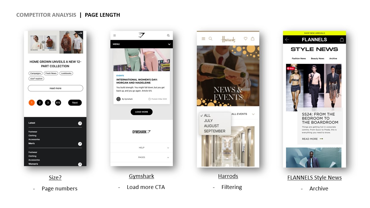
During competitors analysis, I looked at both our direct competitors in luxury retail, as well as organisations that focus entirely on events - such as art galleries.
I focused on what design ideas would solve our core problem statements: 'Navigation, 'Page Length' and 'Visibility'.
Design
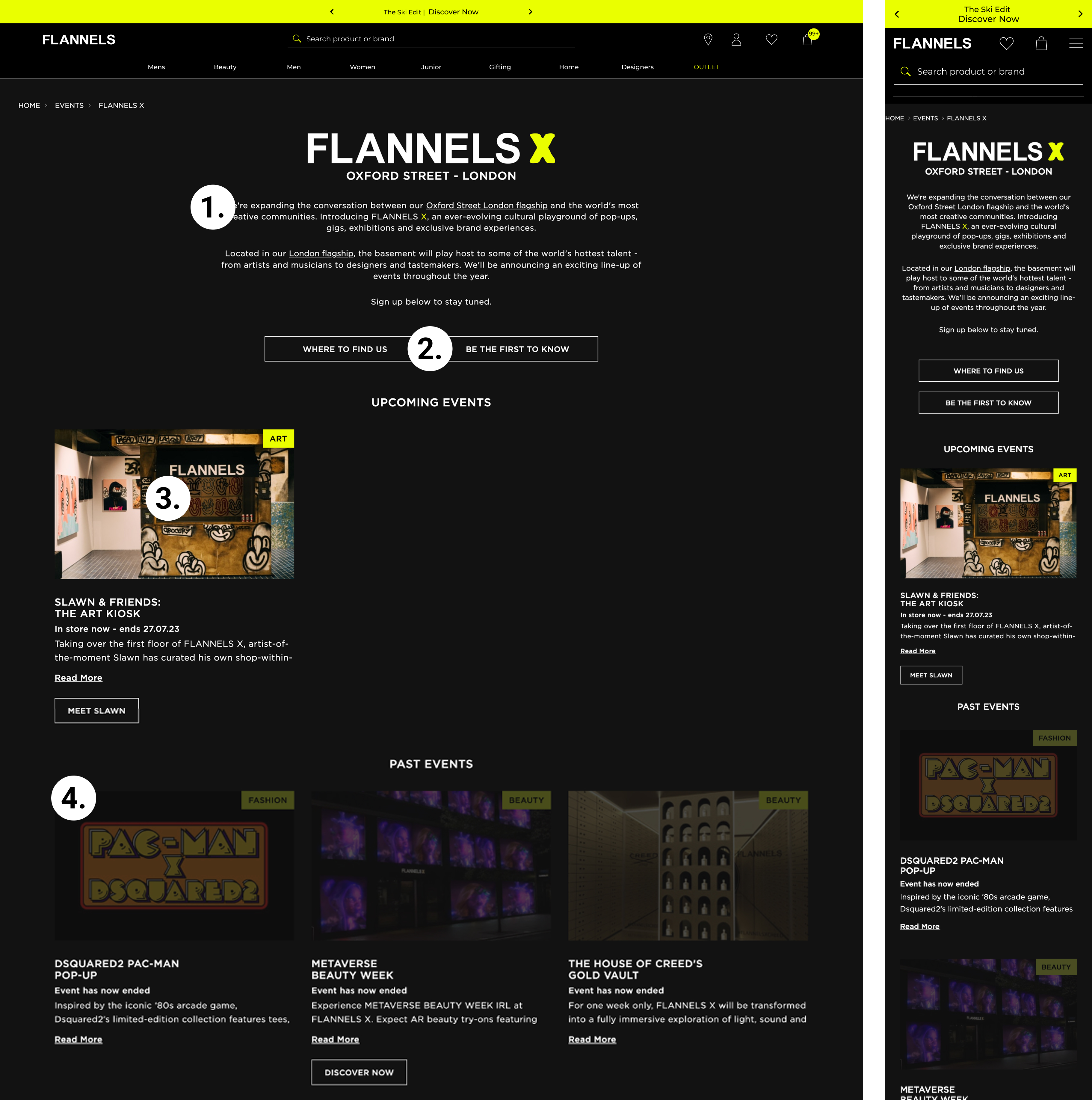
Quick Wins
Using the data collected, I identified several quick wins, simple design solutions that were easy to brief into the development team while addressing user frustrations and key problem statements with minimal effort.
1. Users are not seeing the first event.
Reducing copy or adding a ‘Read More’ link will bring the first event above the fold, leading to higher engagement - ContentSquare data.
2. The store finder and email sign-up buttons are being overlooked.
When asked, “Where is Flannels X?”, users missed the ‘How to Find Us’ button entirely. To improve visibility, I inverted the buttons, simplified the copy, and placed them on a single line—this also helped bring events above the fold.
3. Users expect the lead event images to be clickable.
ContentSquare data showed 796 users clicked on a non-clickable element, compared to 640 who clicked the actual button. Making the images clickable will increase click-through rates to the event page.
4. It not clear when an event had ended.
User testing revealed that the dimmed image wasn’t enough to indicate a finished event—one user even asked why the images were so dark. Adding an ‘X’ over past events makes the status clearer and reduces frustration.
Before
Longer term solutions
Scaling event cards
When I set out to redesign the webpage, my primary goal was to make our events the central focus. The previous design left empty space when there was only one live event. In the new layout, event details are positioned on the right, bringing them above the fold and utilising the available space more effectively.
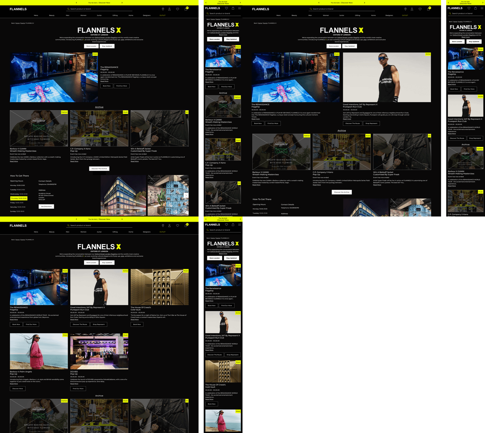
Archive page
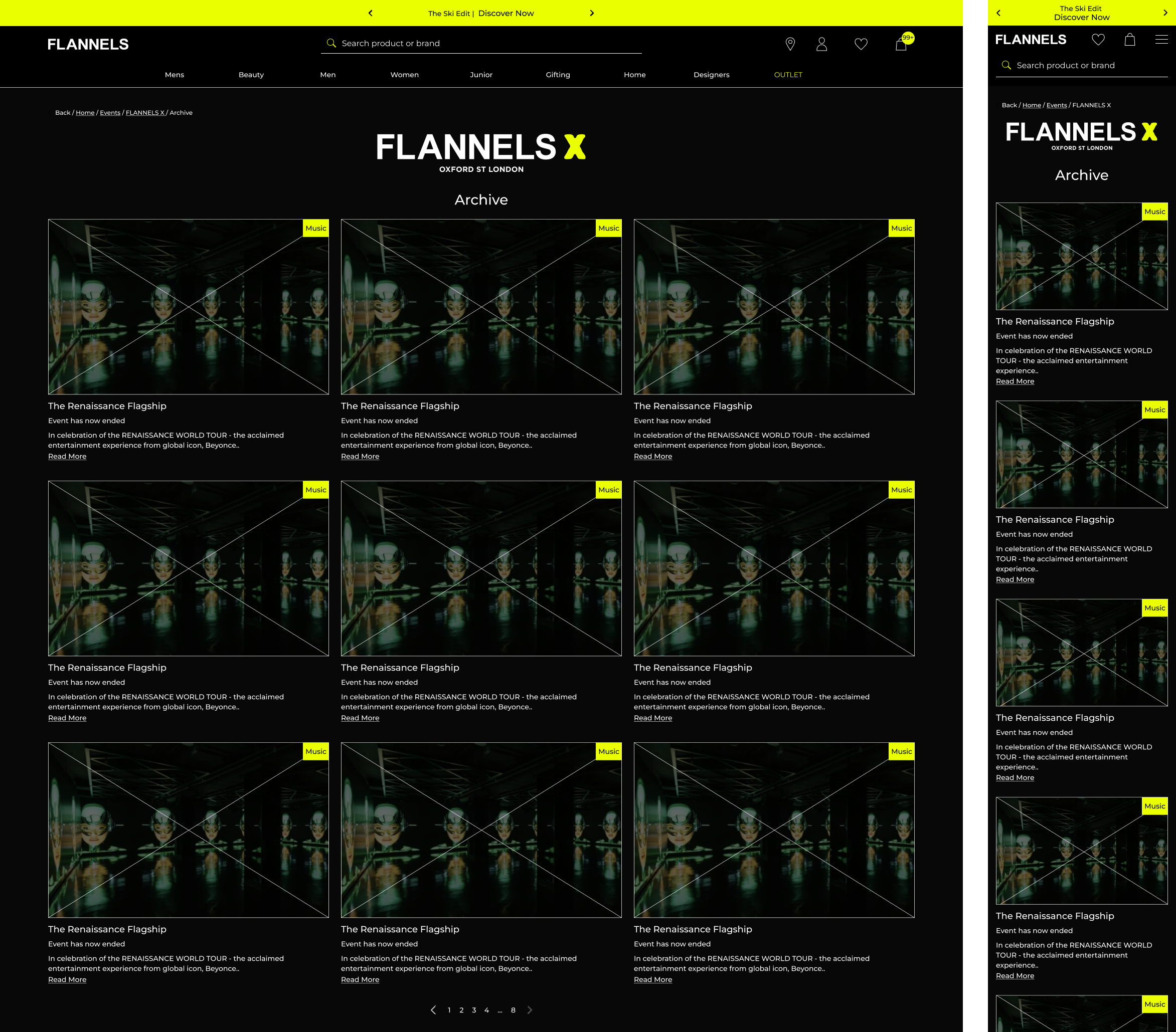
To tackle the issue of page length and make past events less distracting, I introduced an 'Archive' section, as shown in the fourth image. A future iteration could include the addition of filtering options, to help users identify events more relevant to them.
FLANNELS Focus
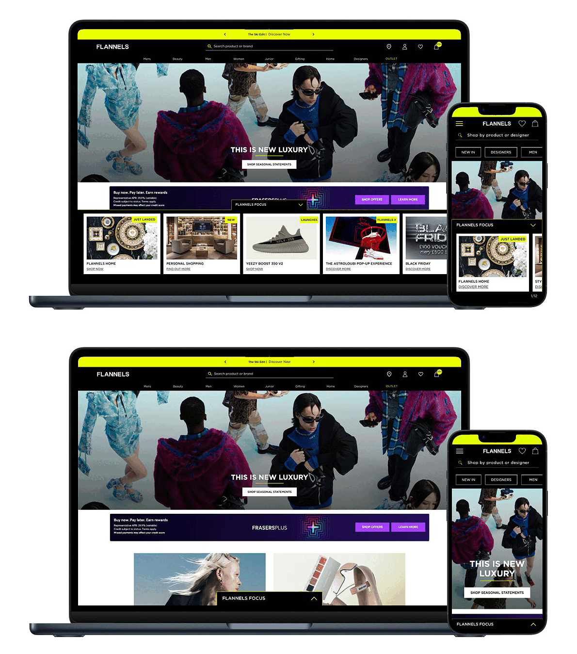
One design solution for improving the visibility of events is 'FLANNELS Focus'. This small tab would appear on the home screen and draw attention to our live events at FLANNELS.
Deliver
Results
Engagement & Interaction Metrics
+26% increase in page views per session – Improved navigation and engaging layouts encouraged deeper content exploration.-18% decrease in bounce rate – More relevant content and seamless interactions kept users engaged.Enhanced mobile usability – Optimised layouts and interactions led to a smoother mobile experience, increasing time spent on mobile by 24%.
Following the implication of the archive page, I would hope to see;
Faster page load speeds – Reducing unnecessary elements improved performance, leading to a decrease in load time.
Please visit the page at, https://www.flannels.com/flannelsx

View more projects
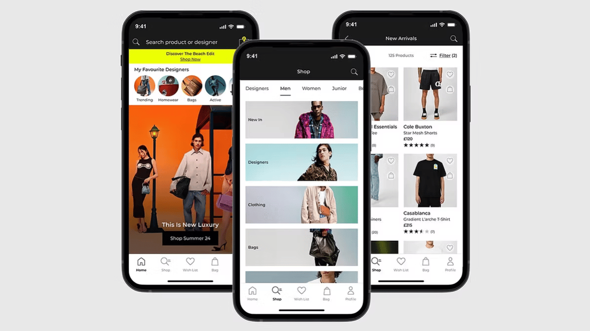
End-to-end case study of the FLANNELS app. Enhancing luxury shopping experience with personalised features and overall user experience.
Read case study

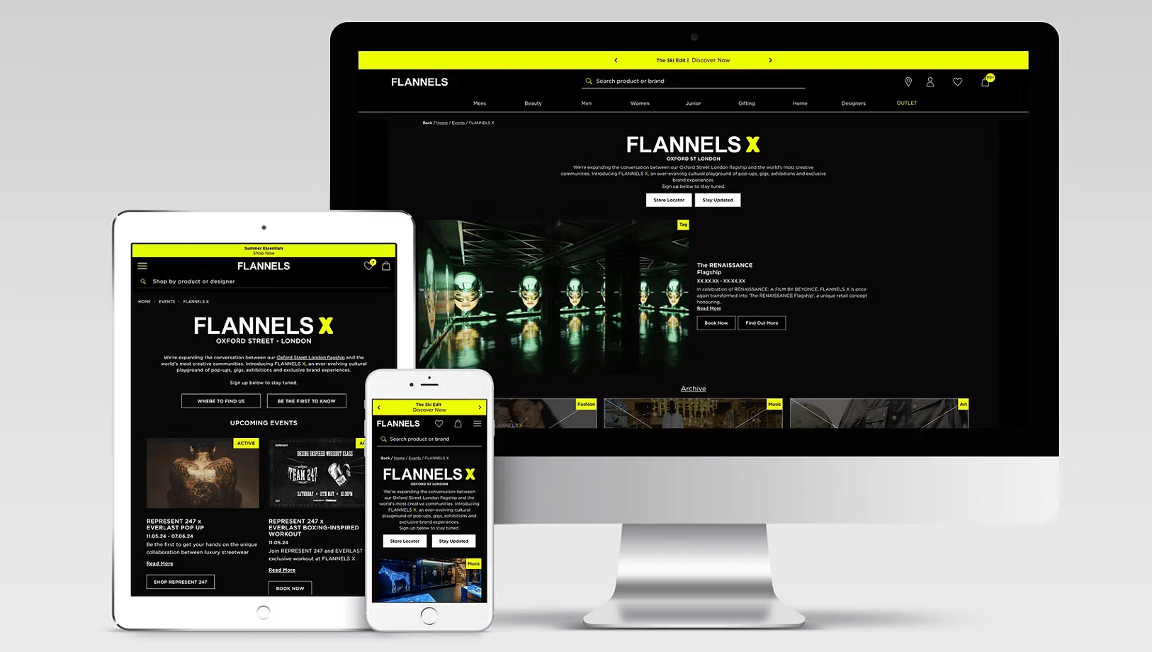
Elevating the experience of a digital hub for exclusive events, brand takeovers and cultural moments at FLANNELS X.
Read case study
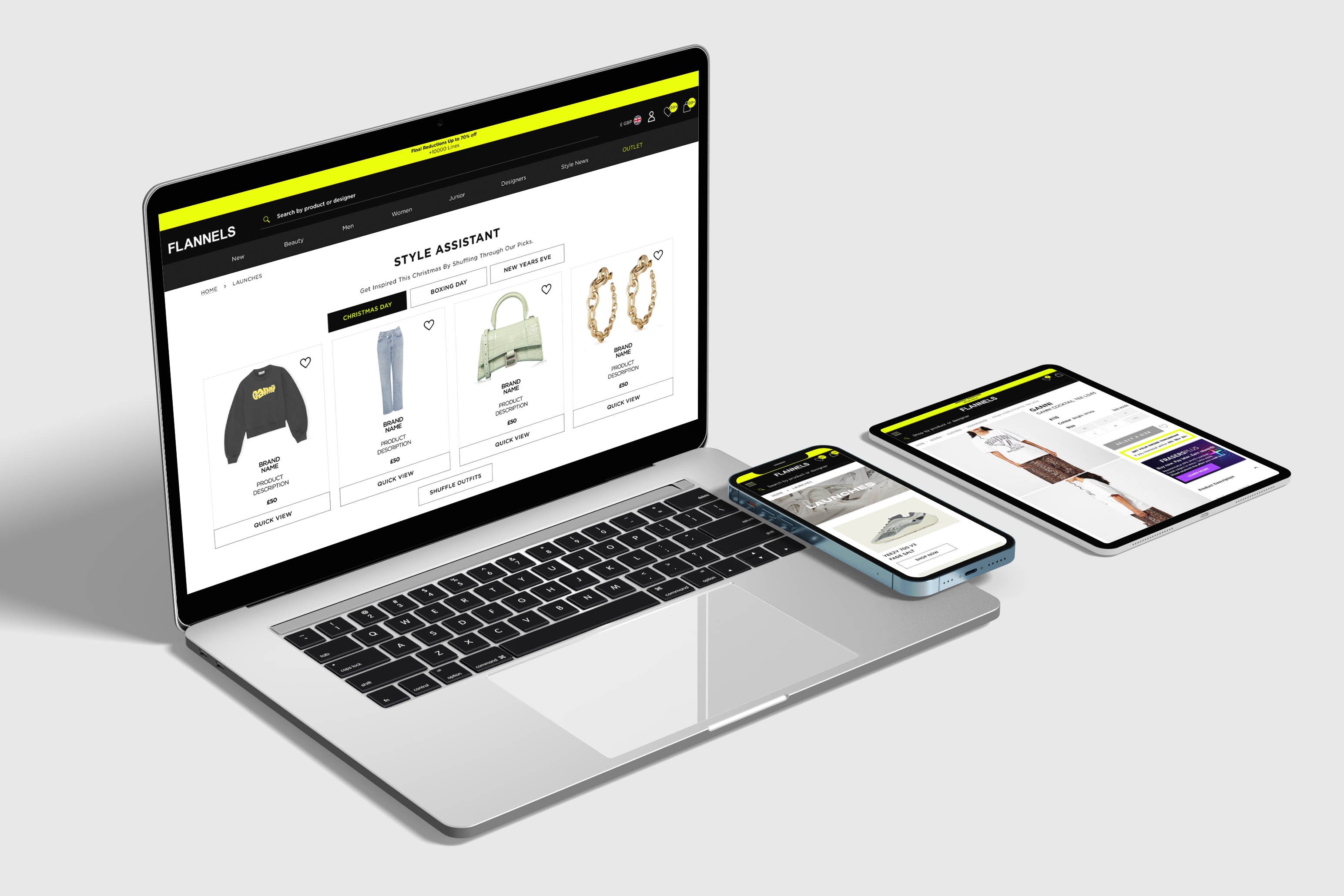
At FLANNELS we are constantly improving and testing the site, here are a few highlights.
Read case study
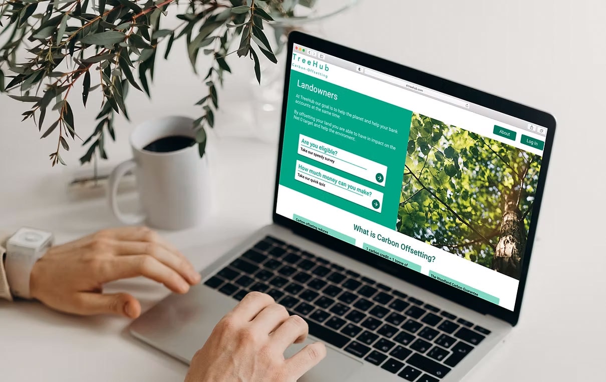
Partnering with TreeHub, I designed a platform helping landowners fund reforestation through carbon offsets.
Read case study
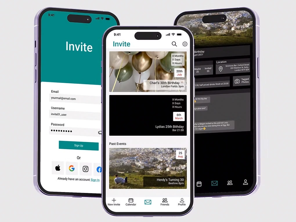
Invite is a design passion project and I use to improve and refine my design skills.
Read case study
Thank you for visitingmade with 💚 and ☕
Let's chat
charlottehemus@hotmail.com


FLANNELS X
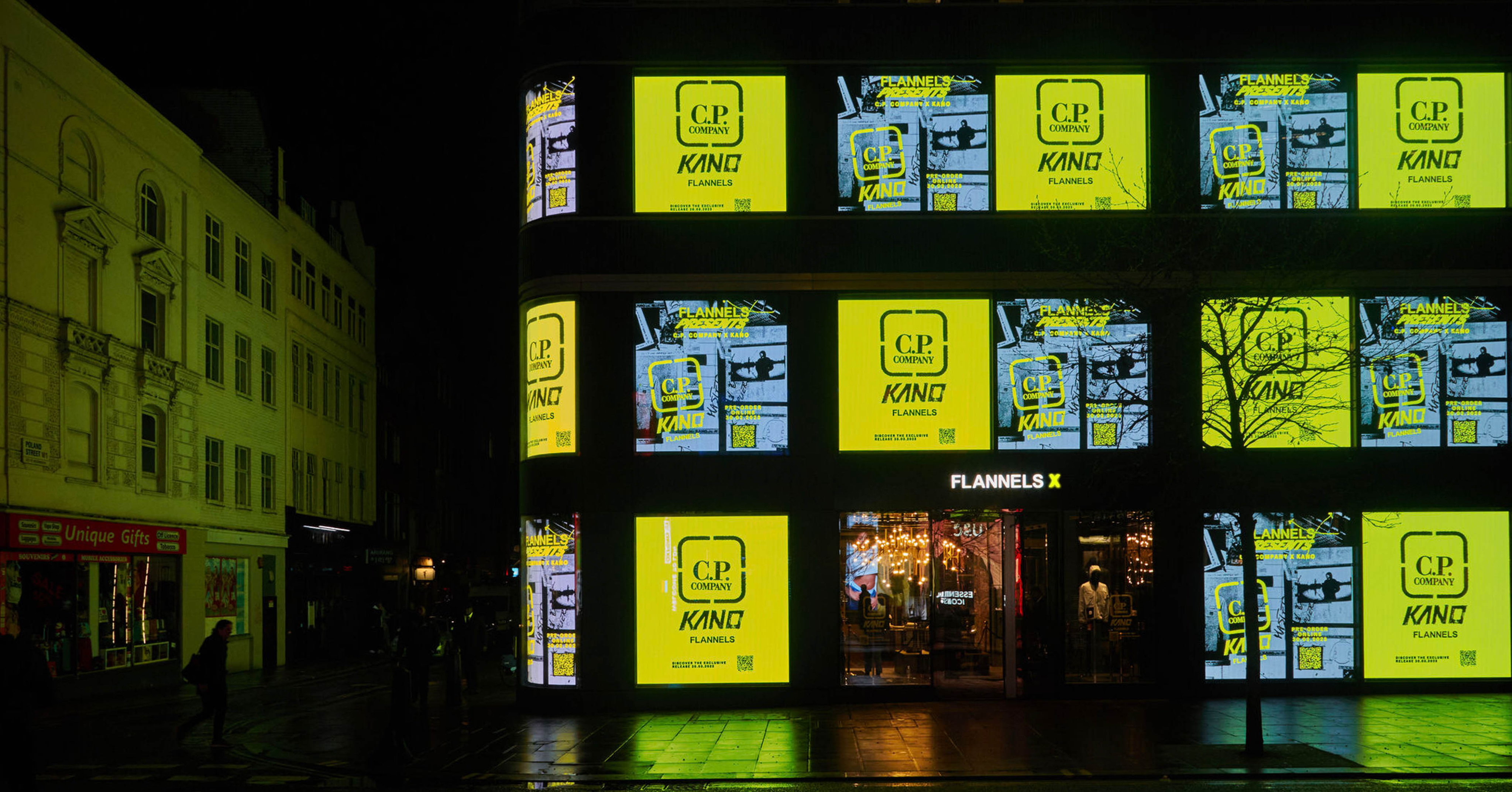
FLANNELS X is a dedicated space located in the basement of our Oxford Street store, designed to host pop-ups, gigs, exhibitions, and exclusive brand experiences. It plays a key role in our omnichannel strategy by driving customers towards in-person, experiential retail events that complement our digital offering.
Project Overview
The FLANNELS X app is an innovative digital experience created to elevate the luxury fashion shopping journey. The project aimed to deliver a seamless, engaging, and immersive experience that blends high-end aesthetics with intuitive, user-friendly functionality.
This initiative supported the wider business goal of integrating digital and physical retail experiences in a meaningful way.
My Role
As Lead Product Designer, I was responsible for defining and shaping the overall user experience, conducting user research and usability testing, and creating wireframes, prototypes, and high-fidelity UI designs.
I worked closely with developers and stakeholders throughout the product lifecycle to ensure every design decision aligned with user needs and upheld the premium positioning of the FLANNELS brand.
My Design Process
4/ Develop
- Collaboration between designers, developers, and stakeholders
- Quality assurance and usability testing
3/ Design
- High fidelity prototyping
- Conducting design reviews and iterating on ideas
- Designing solutions
2/ Define
- Empathy map
- Problem statements
- How might we statements
- Competitor Analysis
1/ Discover
- Content Square Analysis
- Stakeholder Interviews
- User Testing
- Empathy Mapping
05/ Deliver
- Final testing and debugging
- Monitoring user feedback, performance, and analytics
Discover
Content Square Analysis
I started by using Content Square to review data on how users were currently engaging with the Flannels X webpage. This provided valuable insights into user behaviour and revealed a number of pain points:
- Only 60% of users were seeing the details of our upcoming events when landing on this page.
- Over 98% were not scrolling down far enough to see the email signup button.
- A high number of users attempted to tap/click on 'Past Events,' expecting it to be interactive, but it’s currently an un-clickable element.
- 796 users tried to tap on the event image, which is also un-clickable.
Exposure Rate
The percentage of page views where at least half of the area is visible on the screen, which indicates how far users scroll.
Tap Recurrence
The average number of taps in an area for page views. A rate higher than 1 may suggest user frustration or a strong interest in a feature.
Number of taps
High volume of taps on non-clickable assets can indicate opportunities to remove friction from the customer journey.
Stakeholder Requirements
I spoke with key stakeholders from different areas of the business, including trade and marketing teams, to get a better understanding of their current pain points and opportunities. The feedback was consistent across departments:
Pain Points
- Page length
- Slow load time
- Page doesn't excite customers
Opportunities
- Omnichannel integration
- Enhanced video content
- Personalisation
KPIs
- Site speed
- Engagement
- Page views
User Testing and Empathy Mapping
Using the User Testing platform, I was able to monitor 10 users as they engaged with the platform.
- Income - 20k -> 60k
- Age - 25-54
- Gender - 5 x female / 5x male
- Device - 6x mobile / 4x desktop
I decided to map the findings from our user testing onto an empathy map. This made it easier to summarise the findings and identify the key insights. Organising the findings this way also created a clear visualization to help communicate with stakeholders.
We discovered the landing page focused more on style than substance. While users liked the design, there were noticeable usability issues, which aligned with the initial concerns raised by stakeholders.
Define
Problem statements
After gathering site data, understanding my users, and speaking with stakeholders, I then broke down my findings into problem statements. This helped keep the designs focused and ensured the user stayed at the heart of the process.
User Problem 1:
Page Length
Problem
The page itself acts an archive, so it's currently heavy, long and loads very slowly.
How might we?
Make the page short and easy to navigate, while keeping it engaging during times when there are less upcoming events.
User Problem 2:
Navigation
Problem
Currently the only way to access the FLANNELS X page is via the search bar, or in the footer.
How might we?
Make not only the webpage navigation easier, but also enhance the omnichannel experience.
User Problem 3:
Visability (What is FLANNELS X)
Problem
Users are not reading the copy at the top of the page. When asking users "What does flannels X mean to you?", one person asked if it was our twitter account...
How might we?
Improve brand awareness of FLANNELS X and clearly comunicate its purpose to users.
Competitor Analysis
During competitors analysis, I looked at both our direct competitors in luxury retail, as well as organisations that focus entirely on events - such as art galleries.
I focused on what design ideas would solve our core problem statements: 'Navigation, 'Page Length' and 'Visibility'.
Design
Quick Wins
Using the data collected, I identified several quick wins, simple design solutions that were easy to brief into the development team while addressing user frustrations and key problem statements with minimal effort.
1. Users are not seeing the first event.
Reducing copy or adding a ‘Read More’ link will bring the first event above the fold, leading to higher engagement - ContentSquare data.
2. The store finder and email sign-up buttons are being overlooked.
When asked, “Where is Flannels X?”, users missed the ‘How to Find Us’ button entirely. To improve visibility, I inverted the buttons, simplified the copy, and placed them on a single line—this also helped bring events above the fold.
3. Users expect the lead event images to be clickable.
ContentSquare data showed 796 users clicked on a non-clickable element, compared to 640 who clicked the actual button. Making the images clickable will increase click-through rates to the event page.
4. It not clear when an event had ended.
User testing revealed that the dimmed image wasn’t enough to indicate a finished event—one user even asked why the images were so dark. Adding an ‘X’ over past events makes the status clearer and reduces frustration.
Before
Longer term solutions
Scaling event cards
When I set out to redesign the webpage, my primary goal was to make our events the central focus. The previous design left empty space when there was only one live event. In the new layout, event details are positioned on the right, bringing them above the fold and utilising the available space more effectively.
Archive page
To tackle the issue of page length and make past events less distracting, I introduced an 'Archive' section, as shown in the fourth image. A future iteration could include the addition of filtering options, to help users identify events more relevant to them.
FLANNELS Focus
One design solution for improving the visibility of events is 'FLANNELS Focus'. This small tab would appear on the home screen and draw attention to our live events at FLANNELS.
Deliver
Results
Engagement & Interaction Metrics
+26% increase in page views per session – Improved navigation and engaging layouts encouraged deeper content exploration.-18% decrease in bounce rate – More relevant content and seamless interactions kept users engaged.Enhanced mobile usability – Optimised layouts and interactions led to a smoother mobile experience, increasing time spent on mobile by 24%.
Following the implication of the archive page, I would hope to see;
Faster page load speeds – Reducing unnecessary elements improved performance, leading to a 35% decrease in load times.
Please visit the page at, https://www.flannels.com/flannelsx
View more projects
End-to-end case study of the FLANNELS app. Enhancing luxury shopping experience with personalised features and overall user experience.
Read case study
Elevating the experience of a digital hub for exclusive events, brand takeovers and cultural moments at FLANNELS X.
Read case study
At FLANNELS we are constantly improving and testing the site, here are a few highlights.
Read case study
Partnering with TreeHub, I designed a platform helping landowners access funding to reforest their land through carbon offset initiatives.
Read case study
Invite is a design passion project and I use to improve and refine my design skills.
Read case study
Thank you for visitingmade with 💚 and ☕
Let's chat
charlottehemus@hotmail.comFLANNELS X
FLANNELS X is a dedicated space located in the basement of our Oxford Street store, designed to host pop-ups, gigs, exhibitions, and exclusive brand experiences. It plays a key role in our omnichannel strategy by driving customers towards in-person, experiential retail events that complement our digital offering.
Project Overview
The FLANNELS X app is an innovative digital experience created to elevate the luxury fashion shopping journey. The project aimed to deliver a seamless, engaging, and immersive experience that blends high-end aesthetics with intuitive, user-friendly functionality.
This initiative supported the wider business goal of integrating digital and physical retail experiences in a meaningful way.
My Role
As Lead Product Designer, I was responsible for defining and shaping the overall user experience, conducting user research and usability testing, and creating wireframes, prototypes, and high-fidelity UI designs.
I worked closely with developers and stakeholders throughout the product lifecycle to ensure every design decision aligned with user needs and upheld the premium positioning of the FLANNELS brand.
My Design Process
1/ Discover
- Content Square Analysis
- Stakeholder Interviews
- User Testing
- Empathy Mapping
2/ Define
- Empathy map
- Problem statements
- How might we statements
- Competitor Analysis
3/ Design
- High fidelity prototyping
- Conducting design reviews and iterating on ideas
- Designing solutions
4/ Develop
- Collaboration between designers, developers, and stakeholders
- Quality assurance and usability testing
05/ Deliver
- Final testing and debugging
- Monitoring user feedback, performance, and analytics
Discover
Content Square Analysis
I started by using Content Square to review data on how users were currently engaging with the Flannels X webpage. This provided valuable insights into user behaviour and revealed a number of pain points:
- Only 60% of users were seeing the details of our upcoming events when landing on this page.
- Over 98% were not scrolling down far enough to see the email signup button.
- A high number of users attempted to tap/click on 'Past Events,' expecting it to be interactive, but it’s currently an un-clickable element.
- 796 users tried to tap on the event image, which is also un-clickable.
Exposure Rate
The percentage of page views where at least half of the area is visible on the screen, which indicates how far users scroll.
Tap Recurrence
The average number of taps in an area for page views. A rate higher than 1 may suggest user frustration or a strong interest in a feature.
Number of taps
High volume of taps on non-clickable assets can indicate opportunities to remove friction from the customer journey.
Stakeholder Requirements
I spoke with key stakeholders from different areas of the business, including trade and marketing teams, to get a better understanding of their current pain points and opportunities. The feedback was consistent across departments:
Pain Points
- Page length
- Slow load time
- Page doesn't excite customers
Opportunities
- Omnichannel integration
- Enhanced video content
- Personalisation
KPIs
- Site speed
- Engagement
- Page views
User Testing and Empathy Mapping
Using the User Testing platform, I was able to monitor 10 users as they engaged with the platform.
- Income - 20k -> 60k
- Age - 25-54
- Gender - 5 x female / 5x male
- Device - 6x mobile / 4x desktop
I decided to map the findings from our user testing onto an empathy map. This made it easier to summarise the findings and identify the key insights. Organising the findings this way also created a clear visualization to help communicate with stakeholders.
We discovered the landing page focused more on style than substance. While users liked the design, there were noticeable usability issues, which aligned with the initial concerns raised by stakeholders.
Define
Problem statements
After gathering site data, understanding my users, and speaking with stakeholders, I then broke down my findings into problem statements. This helped keep the designs focused and ensured the user stayed at the heart of the process.
User Problem 1:
Page Length
Problem
The page itself acts an archive, so it's currently heavy, long and loads very slowly.
How might we?
Make the page short and easy to navigate, while keeping it engaging during times when there are less upcoming events.
User Problem 2:
Navigation
Problem
Currently the only way to access the FLANNELS X page is via the search bar, or in the footer.
How might we?
Make not only the webpage navigation easier, but also enhance the omnichannel experience.
User Problem 3:
Visibility (What is FLANNELS X)
Problem
Users are not reading the copy at the top of the page. When asking users "What does flannels X mean to you?", one person asked if it was our twitter account...
How might we?
Improve brand awareness of FLANNELS X and clearly comunicate its purpose to users.
Competitor Analysis
During competitors analysis, I looked at both our direct competitors in luxury retail, as well as organisations that focus entirely on events - such as art galleries.
I focused on what design ideas would solve our core problem statements: 'Navigation, 'Page Length' and 'Visibility'.
Design
Quick Wins
Using the data collected, I identified several quick wins, simple design solutions that were easy to brief into the development team while addressing user frustrations and key problem statements with minimal effort.
1. Users are not seeing the first event.
Reducing copy or adding a ‘Read More’ link will bring the first event above the fold, leading to higher engagement - ContentSquare data.
2. The store finder and email sign-up buttons are being overlooked.
When asked, “Where is Flannels X?”, users missed the ‘How to Find Us’ button entirely. To improve visibility, I inverted the buttons, simplified the copy, and placed them on a single line—this also helped bring events above the fold.
3. Users expect the lead event images to be clickable.
ContentSquare data showed 796 users clicked on a non-clickable element, compared to 640 who clicked the actual button. Making the images clickable will increase click-through rates to the event page.
4. It not clear when an event had ended.
User testing revealed that the dimmed image wasn’t enough to indicate a finished event—one user even asked why the images were so dark. Adding an ‘X’ over past events makes the status clearer and reduces frustration.
Before
Longer term solutions
Scaling event cards
When I set out to redesign the webpage, my primary goal was to make our events the central focus. The previous design left empty space when there was only one live event. In the new layout, event details are positioned on the right, bringing them above the fold and utilising the available space more effectively.
Archive page
To tackle the issue of page length and make past events less distracting, I introduced an 'Archive' section, as shown in the fourth image. A future iteration could include the addition of filtering options, to help users identify events more relevant to them.
FLANNELS Focus
One design solution for improving the visibility of events is 'FLANNELS Focus'. This small tab would appear on the home screen and draw attention to our live events at FLANNELS.
Deliver
Results
Engagement & Interaction Metrics
+26% increase in page views per session – Improved navigation and engaging layouts encouraged deeper content exploration.-18% decrease in bounce rate – More relevant content and seamless interactions kept users engaged.Enhanced mobile usability – Optimised layouts and interactions led to a smoother mobile experience, increasing time spent on mobile by 24%.
Following the implication of the archive page, I would hope to see;
Faster page load speeds – Reducing unnecessary elements improved performance, leading to a decrease in load time.
Please visit the page at, https://www.flannels.com/flannelsx

View more projects
End-to-end case study of the FLANNELS app. Enhancing luxury shopping experience with personalised features and overall user experience.
Read case study
Elevating the experience of a digital hub for exclusive events, brand takeovers and cultural moments at FLANNELS X.
Read case study
At FLANNELS we are constantly improving and testing the site, here are a few highlights.
Read case study
Partnering with TreeHub, I designed a platform helping landowners access funding to reforest their land through carbon offset initiatives.
Read case study
Invite is a design passion project and I use to improve and refine my design skills.
Read case study
Thank you for visitingmade with 💚 and ☕
Let's chat
charlottehemus@hotmail.comFLANNELS X
FLANNELS X is a dedicated space located in the basement of our Oxford Street store, designed to host pop-ups, gigs, exhibitions, and exclusive brand experiences. It plays a key role in our omnichannel strategy by driving customers towards in-person, experiential retail events that complement our digital offering.
Project Overview
The FLANNELS X app is an innovative digital experience created to elevate the luxury fashion shopping journey. The project aimed to deliver a seamless, engaging, and immersive experience that blends high-end aesthetics with intuitive, user-friendly functionality.
This initiative supported the wider business goal of integrating digital and physical retail experiences in a meaningful way.
My Role
As Lead Product Designer, I was responsible for defining and shaping the overall user experience, conducting user research and usability testing, and creating wireframes, prototypes, and high-fidelity UI designs.
I worked closely with developers and stakeholders throughout the product lifecycle to ensure every design decision aligned with user needs and upheld the premium positioning of the FLANNELS brand.
My Design Process
1/ Discover
- Content Square Analysis
- Stakeholder Interviews
- User Testing
- Empathy Mapping
2/ Define
- Empathy map
- Problem statements
- How might we statements
- Competitor Analysis
3/ Design
- High fidelity prototyping
- Conducting design reviews and iterating on ideas
- Designing solutions
4/ Develop
- Collaboration between designers, developers, and stakeholders
- Quality assurance and usability testing
05/ Deliver
- Final testing and debugging
- Monitoring user feedback, performance, and analytics
Discover
Content Square Analysis
I started by using Content Square to review data on how users were currently engaging with the Flannels X webpage. This provided valuable insights into user behaviour and revealed a number of pain points:
- Only 60% of users were seeing the details of our upcoming events when landing on this page.
- Over 98% were not scrolling down far enough to see the email signup button.
- A high number of users attempted to tap/click on 'Past Events,' expecting it to be interactive, but it’s currently an un-clickable element.
- 796 users tried to tap on the event image, which is also un-clickable.
Exposure Rate
The percentage of page views where at least half of the area is visible on the screen, which indicates how far users scroll.
Tap Recurrence
The average number of taps in an area for page views. A rate higher than 1 may suggest user frustration or a strong interest in a feature.
Number of taps
High volume of taps on non-clickable assets can indicate opportunities to remove friction from the customer journey.
Stakeholder Requirements
I spoke with key stakeholders from different areas of the business, including trade and marketing teams, to get a better understanding of their current pain points and opportunities. The feedback was consistent across departments:
Pain Points
- Page length
- Slow load time
- Page doesn't excite customers
Opportunities
- Omnichannel integration
- Enhanced video content
- Personalisation
KPIs
- Site speed
- Engagement
- Page views
User Testing and Empathy Mapping
Using the User Testing platform, I was able to monitor 10 users as they engaged with the platform.
- Income - 20k -> 60k
- Age - 25-54
- Gender - 5 x female / 5x male
- Device - 6x mobile / 4x desktop
I decided to map the findings from our user testing onto an empathy map. This made it easier to summarise the findings and identify the key insights. Organising the findings this way also created a clear visualization to help communicate with stakeholders.
We discovered the landing page focused more on style than substance. While users liked the design, there were noticeable usability issues, which aligned with the initial concerns raised by stakeholders.
Define
Problem statements
After gathering site data, understanding my users, and speaking with stakeholders, I then broke down my findings into problem statements. This helped keep the designs focused and ensured the user stayed at the heart of the process.
User Problem 1:
Page Length
Problem
The page itself acts an archive, so it's currently heavy, long and loads very slowly.
How might we?
Make the page short and easy to navigate, while keeping it engaging during times when there are less upcoming events.
User Problem 2:
Navigation
Problem
Currently the only way to access the FLANNELS X page is via the search bar, or in the footer.
How might we?
Make not only the webpage navigation easier, but also enhance the omnichannel experience.
User Problem 3:
Visability (What is FLANNELS X)
Problem
Users are not reading the copy at the top of the page. When asking users "What does flannels X mean to you?", one person asked if it was our twitter account...
How might we?
Improve brand awareness of FLANNELS X and clearly comunicate its purpose to users.
Competitor Analysis
During competitors analysis, I looked at both our direct competitors in luxury retail, as well as organisations that focus entirely on events - such as art galleries.
I focused on what design ideas would solve our core problem statements: 'Navigation, 'Page Length' and 'Visibility'.
Design
Quick Wins
Using the data collected, I identified several quick wins, simple design solutions that were easy to brief into the development team while addressing user frustrations and key problem statements with minimal effort.
1. Users are not seeing the first event.
Reducing copy or adding a ‘Read More’ link will bring the first event above the fold, leading to higher engagement - ContentSquare data.
2. The store finder and email sign-up buttons are being overlooked.
When asked, “Where is Flannels X?”, users missed the ‘How to Find Us’ button entirely. To improve visibility, I inverted the buttons, simplified the copy, and placed them on a single line—this also helped bring events above the fold.
3. Users expect the lead event images to be clickable.
ContentSquare data showed 796 users clicked on a non-clickable element, compared to 640 who clicked the actual button. Making the images clickable will increase click-through rates to the event page.
4. It not clear when an event had ended.
User testing revealed that the dimmed image wasn’t enough to indicate a finished event—one user even asked why the images were so dark. Adding an ‘X’ over past events makes the status clearer and reduces frustration.
Before
Longer term solutions
Scaling event cards
When I set out to redesign the webpage, my primary goal was to make our events the central focus. The previous design left empty space when there was only one live event. In the new layout, event details are positioned on the right, bringing them above the fold and utilising the available space more effectively.
Archive page
To tackle the issue of page length and make past events less distracting, I introduced an 'Archive' section, as shown in the fourth image. A future iteration could include the addition of filtering options, to help users identify events more relevant to them.
FLANNELS Focus
One design solution for improving the visibility of events is 'FLANNELS Focus'. This small tab would appear on the home screen and draw attention to our live events at FLANNELS.
Deliver
Results
Engagement & Interaction Metrics
+26% increase in page views per session – Improved navigation and engaging layouts encouraged deeper content exploration.-18% decrease in bounce rate – More relevant content and seamless interactions kept users engaged.Enhanced mobile usability – Optimised layouts and interactions led to a smoother mobile experience, increasing time spent on mobile by 24%.
Following the implication of the archive page, I would hope to see;
Faster page load speeds – Reducing unnecessary elements improved performance, leading to a decrease in load time.
Please visit the page at, https://www.flannels.com/flannelsx
View more projects
End-to-end case study of the FLANNELS app. Enhancing luxury shopping experience with personalised features and overall user experience.
Read case study
Elevating the experience of a digital hub for exclusive events, brand takeovers and cultural moments at FLANNELS X.
Read case study
At FLANNELS we are constantly improving and testing the site, here are a few highlights.
Read case study
Partnering with TreeHub, I designed a platform helping landowners access funding to reforest their land through carbon offset initiatives.
Read case study
Invite is a design passion project and I use to improve and refine my design skills.
Read case study
Thank you for visitingmade with 💚 and ☕