
TreeHub
This project was the practical component of my qualification at Experience Haus. Collaborating with stakeholders at TreeHub, I developed a digital platform that connects landowners seeking to repurpose their land for reforestation with carbon offset funding.
Team
4x Design Team members
4x CRO Team members
Stakeholders across the buisness
Timeline
Project Duration : 1 month
Discovery & Research : 2 weeks
Design & testing : 2 weeks
Tools Used
Figma
Content Square
User Testing platform
My Design Process
1/ Discover
- Current problem and goals
- Stakeholder requirements
- Competitor research
- Quantitative data
- User interviews
2/ Define
- User personas
- Affinity mapping
- Problem statement
- Flow diagram
3/ Design
- Wireframing
- High fidelity prototype
- Branding
- User testing
4/ Deliver
- User Testing
- Presenting back to stakeholders
Discover
Current Problem and Goals
In order to hit the UK’s Net Zero target, we need to plant 1.5bn trees by 2050. This is the equivalent of 30,00 hectares per year; in 2018/2019, we planted less than 50% of this.TreeHub is a pre-revenue startup with a headcount of two. It was founded in 2020 with the goal of accelerating forestation in the UK. Their approach is to use digital technology to make planting trees simpler and more accessible, which will support UK’s Net Zero target. The eventual goal for TreeHub is to sell carbon credits on the site. This will allow landowners to make a profit from their land, as a possible alternative to farming. The only current solution is via The Woodland Carbon Code (WCC) site. This is the only UK quality assurance standard for woodland creation projects and generates independently verified carbon units. The WCC website is difficult to navigate for users and requires downloading an excel file to calculate potential returns.
Stakeholder Requirements

Speed
What is the shortest number of steps to complete an initial screening process to determine eligibility for the WCC process?

Simplicity
Is the design sufficiently intuitive for users that have little/no understanding of the WCC and how their process works.

Online-Only
Is it possible to make the process 100% online, i.e. no downloading/offline steps?This will keep the users on the website.
Competitor Research
My first step was to do competitor research, I found that TreeHub's main competitors are ‘Project Developers’. These are companies that have gone through the WCC process and are now at the stage to allow their customers to offset carbon through the site.
My key findings were that;
- The majority of sites are focused on corporate companies.
- Offer an ability to offset carbon through the site.
- Focus on how the individuals offset their carbon.
- Don't offer a clear way how landowners sign up.
Quantitative Data
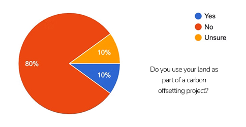
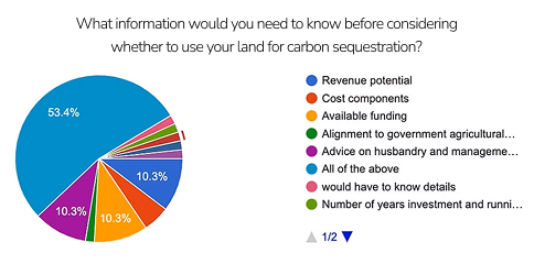
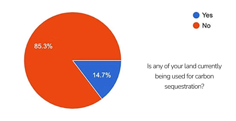
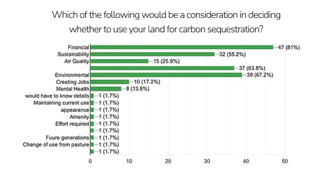
To collect quantitative data, I surveyed 70 users using Google Forms.
These were the results:
Key Findings
- Most people own land but do not use it for carbon offsetting.
- The product needs to educate users, as most participants were unsure about carbon offsetting and made assumptions when asked if they had enough land to offset.
- Financial and environmental concerns are the key considerations when deciding to offset land.
Define
User Interviews
From the survey, some landowners were happy to speak further, so I conducted a range of user interviews. I was able to speak to a wide range of landowners including farmers, estate owners, and smallholdings owners. All users had different requirements so it was really important to have a wide range of user interviews.
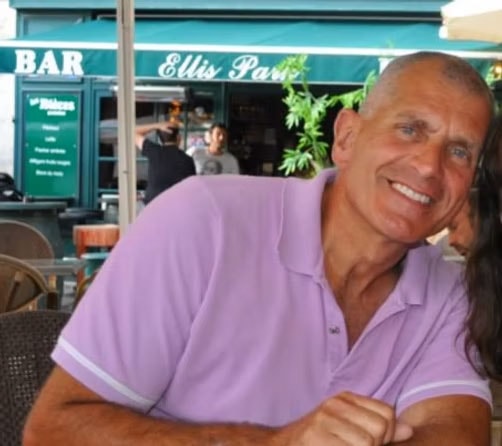
Paul - Former Farmer
“I would look into it to see if it was financially viable, this is more important than anything. From a landowner's view you have to have a financial return on whatever you do”.
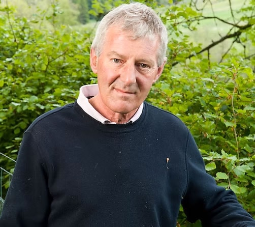
Mark - Estate owner
“It is good to know what you're doing is good for the planet.“
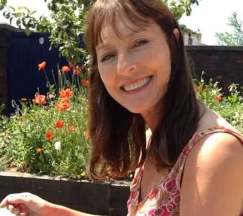
Suzanna - Small holdings owner
“It’s generally something you do for love, not just financial gain, but a little bit of financial gain might motivate "
User Personas
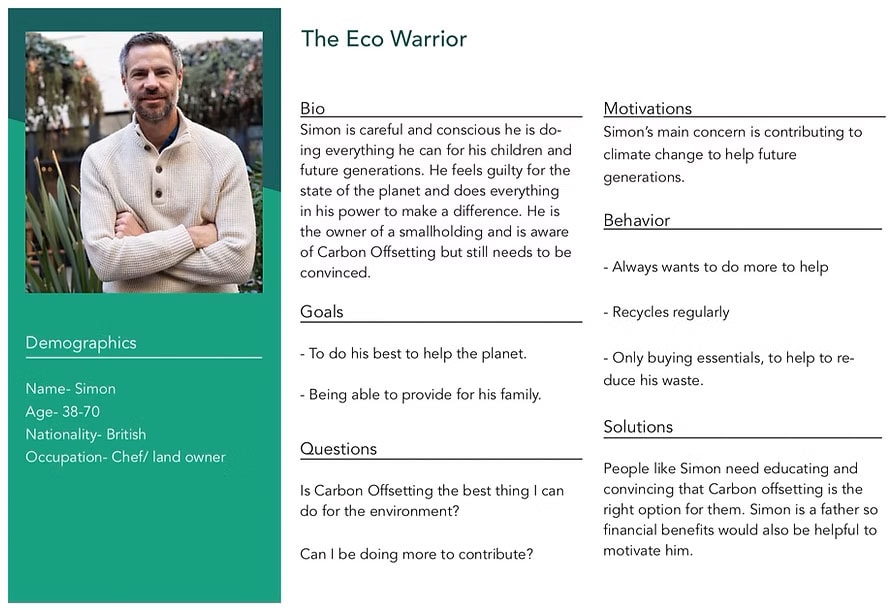
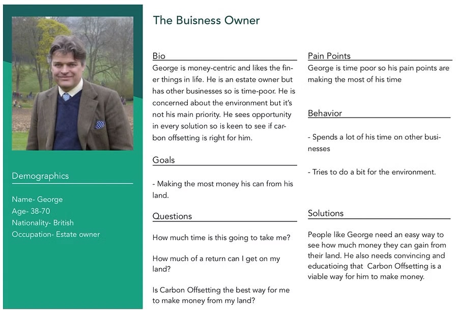
Personas helped me to plot out users' motivations, pain points, and concerns. This helped me to clarify my priorities with the design process by focusing on what was important to different segments of Treehub's target audience: I split the target audience into two personas: 'Business owners' and 'Eco Warriors'.
Affinity Mapping
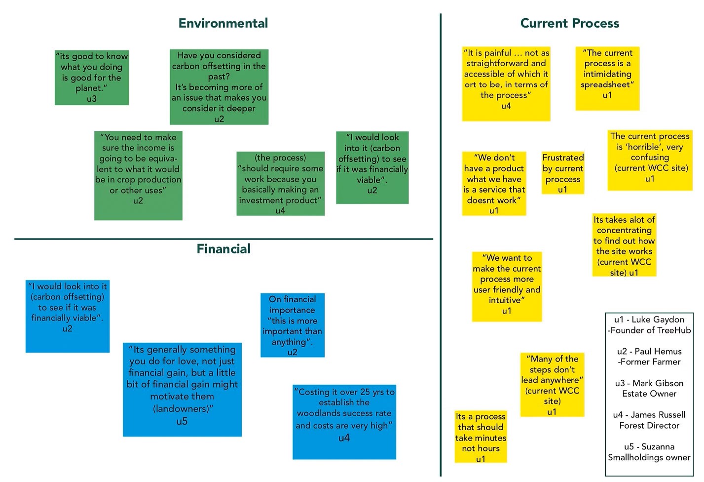
After my user interviews, I mapped out quotes and key takeaways into an affinity map. I used this method to organise the data, look for patterns, and prioritise my designs with a focus on the user.
The data showed that financial and environmental concerns were most important to the user. The other critical problems was the usability of the current solution - the WCC site.
Problem Statement
‘Landowners need to quickly and easily find out if carbon offsetting is a viable option for them, because the current process is too complicated, preventing landowners from exploring the idea’.
Design
Flow Diagram
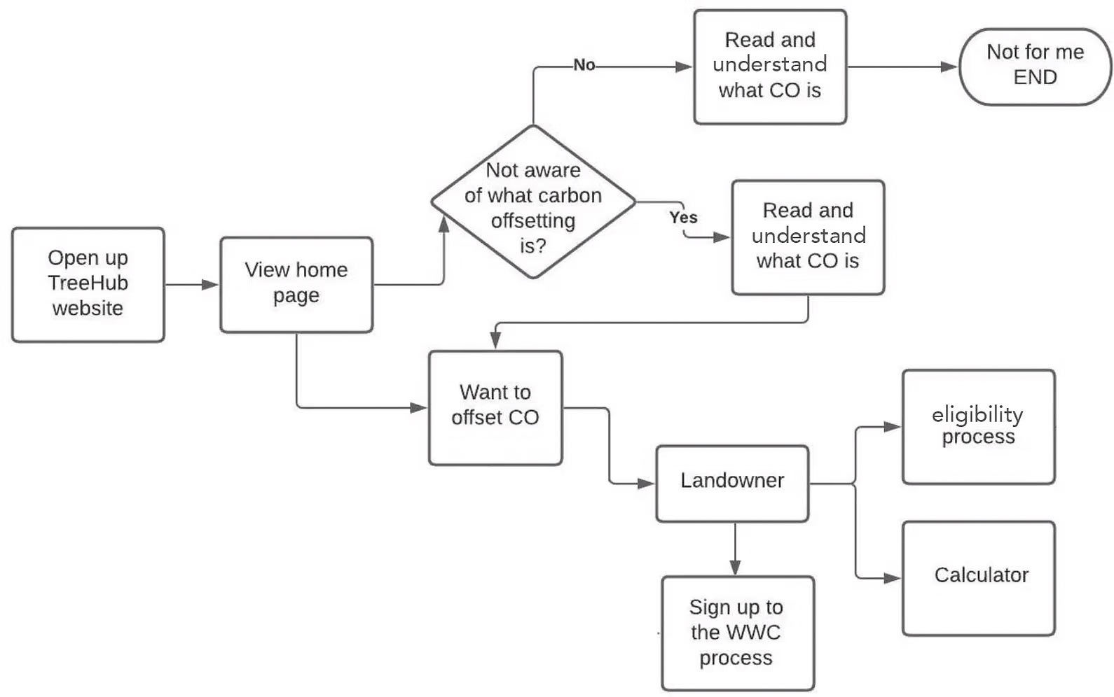
I started by understanding what the user journey would be. I did this by creating a flow diagram. This helped me to understand what I needed to build to have a working product.
From my research, I identified a need for the following features:
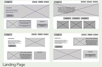
- Landing Page:As this is a new product I was starting from scratch, my first task was to make a landing page to direct users to.
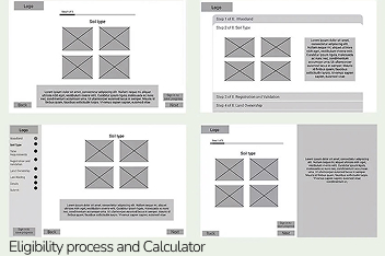
- Eligibility Process and Calculator:Users need a way to see if they can apply to the process of carbon offsetting, so I to build an eligibility process.
- A way to educate users:From my survey, I found that users were unsure of what carbon offsetting is so the process needs to teach users.
Wireframing
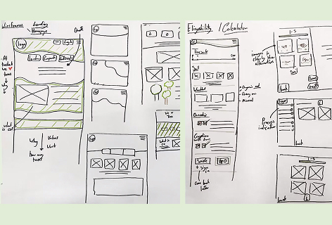
My next stage was prototyping. I started by sketching ideas by hand to quickly generate a variety of concepts. I experimented with different layouts and designs before moving into Figma.
When developing design ideas, I looked at mortgage calculators from banking sites, as they are effective at translating large amounts of information and providing easy-to-use eligibility questionnaires.
Understanding the financial benefits and eligibility was important to my audience, so I experimented with different hierarchies in my designs, ensuring this calculator was front and centre when arriving at the landing page.
Branding
As TreeHub is a startup, it didn’t have any established branding. Before designing in colour, I needed to create a colour palette and logo.
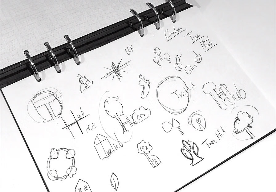
For the logo, I sketched lots of ideas around:
- TreeHub being a UK company
- The hub as a treehouse
- Circles representing sustainability
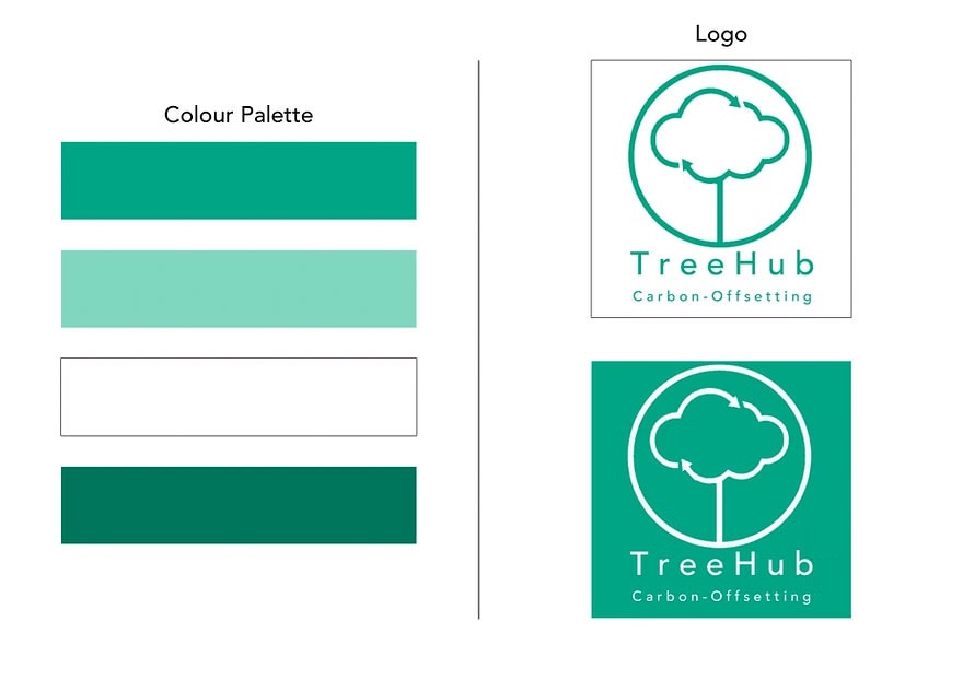
The logo I chose is a simple, clear design featuring a tree in the shape of a cloud, with arrows symbolising sustainability. The colour palette consists of various shades of green, which in branding is generally associated with nature, growth, new beginnings, and money.
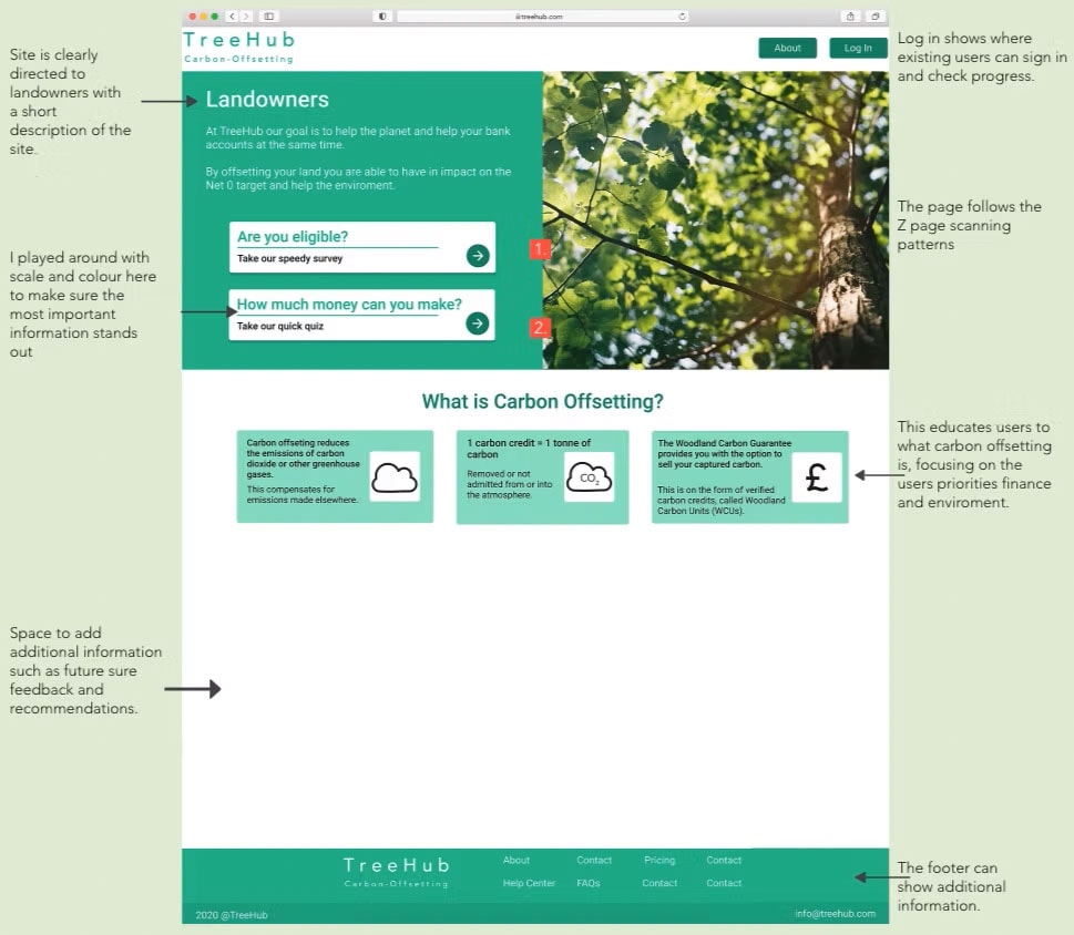
High Fidelity PrototypeHomescreen
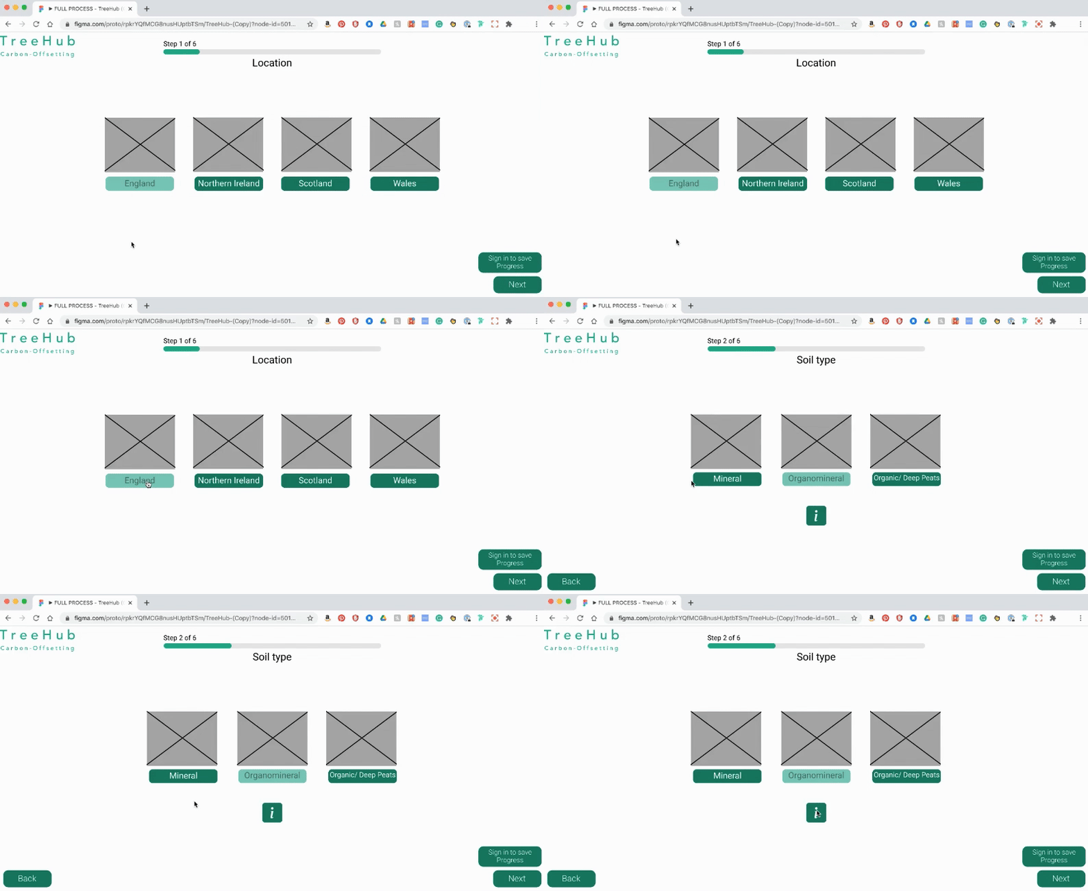
Eligibility Process
Subtitle
The bar along the top shows the progress made. This gives the user feedback and lets them know how many steps are left.
Calculator
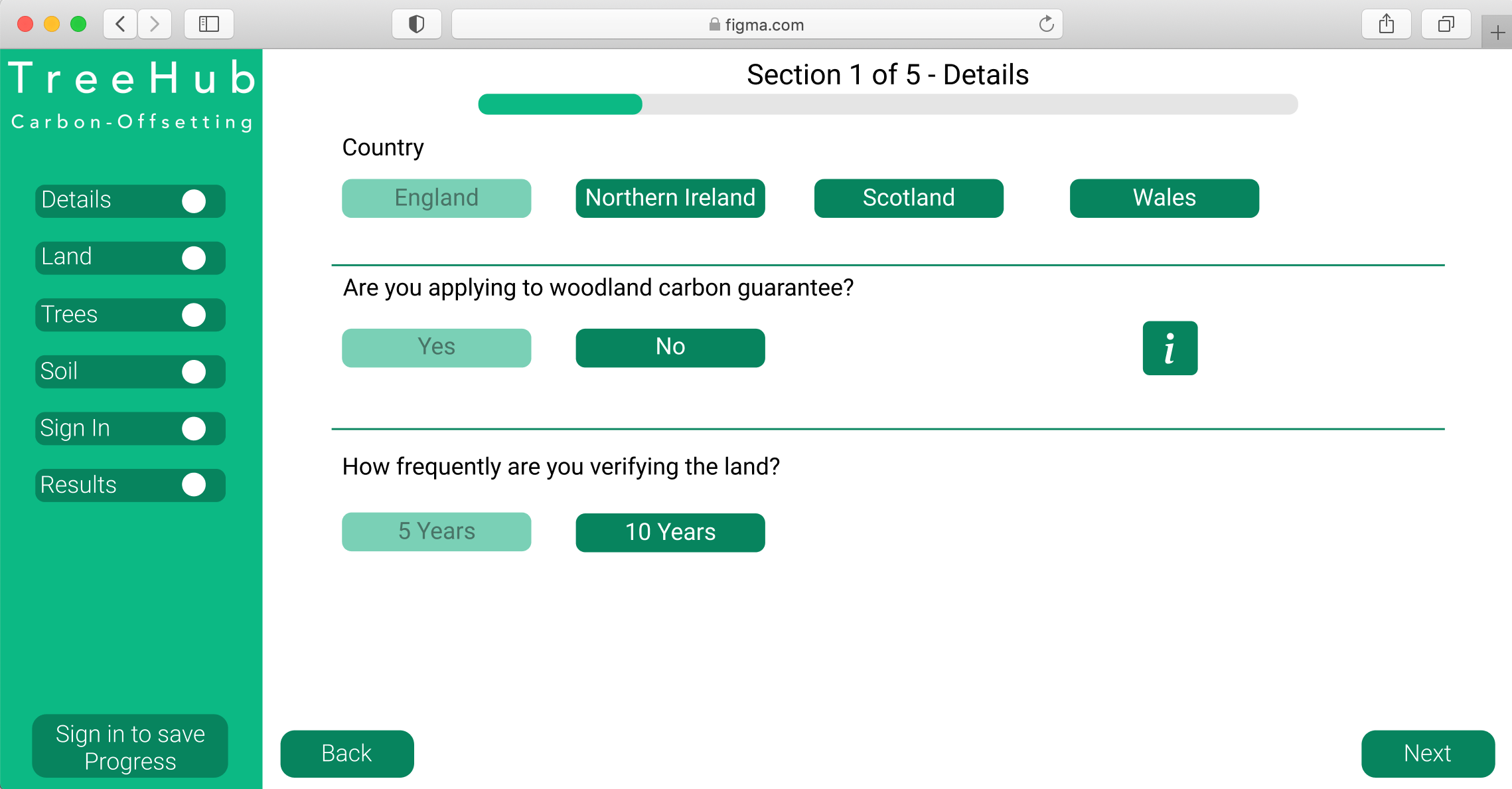
The calculator is a much more in-depth process, hence why there is more information.
As the user completes the form, feedback is provided throughout the process, including a progress bar at the top and ticks on the left-hand side. The 'i' button also opens a pop-up when additional information is needed.


User Testing
I had 3 users and gave them different scenarios;
- You are passionate about the environment and want to see if carbon offsetting is right for you.
- You are a business owner and need to see if you can make revenue from your land.
Watching the users I found that they quickly picked up the site and easily navigated to the different pages. They found the process easy to use and the information button informative. One challenge was confusion on the difference between the eligibility and the calculator pages. This can be improved by adding a title to each of the pages to easily distinguish the difference.I have made changes from the results of the user testing, please select here to see the prototype.
Deliver
Next Steps
These are the actions I would take if I continued to work on this project. I would also be keen to keep testing new site with a wider user base, including the original users and get their feedback.
- Applications via website:Through the work that I have done on TreeHub, users can now see if they are eligible to apply to carbon offsetting and estimate the financial returns. As a next step I would design a functionality where the users can make applications to the WCC via the TreeHub site.
- Funding options for landowners:There is funding available through government to help offset costs. I would want to include education on the funding schemes available to help users who are concerned about the associated costs.
- Tree maintenance prices and options for landowners:This was also concern for landowners, so education on maintainec costs would be another target feature.

View more projects
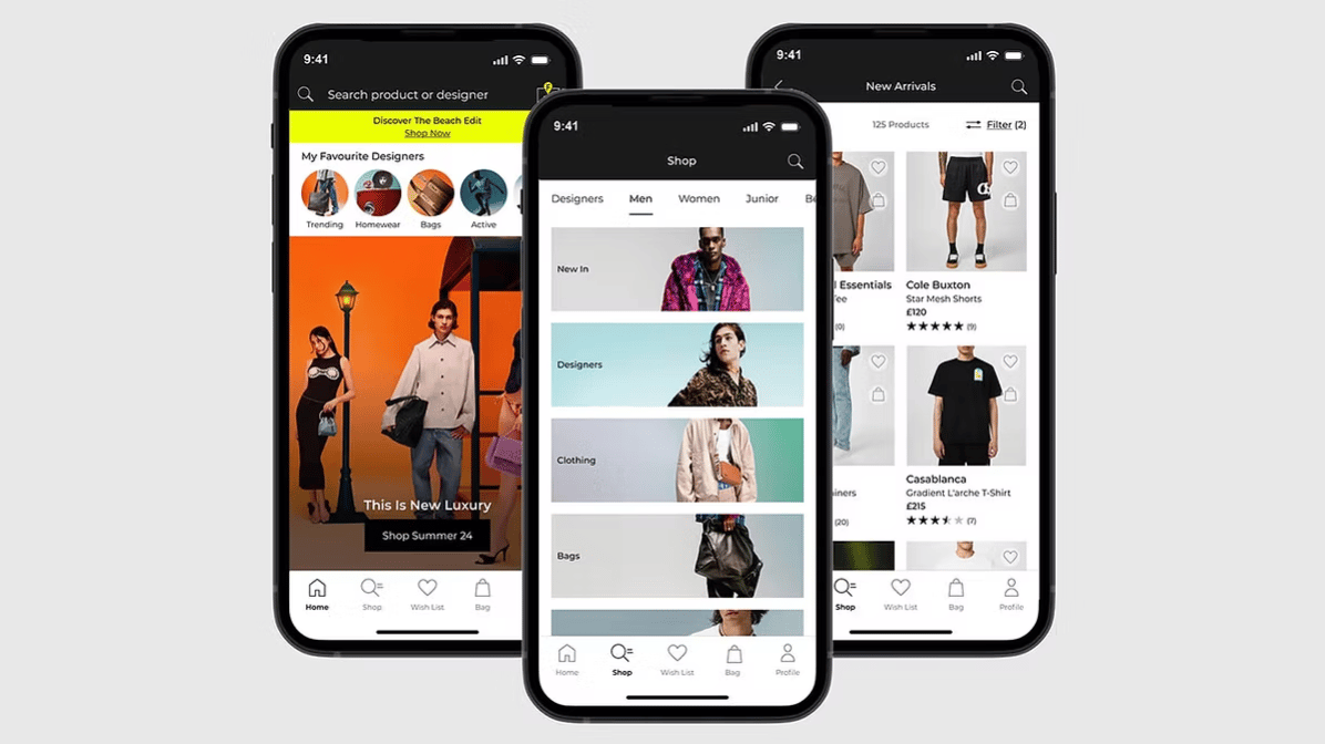
End-to-end case study of the FLANNELS app. Enhancing luxury shopping experience with personalised features and overall user experience.
Read case study

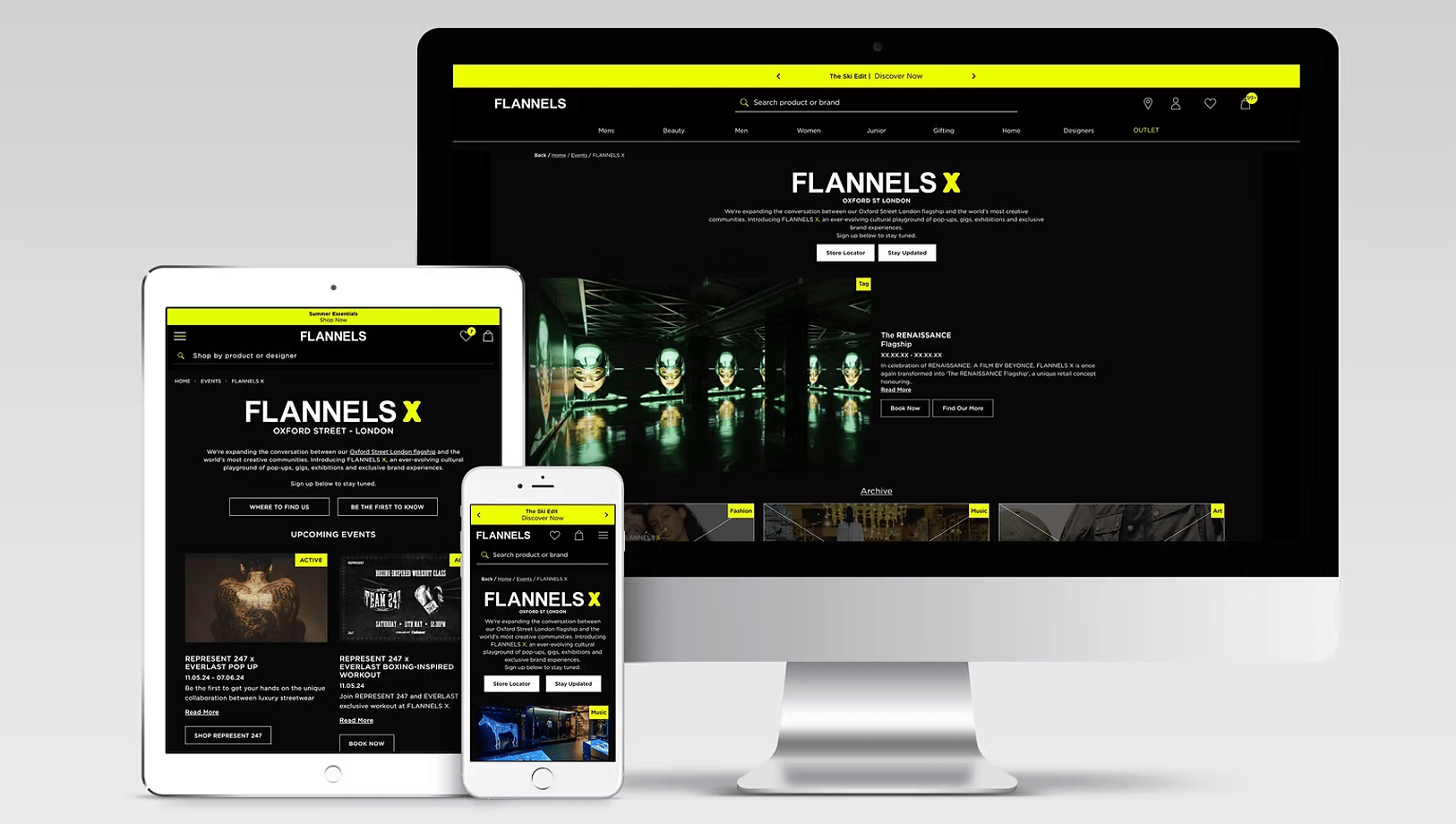
Elevating the experience of a digital hub for exclusive events, brand takeovers and cultural moments at FLANNELS X.
Read case study
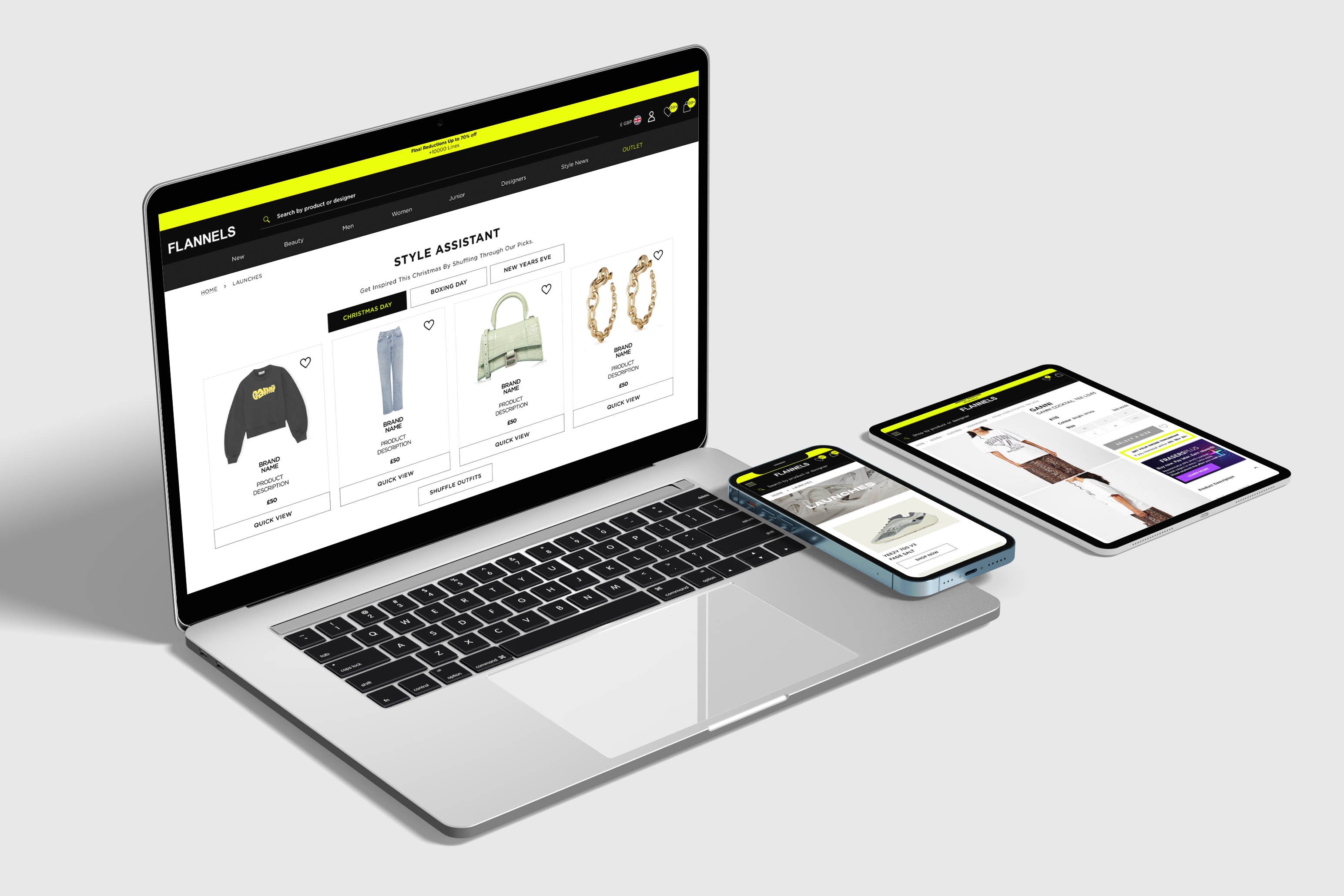
At FLANNELS we are constantly improving and testing the site, here are a few highlights.
Read case study
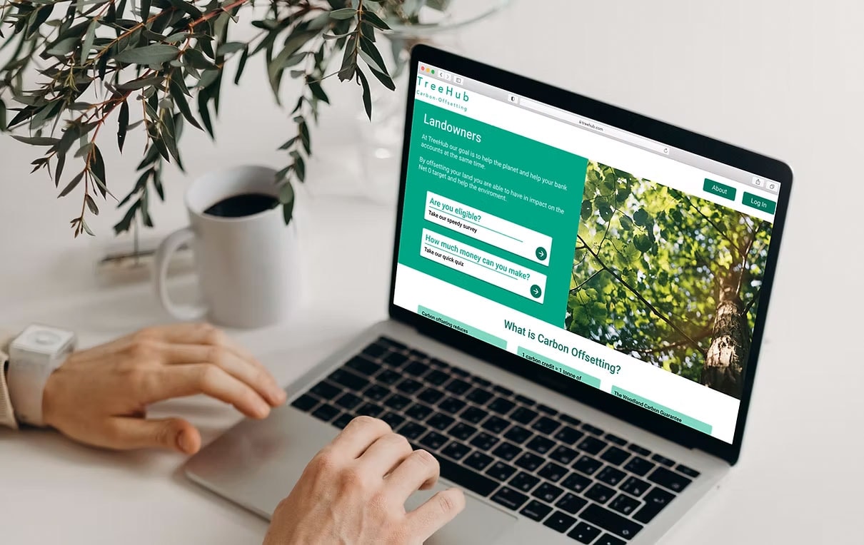
Partnering with TreeHub, I designed a platform helping landowners fund reforestation through carbon offsets.
Read case study
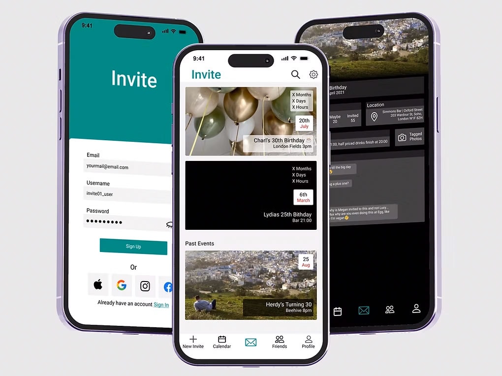
Invite is a design passion project and I use to improve and refine my design skills.
Read case study
Thank you for visitingmade with 💚 and ☕
Let's chat
charlottehemus@hotmail.com


TreeHub
This project was the practical component of my qualification at Experience Haus. Collaborating with stakeholders at TreeHub, I developed a digital platform that connects landowners seeking to repurpose their land for reforestation with carbon offset funding.
Team
4x Design Team members
4x CRO Team members
Stakeholders across the buisness
Timeline
Project Duration: 1 month
Discovery & Research: 2 weeks
Design & testing: 2 weeks
Tools
Figma
Content Square
User Testing platform
My Design Process
4/ Deliver
- User Testing
- Presenting back to stakeholders
3/ Design
- Wireframing
- High fidelity prototype
- Branding
- User testing
2/ Define
- User personas
- Affinity mapping
- Problem statement
- Flow diagram
1/ Discover
- Current problem and goals
- Stakeholder requirements
- Competitor research
- Quantitative data
- User interviews
Discover
Current Problem and Goals
In order to hit the UK’s Net Zero target, we need to plant 1.5bn trees by 2050. This is the equivalent of 30,00 hectares per year; in 2018/2019, we planted less than 50% of this.TreeHub is a pre-revenue startup with a headcount of two. It was founded in 2020 with the goal of accelerating forestation in the UK. Their approach is to use digital technology to make planting trees simpler and more accessible, which will support UK’s Net Zero target. The eventual goal for TreeHub is to sell carbon credits on the site. This will allow landowners to make a profit from their land, as a possible alternative to farming. The only current solution is via The Woodland Carbon Code (WCC) site. This is the only UK quality assurance standard for woodland creation projects and generates independently verified carbon units. The WCC website is difficult to navigate for users and requires downloading an excel file to calculate potential returns.
Stakeholder Requirements
Speed
What is the shortest number of steps to complete an initial screening process to determine eligibility for the WCC process?
Simplicity
Is the design sufficiently intuitive for users that have little/ no understanding of WCC and how their process works.
Online-Only
Is it possible to make the process 100% online, i.e. no downloading/offline steps?This will keep the users on the website.
Competitor Research
My first step was to do competitor research, I found that TreeHub's main competitors are ‘Project Developers’. These are companies that have gone through the WCC process and are now at the stage to allow their customers to offset carbon through the site.
My key findings were that;
- The majority of sites are focused on corporate companies.
- Offer an ability to offset carbon through the site.
- Focus on how the individuals offset their carbon.
- Don't offer a clear way how landowners sign up.
Quantitative Data
To collect quantitative data, I surveyed 70 users using Google Forms.
These were the results:
Key Findings
- Most people own land but do not use it for carbon offsetting.
- The product needs to educate users, as most participants were unsure about carbon offsetting and made assumptions when asked if they had enough land to offset.
- Financial and environmental concerns are the key considerations when deciding to offset land.
Define
User Interviews
From the survey, some landowners were happy to speak further, so I conducted a range of user interviews. I was able to speak to a wide range of landowners including farmers, estate owners, and smallholdings owners. All users had different requirements so it was really important to have a wide range of user interviews.
Paul - Former farmer
“I would look into it to see if it was financially viable, this is more important than anything. From a landowner's view you have to have a financial return on whatever you do”.
Mark - Estate Owner
“It is good to know what you're doing is good for the planet.“
Suzanna - Small holdings owner
“It’s generally something you do for love, not just financial gain, but a little bit of financial gain might motivate "
User Personas
Personas helped me to plot out users' motivations, pain points, and concerns. This helped me to clarify my priorities with the design process by focusing on what was important to different segments of Treehub's target audience: I split the target audience into two personas: 'Business owners' and 'Eco Warriors'.
Affinity Mapping
After my user interviews, I mapped out quotes and key takeaways into an affinity map. I used this method to organise the data, look for patterns, and prioritise my designs with a focus on the user.
The data showed that financial and environmental concerns were most important to the user. The other critical problems was the usability of the current solution - the WCC site.
Problem Statement
‘Landowners need to quickly and easily find out if carbon offsetting is a viable option for them, because the current process is too complicated, preventing landowners from exploring the idea’.
Design
Flow Diagram
I started by understanding what the user journey would be. I did this by creating a flow diagram. This helped me to understand what I needed to build to have a working product.
From my research, I identified a need for the following features:
- Landing Page:As this is a new product I was starting from scratch, my first task was to make a landing page to direct users to.
- Eligibility Process and Calculator:Users need a way to see if they can apply to the process of carbon offsetting, so I to build an eligibility process.
- A way to educate users:From my survey, I found that users were unsure of what carbon offsetting is so the process needs to teach users.
Wireframing
My next stage was prototyping. I started by sketching ideas by hand to quickly generate a variety of concepts. I experimented with different layouts and designs before moving into Figma.
When developing design ideas, I looked at mortgage calculators from banking sites, as they are effective at translating large amounts of information and providing easy-to-use eligibility questionnaires.
Understanding the financial benefits and eligibility was important to my audience, so I experimented with different hierarchies in my designs, ensuring this calculator was front and centre when arriving at the landing page.
Branding
As TreeHub is a startup, it didn’t have any established branding. Before designing in colour, I needed to create a colour palette and logo.
For the logo, I sketched lots of ideas around:
- TreeHub being a UK company
- The hub as a treehouse
- Circles representing sustainability
The logo I chose is a simple, clear design featuring a tree in the shape of a cloud, with arrows symbolising sustainability. The colour palette consists of various shades of green, which in branding is generally associated with nature, growth, new beginnings, and money.
High Fidelity PrototypeHomescreen
Eligibility Process
The bar along the top shows the progress made. This gives the user feedback and lets them know how many steps are left.
Calculator
The calculator is a much more in-depth process, hence why there is more information.
As the user completes the form, feedback is provided throughout the process, including a progress bar at the top and ticks on the left-hand side. The 'i' button also opens a pop-up when additional information is needed.


User Testing
I had 3 users and gave them different scenarios;
- You are passionate about the environment and want to see if carbon offsetting is right for you.
- You are a business owner and need to see if you can make revenue from your land.
Watching the users I found that they quickly picked up the site and easily navigated to the different pages. They found the process easy to use and the information button informative. One challenge was confusion on the difference between the eligibility and the calculator pages. This can be improved by adding a title to each of the pages to easily distinguish the difference.I have made changes from the results of the user testing, please select here to see the prototype.
Deliver
Next Steps
These are the actions I would take if I continued to work on this project. I would also be keen to keep testing new site with a wider user base, including the original users and get their feedback.
- Applications via website:Through the work that I have done on TreeHub, users can now see if they are eligible to apply to carbon offsetting and estimate the financial returns. As a next step I would design a functionality where the users can make applications to the WCC via the TreeHub site.
- Funding options for landowners:There is funding available through government to help offset costs. I would want to include education on the funding schemes available to help users who are concerned about the associated costs.
- Tree maintenance prices and options for landowners:This was also concern for landowners, so education on maintainec costs would be another target feature.
View more projects
End-to-end case study of the FLANNELS app. Enhancing luxury shopping experience with personalised features and overall user experience.
Read case study
Elevating the experience of a digital hub for exclusive events, brand takeovers and cultural moments at FLANNELS X.
Read case study
At FLANNELS we are constantly improving and testing the site, here are a few highlights.
Read case study
Invite is a design passion project and I use to improve and refine my design skills.
Read case study
Thank you for visitingmade with 💚 and ☕
Let's chat
charlottehemus@hotmail.comTreeHub
This project was the practical component of my qualification at Experience Haus. Collaborating with stakeholders at TreeHub, I developed a digital platform that connects landowners seeking to repurpose their land for reforestation with carbon offset funding.
Team
4x Design Team members
4x CRO Team members
Stakeholders across the buisness
Timeline
Project Duration: 1 month
Discovery & Research: 2 weeks
Design & testing: 2 weeks
Tools
Figma
Content Square
User Testing platform
My Design Process
1/ Discover
- Current problem and goals
- Stakeholder requirements
- Competitor research
- Quantitative data
- User interviews
2/ Define
- User personas
- Affinity mapping
- Problem statement
- Flow diagram
3/ Discover
- Wireframing
- High fidelity prototype
- Branding
- User testing
4/ Deliver
- User Testing
- Presenting back to stakeholders
Discover
Current Problem
and Goals
In order to hit the UK’s Net Zero target, we need to plant 1.5bn trees by 2050. This is the equivalent of 30,00 hectares per year; in 2018/2019, we planted less than 50% of this.TreeHub is a pre-revenue startup with a headcount of two. It was founded in 2020 with the goal of accelerating forestation in the UK. Their approach is to use digital technology to make planting trees simpler and more accessible, which will support UK’s Net Zero target. The eventual goal for TreeHub is to sell carbon credits on the site. This will allow landowners to make a profit from their land, as a possible alternative to farming. The only current solution is via The Woodland Carbon Code (WCC) site. This is the only UK quality assurance standard for woodland creation projects and generates independently verified carbon units. The WCC website is difficult to navigate for users and requires downloading an excel file to calculate potential returns.
Stakeholder Requirements
Speed
What is the shortest number of steps to complete an initial screening process to determine eligibility for the WCC process?
Simplicity
Is the design sufficiently intuitive for users that have little/ no understanding of WCC and how their process works.
Online-Only
Is it possible to make the process 100% online, i.e. no downloading/offline steps?
This will keep the users on the website.
Competitor Research
My first step was to do competitor research, I found that TreeHub's main competitors are ‘Project Developers’. These are companies that have gone through the WCC process and are now at the stage to allow their customers to offset carbon through the site.
My key findings were that;
- The majority of sites are focused on corporate companies.
- Offer an ability to offset carbon through the site.
- Focus on how the individuals offset their carbon.
- Don't offer a clear way how landowners sign up.
Quantitative Data
To collect quantitative data, I surveyed 70 users using Google Forms.
These were the results:
Key Findings
- Most people own land but do not use it for carbon offsetting.
- The product needs to educate users, as most participants were unsure about carbon offsetting and made assumptions when asked if they had enough land to offset.
- Financial and environmental concerns are the key considerations when deciding to offset land.
Define
User Interviews
From the survey, some landowners were happy to speak further, so I conducted a range of user interviews. I was able to speak to a wide range of landowners including farmers, estate owners, and smallholdings owners. All users had different requirements so it was really important to have a wide range of user interviews.
Paul - Former farmer
“I would look into it to see if it was financially viable, this is more important than anything. From a landowner's view you have to have a financial return on whatever you do”.
Mark - Estate Owner
“It is good to know what you're doing is good for the planet.“
Suzanna - Small holdings owner
“It’s generally something you do for love, not just financial gain, but a little bit of financial gain might motivate "
User Personas
Personas helped me to plot out users' motivations, pain points, and concerns. This helped me to clarify my priorities with the design process by focusing on what was important to different segments of Treehub's target audience: I split the target audience into two personas: 'Business owners' and 'Eco Warriors'.
Afinity Mapping
After my user interviews, I mapped out quotes and key takeaways into an affinity map. I used this method to organise the data, look for patterns, and prioritise my designs with a focus on the user.
The data showed that financial and environmental concerns were most important to the user. The other critical problems was the usability of the current solution - the WCC site.
Problem Statement
‘Landowners need to quickly and easily find out if carbon offsetting is a viable option for them, because the current process is too complicated, preventing landowners from exploring the idea’.
Design
Flow Diagram
I started by understanding what the user journey would be. I did this by creating a flow diagram. This helped me to understand what I needed to build to have a working product.
From my research, I identified a need for the following features:
- Landing Page:As this is a new product I was starting from scratch, my first task was to make a landing page to direct users to.
- Eligibility Process and Calculator:Users need a way to see if they can apply to the process of carbon offsetting, so I to build an eligibility process.
- A way to educate users:From my survey, I found that users were unsure of what carbon offsetting is so the process needs to teach users.
Wireframing
My next stage was wireframing. I started by sketching ideas by hand to quickly generate a variety of concepts. I experimented with different layouts and designs before moving into Figma.
When developing design ideas, I looked at mortgage calculators from banking sites, as they are effective at translating large amounts of information and providing easy-to-use eligibility questionnaires.
Understanding the financial benefits and eligibility was important to my audience, so I experimented with different hierarchies in my designs, ensuring this calculator was front and centre when arriving at the landing page.
Branding
As TreeHub is a startup, it didn’t have any established branding. Before designing in colour, I needed to create a colour palette and logo.
For the logo, I sketched lots of ideas around:
- TreeHub being a UK company
- The hub as a treehouse
- Circles representing sustainability
The logo I chose is a simple, clear design featuring a tree in the shape of a cloud, with arrows symbolising sustainability. The colour palette consists of various shades of green, which in branding is generally associated with nature, growth, new beginnings, and money.
High Fidelity PrototypeHomescreen
Eligibility Process
The bar along the top shows the progress made. This gives the user feedback and lets them know how many steps are left.
Calculator
The calculator is a much more in-depth process, hence why there is more information.
As the user completes the form, feedback is provided throughout the process, including a progress bar at the top and ticks on the left-hand side. The 'i' button also opens a pop-up when additional information is needed.


User Testing
I had 3 users and gave them different scenarios;
- You are passionate about the environment and want to see if carbon offsetting is right for you.
- You are a business owner and need to see if you can make revenue from your land.
Watching the users I found that they quickly picked up the site and easily navigated to the different pages. They found the process easy to use and the information button informative. One challenge was confusion on the difference between the eligibility and the calculator pages. This can be improved by adding a title to each of the pages to easily distinguish the difference.I have made changes from the results of the user testing, please select here to see the prototype.
Deliver
Next Steps
These are the actions I would take if I continued to work on this project. I would also be keen to keep testing new site with a wider user base, including the original users and get their feedback.
- Applications via website:Through the work that I have done on TreeHub, users can now see if they are eligible to apply to carbon offsetting and estimate the financial returns. As a next step I would design a functionality where the users can make applications to the WCC via the TreeHub site.
- Funding options for landowners:There is funding available through government to help offset costs. I would want to include education on the funding schemes available to help users who are concerned about the associated costs.
- Tree maintenance prices and options for landowners:This was also concern for landowners, so education on maintainec costs would be another target feature.

View more projects
End-to-end case study of the FLANNELS app. Enhancing luxury shopping experience with personalised features and overall user experience.
Read case study
Elevating the experience of a digital hub for exclusive events, brand takeovers and cultural moments at FLANNELS X.
Read case study
At FLANNELS we are constantly improving and testing the site, here are a few highlights.
Read case study
Invite is a design passion project and I use to improve and refine my design skills.
Read case study
Thank you for visitingmade with 💚 and ☕
Let's chat
charlottehemus@hotmail.comTreeHub
This project was the practical component of my qualification at Experience Haus. Collaborating with stakeholders at TreeHub, I developed a digital platform that connects landowners seeking to repurpose their land for reforestation with carbon offset funding.
Team
4x Design Team members
4x CRO Team members
Stakeholders across the buisness
Timeline
Project Duration: 1 month
Discovery & Research: 2 weeks
Design & testing: 2 weeks
Tools
Figma
Content Square
User Testing platform
My Design Process
1/ Discover
- Current problem and goals
- Stakeholder requirements
- Competitor research
- Quantitative data
- User interviews
2/ Define
- User personas
- Affinity mapping
- Problem statement
- Flow diagram
3/ Discover
- Wireframing
- High fidelity prototype
- Branding
- User testing
4/ Deliver
- User Testing
- Presenting back to stakeholders
Discover
Current Problem
and Goals
In order to hit the UK’s Net Zero target, we need to plant 1.5bn trees by 2050. This is the equivalent of 30,00 hectares per year; in 2018/2019, we planted less than 50% of this.TreeHub is a pre-revenue startup with a headcount of two. It was founded in 2020 with the goal of accelerating forestation in the UK. Their approach is to use digital technology to make planting trees simpler and more accessible, which will support UK’s Net Zero target. The eventual goal for TreeHub is to sell carbon credits on the site. This will allow landowners to make a profit from their land, as a possible alternative to farming. The only current solution is via The Woodland Carbon Code (WCC) site. This is the only UK quality assurance standard for woodland creation projects and generates independently verified carbon units. The WCC website is difficult to navigate for users and requires downloading an excel file to calculate potential returns.
Stakeholder Requirements
Speed
What is the shortest number of steps to complete an initial screening process to determine eligibility for the WCC process?
Simplicity
Is the design sufficiently intuitive for users that have little/ no understanding of WCC and how their process works.
Online-Only
Is it possible to make the process 100% online, i.e. no downloading/offline steps?
This will keep the users on the website.
Competitor Research
My first step was to do competitor research, I found that TreeHub's main competitors are ‘Project Developers’. These are companies that have gone through the WCC process and are now at the stage to allow their customers to offset carbon through the site.
My key findings were that;
- The majority of sites are focused on corporate companies.
- Offer an ability to offset carbon through the site.
- Focus on how the individuals offset their carbon.
- Don't offer a clear way how landowners sign up.
Quantitative Data
To collect quantitative data, I surveyed 70 users using Google Forms.
These were the results:
Key Findings
- Most people own land but do not use it for carbon offsetting.
- The product needs to educate users, as most participants were unsure about carbon offsetting and made assumptions when asked if they had enough land to offset.
- Financial and environmental concerns are the key considerations when deciding to offset land.
Define
User Interviews
From the survey, some landowners were happy to speak further, so I conducted a range of user interviews. I was able to speak to a wide range of landowners including farmers, estate owners, and smallholdings owners. All users had different requirements so it was really important to have a wide range of user interviews.
Paul - Former farmer
“I would look into it to see if it was financially viable, this is more important than anything. From a landowner's view you have to have a financial return on whatever you do”.
Mark - Estate Owner
“It is good to know what you're doing is good for the planet.“
Suzanna - Small holdings owner
“It’s generally something you do for love, not just financial gain, but a little bit of financial gain might motivate "
User Personas
Personas helped me to plot out users' motivations, pain points, and concerns. This helped me to clarify my priorities with the design process by focusing on what was important to different segments of Treehub's target audience: I split the target audience into two personas: 'Business owners' and 'Eco Warriors'.
Afinity Mapping
After my user interviews, I mapped out quotes and key takeaways into an affinity map. I used this method to organise the data, look for patterns, and prioritise my designs with a focus on the user.
The data showed that financial and environmental concerns were most important to the user. The other critical problems was the usability of the current solution - the WCC site.
Problem Statement
‘Landowners need to quickly and easily find out if carbon offsetting is a viable option for them, because the current process is too complicated, preventing landowners from exploring the idea’.
Design
Flow Diagram
I started by understanding what the user journey would be. I did this by creating a flow diagram. This helped me to understand what I needed to build to have a working product.
From my research, I identified a need for the following features:
- Landing Page:As this is a new product I was starting from scratch, my first task was to make a landing page to direct users to.
- Eligibility Process and Calculator:Users need a way to see if they can apply to the process of carbon offsetting, so I to build an eligibility process.
- A way to educate users:From my survey, I found that users were unsure of what carbon offsetting is so the process needs to teach users.
Wireframing
My next stage was wireframing. I started by sketching ideas by hand to quickly generate a variety of concepts. I experimented with different layouts and designs before moving into Figma.
When developing design ideas, I looked at mortgage calculators from banking sites, as they are effective at translating large amounts of information and providing easy-to-use eligibility questionnaires.
Understanding the financial benefits and eligibility was important to my audience, so I experimented with different hierarchies in my designs, ensuring this calculator was front and centre when arriving at the landing page.
Branding
As TreeHub is a startup, it didn’t have any established branding. Before designing in colour, I needed to create a colour palette and logo.
For the logo, I sketched lots of ideas around:
- TreeHub being a UK company
- The hub as a treehouse
- Circles representing sustainability
The logo I chose is a simple, clear design featuring a tree in the shape of a cloud, with arrows symbolising sustainability. The colour palette consists of various shades of green, which in branding is generally associated with nature, growth, new beginnings, and money.
High Fidelity PrototypeHomescreen
Eligibility Process
The bar along the top shows the progress made. This gives the user feedback and lets them know how many steps are left.
Calculator
The calculator is a much more in-depth process, hence why there is more information.
As the user completes the form, feedback is provided throughout the process, including a progress bar at the top and ticks on the left-hand side. The 'i' button also opens a pop-up when additional information is needed.
User Testing
I had 3 users and gave them different scenarios;
- You are passionate about the environment and want to see if carbon offsetting is right for you.
- You are a business owner and need to see if you can make revenue from your land.
Watching the users I found that they quickly picked up the site and easily navigated to the different pages. They found the process easy to use and the information button informative. One challenge was confusion on the difference between the eligibility and the calculator pages. This can be improved by adding a title to each of the pages to easily distinguish the difference.I have made changes from the results of the user testing, please select here to see the prototype.
Deliver
Next Steps
These are the actions I would take if I continued to work on this project. I would also be keen to keep testing new site with a wider user base, including the original users and get their feedback.
- Applications via website:Through the work that I have done on TreeHub, users can now see if they are eligible to apply to carbon offsetting and estimate the financial returns. As a next step I would design a functionality where the users can make applications to the WCC via the TreeHub site.
- Funding options for landowners:There is funding available through government to help offset costs. I would want to include education on the funding schemes available to help users who are concerned about the associated costs.
- Tree maintenance prices and options for landowners:This was also concern for landowners, so education on maintainec costs would be another target feature.
View more projects
End-to-end case study of the FLANNELS app. Enhancing luxury shopping experience with personalised features and overall user experience.
Read case study
Elevating the experience of a digital hub for exclusive events, brand takeovers and cultural moments at FLANNELS X.
Read case study
At FLANNELS we are constantly improving and testing the site, here are a few highlights.
Read case study
Invite is a design passion project and I use to improve and refine my design skills.
Read case study
Thank you for visitingmade with 💚 and ☕