
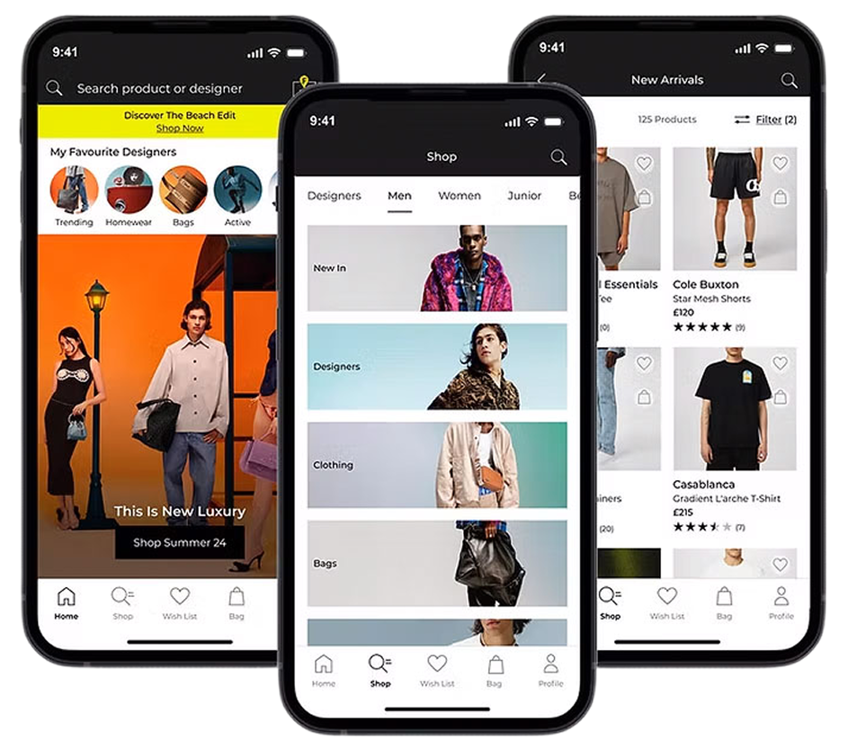
FLANNELS App
Business Context:
At Frasers group, we're very fast-moving and well known for acquiring new brands; therefore, we wanted to create a white label product for our mobile apps that could be reskinned across different newly acquired brands. The team were in the process of developing the white label app for sports direct initially , with other facias to then utilise the components
Project Overview:
As Lead Product Designer, my role was to design a FLANNELS native app to elevating the luxury shopping experience through seamless navigation, personalised content, while optimising the omnichannel journey.
My Design Process
1/ Discover
- Buisness context
- Heuristic review
- User testing
- Stakeholder Insights & Business Objectives
- Competitor analysis
2/ Define
- KPIs
- User problem statements
- HMW statements
3/ Discover
- Design exploration
- Design reviews
- User testing
4/ Deliver
- User Testing
- Presenting back to stakeholders
05 Deliver
- Monitoring user feedback, performance, and analytics
- Planning for design iterations based on users and data
Discover
End to end audit
and competitor analysis
We began with a thorough UX audit to assess the current state of the platform, focusing on usability, performance, and overall user experience. This included reviewing user flows, and design consistency to uncover existing issues.
We also carried out competitor benchmarking and break analysis to identify gaps and opportunities in the market. By mapping internal assumptions against expected user behaviour, we prioritised key areas for improvement to guide the redesign.
- The app maintained the FLANNELS branding, but it lacked a native experience, which resulted in a cumbersome user interface.
- FLANNELS app and site have very different components which makes the journey seem disjointed and doesn’t align with Frasers Groups omnichannel strategy.
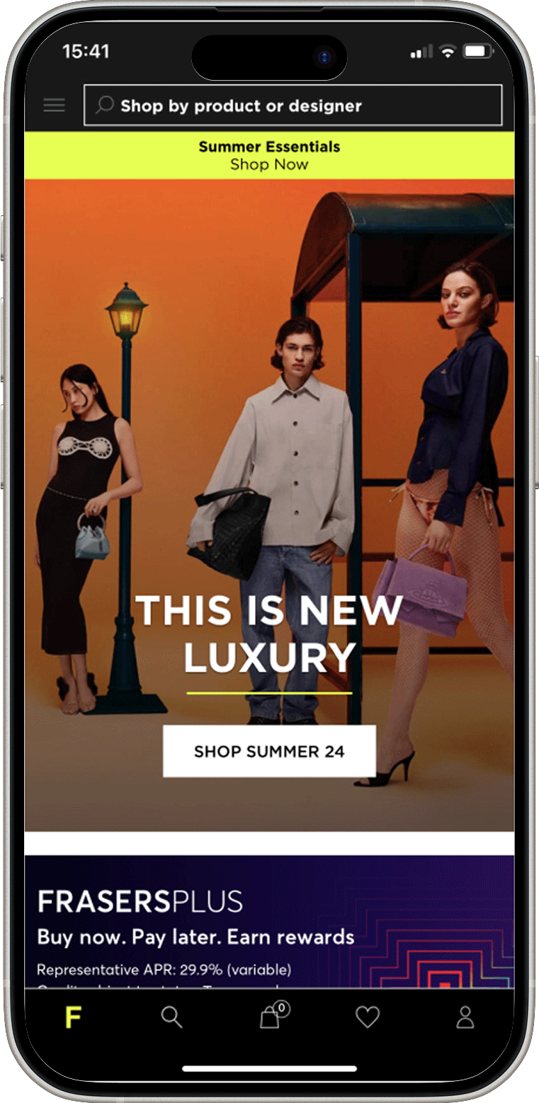
Homepage

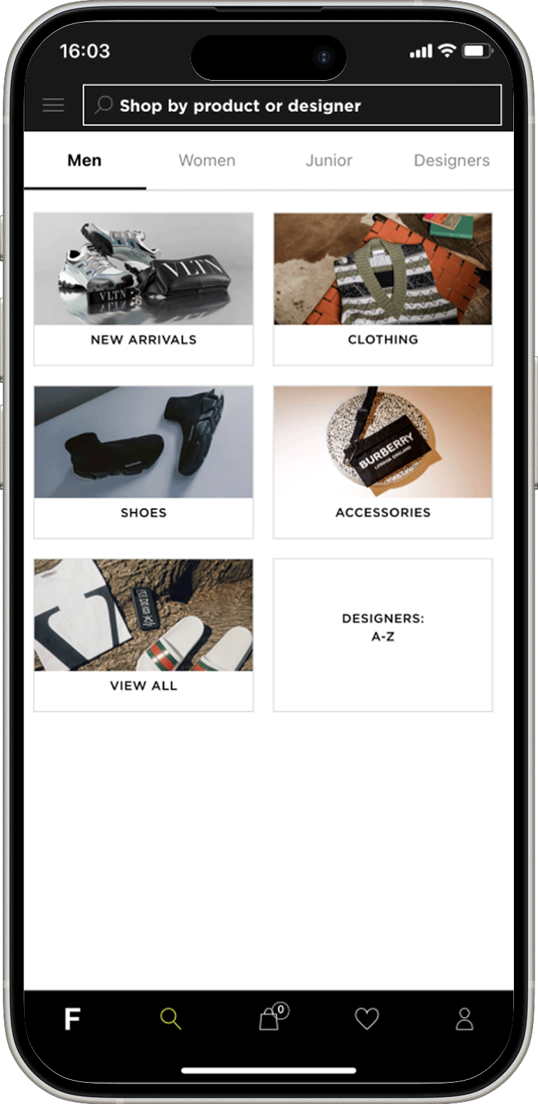
Shop Tab
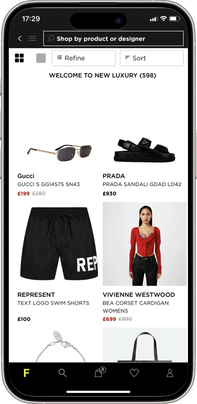
PLP
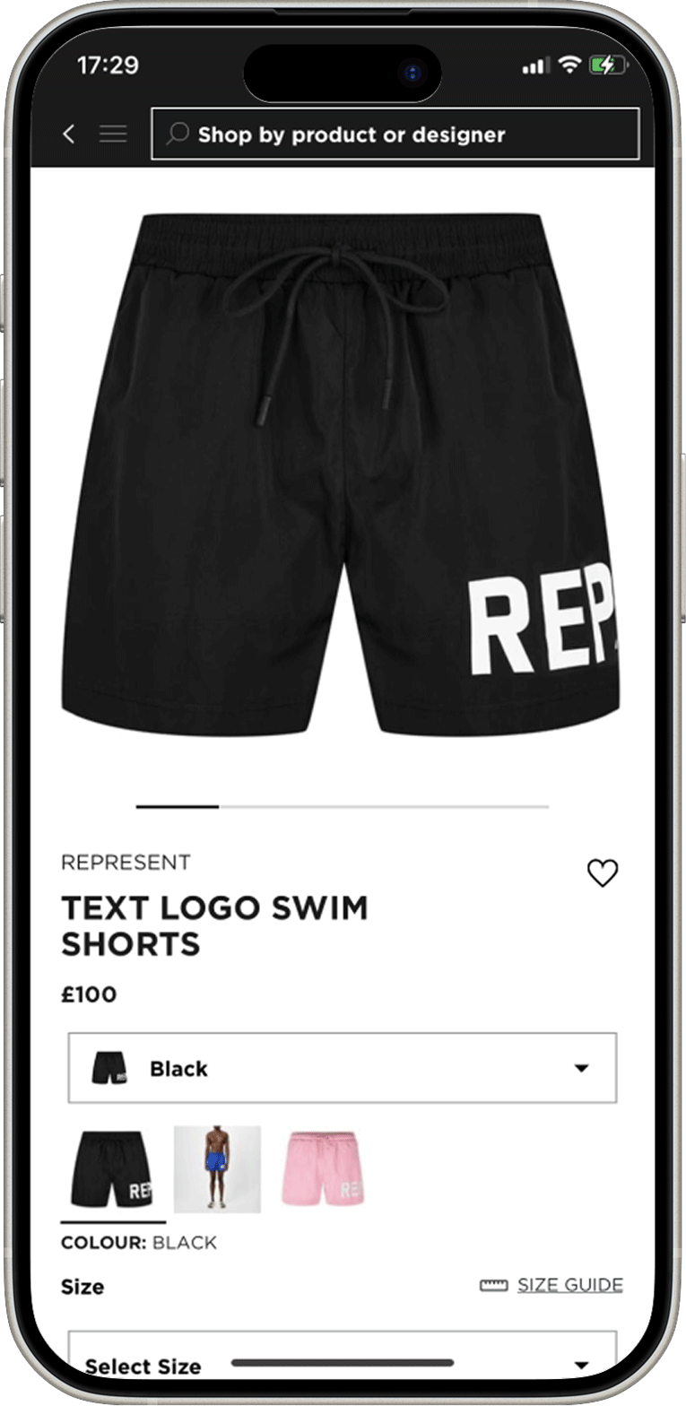
PDP
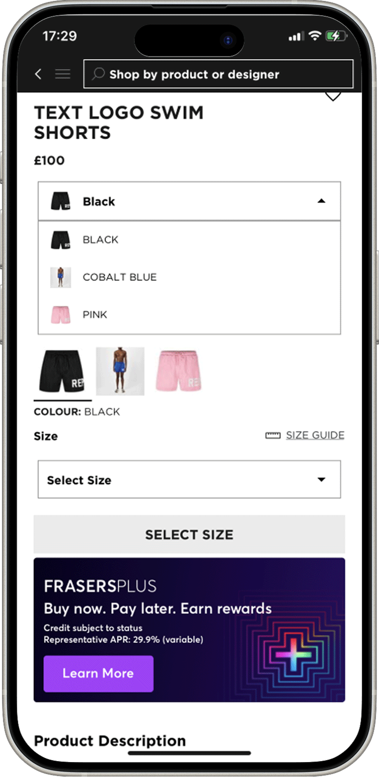
PDP
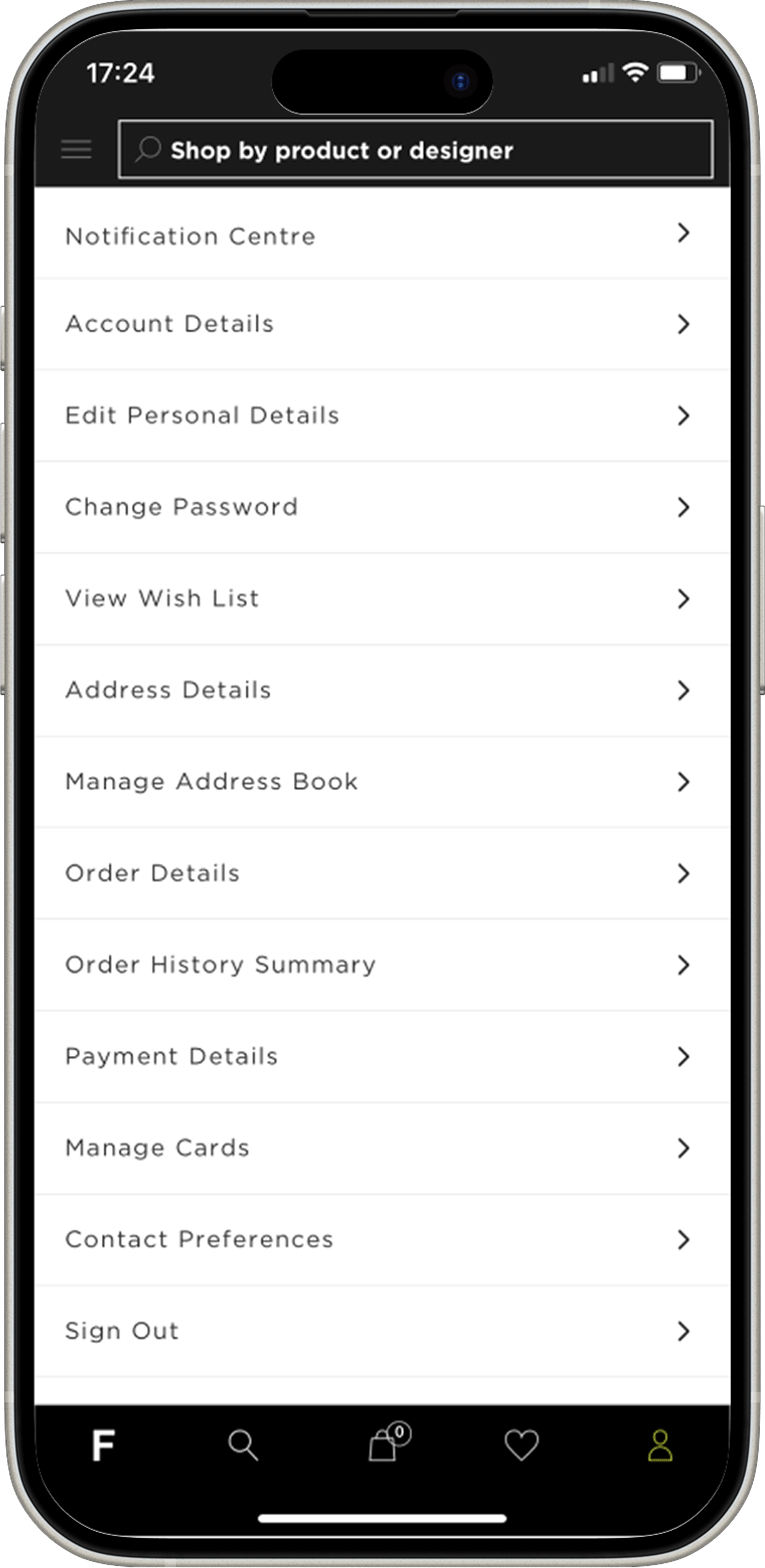
Account Section
User Testing
Using the UserTesting platform, my team and I conducted an end-to-end test of the previous app, observing 15 users as they engaged with the platform. Our goal was to understand what was working well and identify areas for improvement.
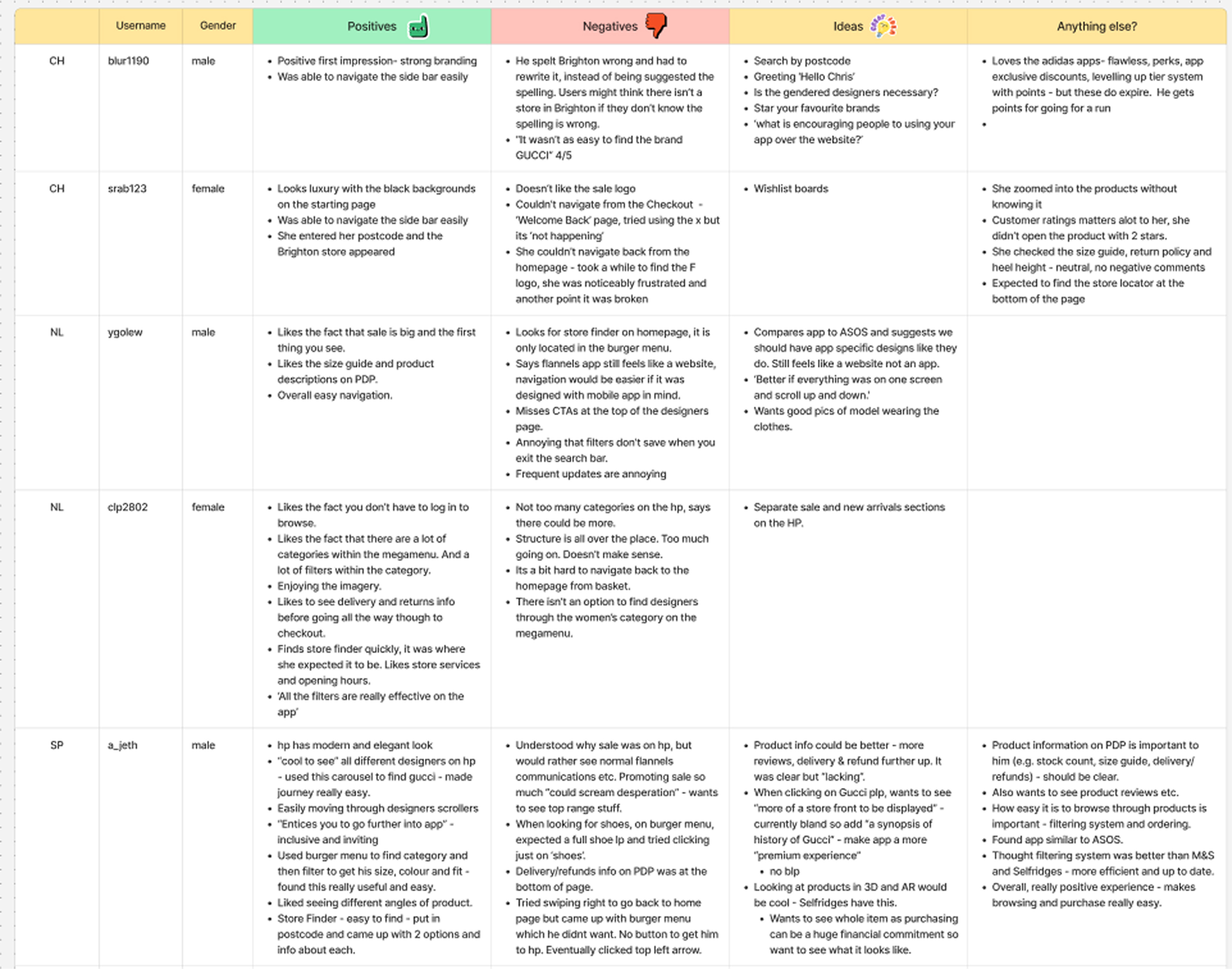
To keep track of the user feedback we inputted user feedback into a table on FigJam, below are the main themes from user testing:

10 Users tested

New/ existing customers

Male and female genders

End to end journey tested


IOS / Android
devices
Results
• Not Personalised
“The app gets the job done from browsing to checkout, but it feels impersonal.”
“I don’t find the product recommendations relevant to me.”
• Navigation & Usability Issues
40% of users struggled with navigation, filters, and checkout.
“It takes too long to find what I’m looking for.”
• Perceived Lack of Luxury
50% of users felt the app didn’t reflect Flannels’ luxury branding.
“It feels standard, not high-end.”
Stakeholder Insights & Business Objectives
To align with business goals, I interviewed key stakeholders from trade, marketing, and product teams to understand their challenges and opportunities.
• Gender-led Journeys
Trade teams wanted gender-specific experiences to drive relevance and engagement, leading to tailored user journeys.
• Omnichannel Experience
The need for a seamless online-to-offline experience informed the decision to create an immersive app experience that encouraged app usage over the website.
• Luxury Positioning
Stakeholders emphasised the importance of a premium, high-end experience, guiding the inclusion of editorial content and sophisticated visuals.
• Native Experience
The push for a mobile-first approach will result in a smoother, more responsive app design, enhancing usability. Scaling and innovating on an old platform would also present significant challenges.
Define
User Problem Themes and
HMW Statements
Problem Theme 1:Uninspiring Experience
Customers expected more than a standard mobile version of the website.
“How might we make the app compelling enough to choose over the website?”
Problem Theme 2:Lack of Personalisation
Users aren't getting a tailored experience, leading to generic product recommendations and lower engagement.
“How might we make feel more curated and relevant to individual users?”
Problem Theme 3:Usability & Accessibility
Users struggled with navigation, filtering products, and reading text, making it harder to browse and engage.
“How might we make the shopping journey smoother and more intuitive?”
Problem Theme 4:Not Luxury Enough
Users expected a high-end, immersive experience with more video content and editorial storytelling.
“How might we make the app better reflect FLANNELS premium brand identity?”
Design
Design in focus
Editorial Content
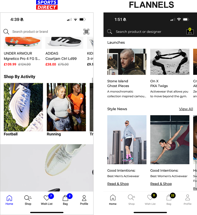
For the Homepage across both apps, we’ve used our library of content blocks in Amplience, our CMS platform.While the blocks remain the same, they use different image ratios and have different purposes. Sports Direct focuses on shopping by sport, whereas FLANNELS highlights editorial content, with features like Launches and Style News (our blog).
Shop tab
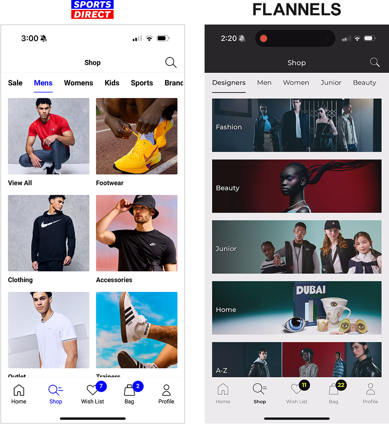
It was crucial to differentiate the FLANNELS app from Sports Direct and to align the new app with luxury audience expectations. Stakeholders wanted the app to stand out, so we focused on editorial assets to enhance the premium feel. After experimenting with image sizes and layouts, we chose a full-width design for a polished, high-end look.
Designer A-Z
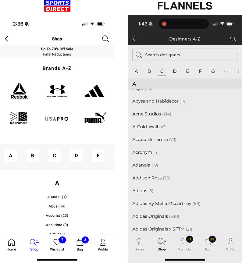
With this design we wanted to enhances brand discovery. Sports Direct shoppers prioritise equipment over brands, except for major names like Nike and Adidas. In contrast, FLANNELS customers seek luxury brands like Gucci, Prada, and Balenciaga.
To improve this, we added a search feature and refined the brand list for easier navigation. The old Sports Direct interface (left) was a web view, while our new design (right) delivers a seamless, app-native experience.
To Note
Throughout the app development process, we encountered multiple challenges, and smaller projects emerged along the way. For each of these, I followed the ‘Discover - Define - Design - Deliver’ process. A few examples include:
- Users over-refining their searches – Identified through filter usability testing, see project
- How do we increase the number of users signing in? – Dot notification – Increased sign-ins by 48%
- Enhancing the omnichannel experience – Implemented a store finder icon.
User Testing
As the app wasn’t live and we were under an NDA that limited our ability to test effectively, we worked with an external agency to run user testing. The agency ensured participants were impartial and had no direct ties to Frasers.
The limited time for proper user testiang was a challenge, so during sessions we focused on asking, “What did you expect to happen?” and used two note-takers per interview to capture comprehensive feedback.
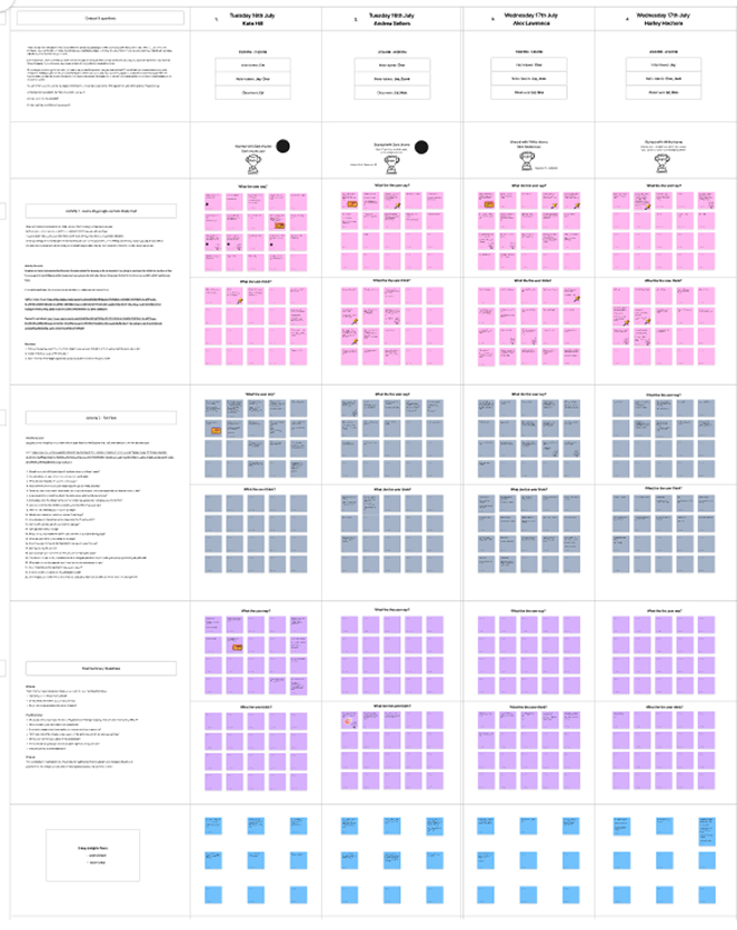
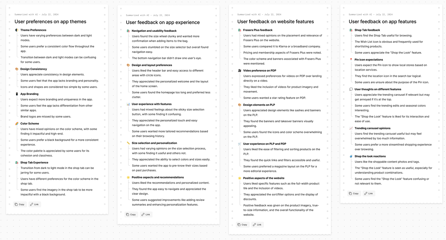
We used Figma’s AI to analyse and dissect the notes from the user testing sessions, helping to identify key insights and trends more efficiently.
10 Users tested
New/ existing customers
Male and female genders
End to end journey tested
IOS / Android
devices
Results
• Clean, Easy-to-Use Layout, the app was seen as easy to browse, with a clean interface that users appreciated.
“The app is clean and easy to use; it allows me to browse without distractions.”
• Header & Visual Design, users preferred the black header and found it made the app feel more premium.
“The black header looks sleek and adds a high-end feel.”
• Clear User Segmentation, users clearly identified with two main personas:
• Know What They Want
• Browsers
Develop
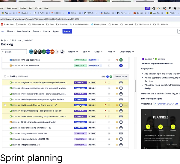
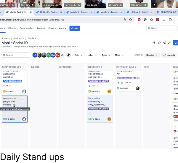
Once the end-to-end app was signed off by stakeholders, the journey was broken down into development tickets.
Some tickets required additional design input, so we followed the same Discover, Define, Design, Deliver process.
Deliver
View the 60second video I worked on with
marketing to showcase all the new features
Results
Increased Engagement with Personalisation
The introduction of gender-led journeys and personalised recommendations led to a 63% increase in user interaction and satisfaction with product suggestions.
Positive Response to Luxury Positioning
The addition of editorial content and more refined visuals led to a stronger alignment with Flannels’ premium, luxury brand image, with positive feedback from internal stakeholders and users.
Easier Navigation and Reduced Friction
Usability improvements resulted in a 20% reduction in time spent navigating between pages, with users finding the experience smoother and more intuitive.
Accessibility Enhancements
Post-implementation testing showed a improvement in task completion rates for users with accessibility needs, confirming that changes made the app more inclusive.

View more projects
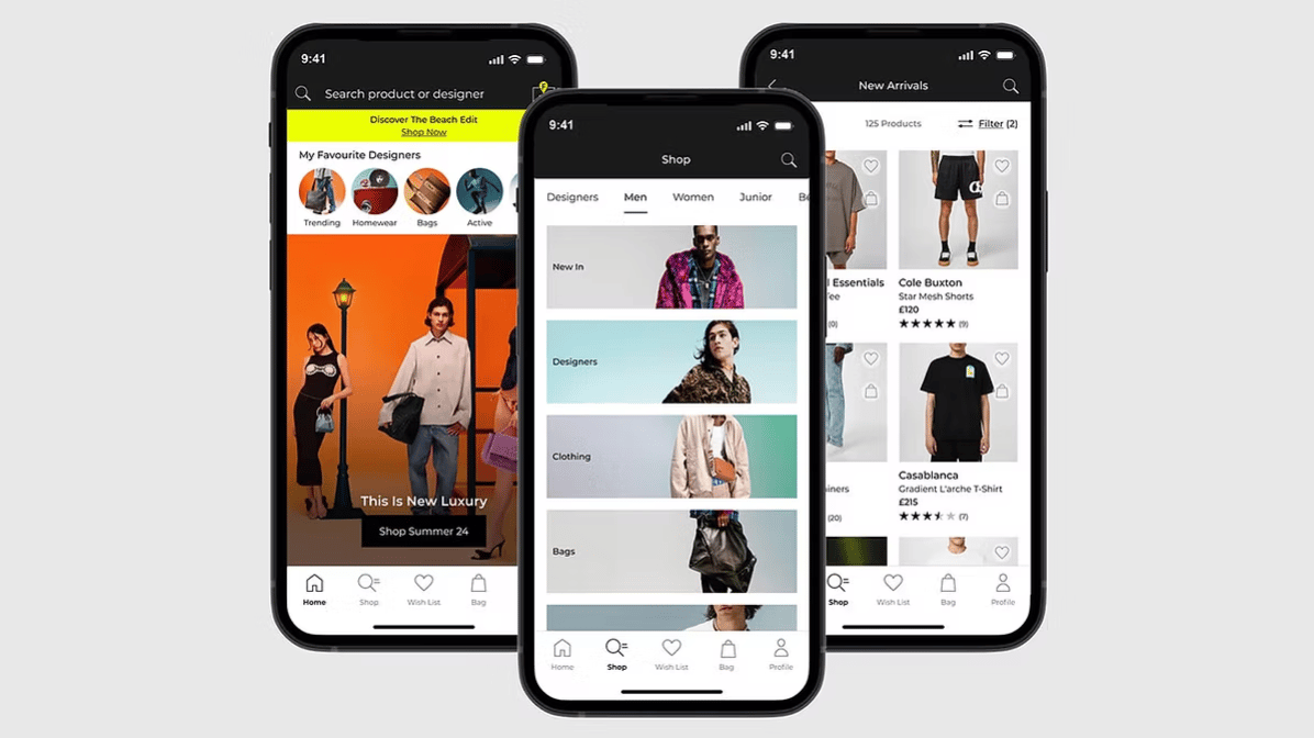
End-to-end case study of the FLANNELS app. Enhancing luxury shopping experience with personalised features and overall user experience.
Read case study

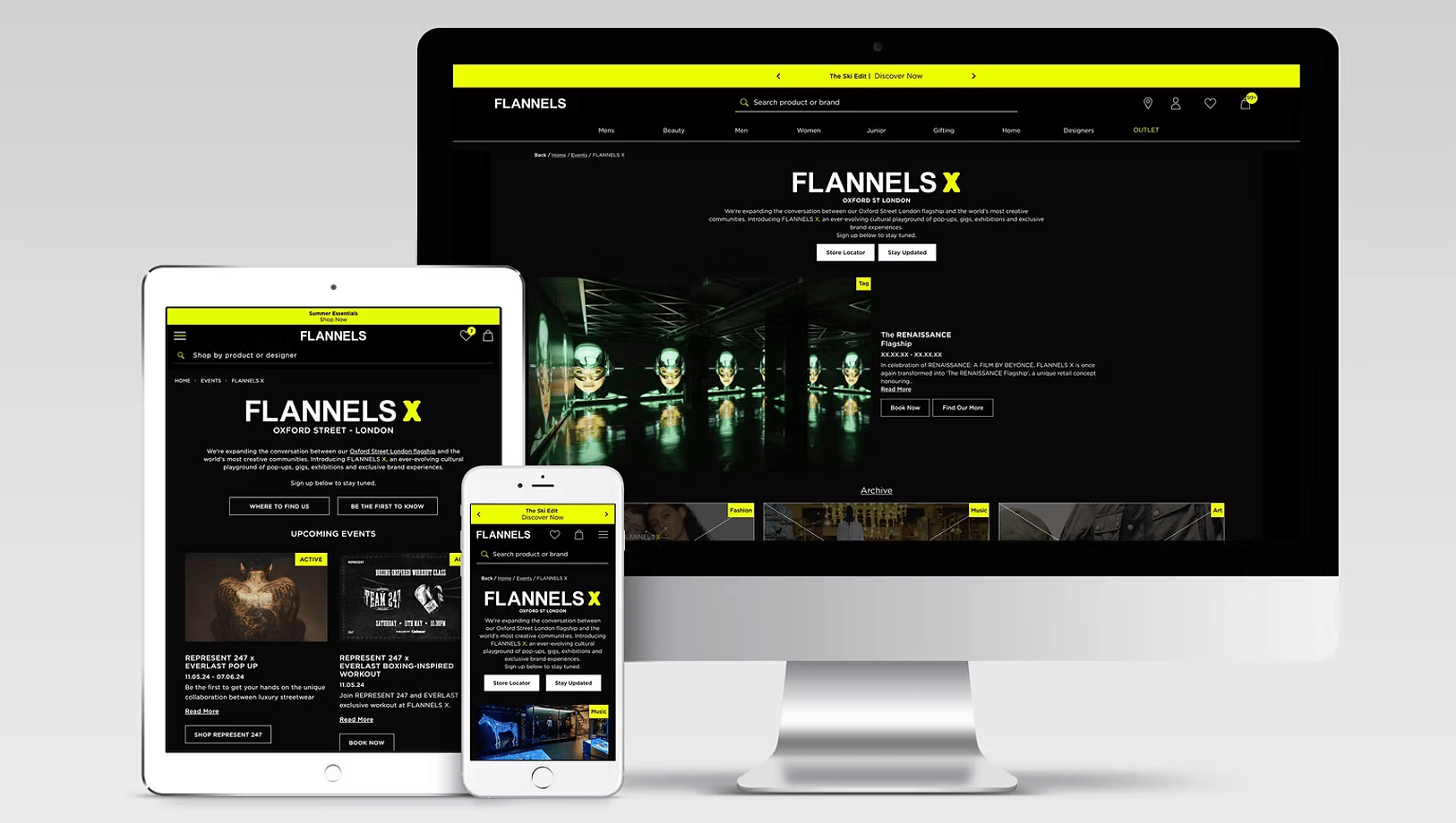
Elevating the experience of a digital hub for exclusive events, brand takeovers and cultural moments at FLANNELS X.
Read case study
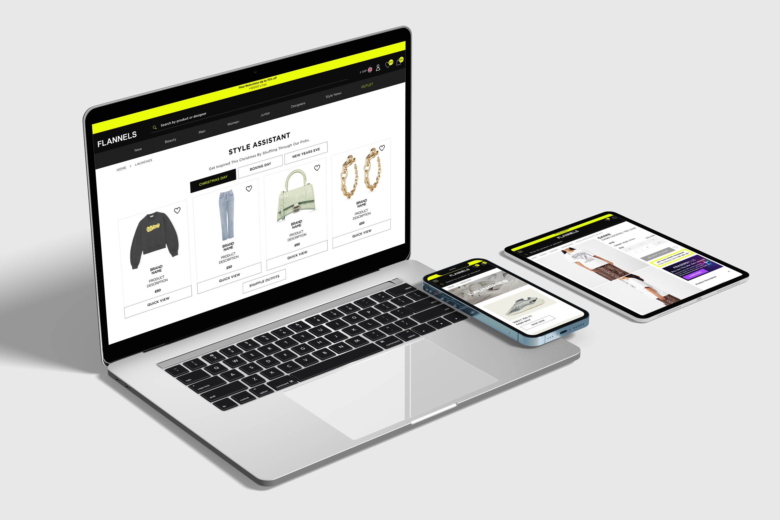
At FLANNELS we are constantly improving and testing the site, here are a few highlights.
Read case study
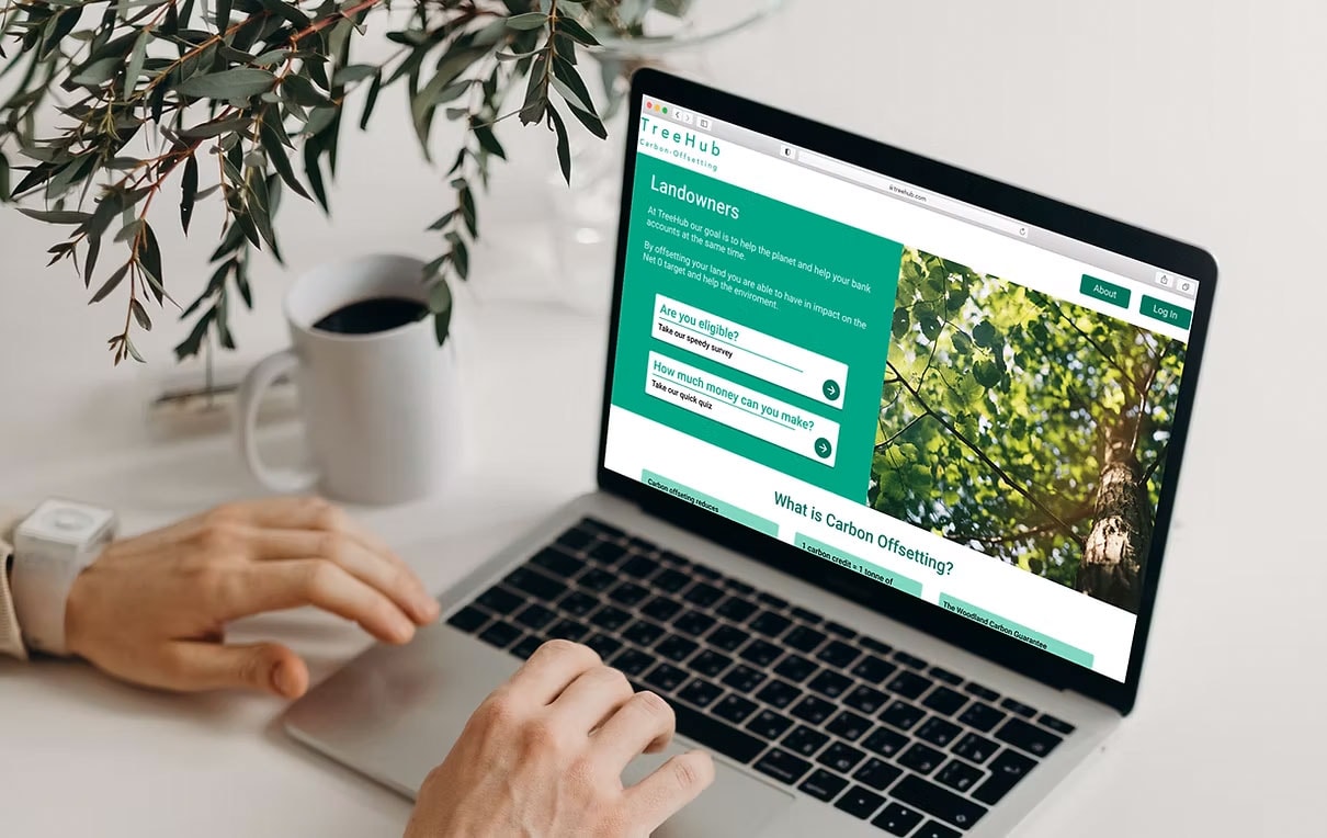
Partnering with TreeHub, I designed a platform helping landowners fund reforestation through carbon offsets.
Read case study
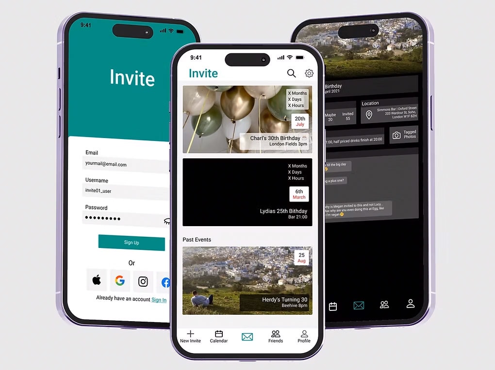
Invite is a design passion project and I use to improve and refine my design skills.
Read case study
Thank you for visitingmade with 💚 and ☕
Let's chat
charlottehemus@hotmail.com


FLANNELS App
Business Context:
At Frasers group, we're very fast-moving and well known for acquiring new brands; therefore, we wanted to create a white label product for our mobile apps that could be reskinned across different newly acquired brands. The team were in the process of developing the white label app for sports direct initially , with other facias to then utilise the components
Project Overview:
As Lead Product Designer, my role was to design a FLANNELS native app to elevating the luxury shopping experience through seamless navigation, personalised content, while optimising the omnichannel journey.
My Design Process
4/ Deliver
- User Testing
- Presenting back to stakeholders
3/ Discover
- Design exploration
- Design reviews
- User testing
2/ Define
- KPIs
- User problem statements
- HMW statements
1/ Discover
- Buisness context
- Heuristic review
- User testing
- Stakeholder Insights & Business Objectives
- Competitor analysis
05 Deliver
- Monitoring user feedback, performance, and analytics
- Planning for design iterations based on users and data
Discover
End to end audit
and competitor analysis
We began with a thorough UX audit to assess the current state of the platform, focusing on usability, performance, and overall user experience. This included reviewing user flows, and design consistency to uncover existing issues.
We also carried out competitor benchmarking and break analysis to identify gaps and opportunities in the market. By mapping internal assumptions against expected user behaviour, we prioritised key areas for improvement to guide the redesign.
- The app maintained the FLANNELS branding, but it lacked a native experience, which resulted in a cumbersome user interface.
- FLANNELS app and site have very different components which makes the journey seem disjointed and doesn’t align with Frasers Groups omnichannel strategy.
Homepage
Shop Tab
PLP
PDP
PDP
Account Section
User Testing
Using the UserTesting platform, my team and I conducted an end-to-end test of the previous app, observing 15 users as they engaged with the platform. Our goal was to understand what was working well and identify areas for improvement.
To keep track of the user feedback we inputted user feedback into a table on FigJam, below are the main themes from user testing:
10 Users
tested
New/ existing customers
Male and female genders
End to end
journey tested
IOS / Android
devices
Results
• Not Personalised
“The app gets the job done from browsing to checkout, but it feels impersonal.”
“I don’t find the product recommendations relevant to me.”
• Navigation & Usability Issues
40% of users struggled with navigation, filters, and checkout.
“It takes too long to find what I’m looking for.”
• Perceived Lack of Luxury
50% of users felt the app didn’t reflect Flannels’ luxury branding.
“It feels standard, not high-end.”
Stakeholder Insights & Business Objectives
To align with business goals, I interviewed key stakeholders from trade, marketing, and product teams to understand their challenges and opportunities.
• Gender-led Journeys
Trade teams wanted gender-specific experiences to drive relevance and engagement, leading to tailored user journeys.
• Omnichannel Experience
The need for a seamless online-to-offline experience informed the decision to create an immersive app experience that encouraged app usage over the website.
• Luxury Positioning
Stakeholders emphasised the importance of a premium, high-end experience, guiding the inclusion of editorial content and sophisticated visuals.
• Native Experience
The push for a mobile-first approach will result in a smoother, more responsive app design, enhancing usability. Scaling and innovating on an old platform would also present significant challenges.
Define
User Problem Themes and HMW Statements
Problem Theme 4:Not Luxury Enough
Users expected a high-end, immersive experience with more video content and editorial storytelling.
“How might we make the app compelling enough to choose over the website?”
Problem Theme 3:Usability & Accessibility
Users struggled with navigation, filtering products, and reading text, making it harder to browse and engage.
“How might we make feel more curated and relevant to individual users?”
Problem Theme 2:Lack of Personalisation
Users are not receiving a tailored experience, resulting in generic product recommendations and reduced engagement.
“How might we make the shopping journey smoother and more intuitive?”
Problem Theme 4:Not Luxury
Enough
Customers expected more than a standard mobile version of the website.
“How might we make the app better reflect FLANNELS premium brand identity?”
Design
Design in focus
Editorial Content
For the Homepage across both apps, we’ve used our library of content blocks in Amplience, our CMS platform.
While the blocks remain the same, they use different image ratios and have different purposes. Sports Direct focuses on shopping by sport, whereas FLANNELS highlights editorial content, with features like Launches and Style News (our blog).
Shop tab
It was crucial to differentiate the FLANNELS app from Sports Direct and to align the new app with luxury audience expectations. Stakeholders wanted the app to stand out, so we focused on editorial assets to enhance the premium feel.
After experimenting with image sizes and layouts, we chose a full-width design for a polished, high-end look.
Designer A–Z
With this design we wanted to enhances brand discovery. Sports Direct shoppers prioritise equipment over brands, except for major names like Nike and Adidas. In contrast, FLANNELS customers seek luxury brands like Gucci, Prada, and Balenciaga.
To improve this, we added a search feature and refined the brand list for easier navigation. The old Sports Direct interface (left) was a web view, while our new design (right) delivers a seamless, app-native experience.
To note
Throughout the app development process, we encountered multiple challenges, and smaller projects emerged along the way. For each of these, I followed the ‘Discover - Define - Design - Deliver’ process. A few examples include:
- Users over-refining their searches – Identified through filter usability testing, see project
- How do we increase the number of users signing in? – Dot notification – Increased sign-ins by 48%
- Enhancing the omnichannel experience – Implemented a store finder icon.
User Testing
As the app wasn’t live and we were under an NDA that limited our ability to test effectively, we worked with an external agency to run user testing. The agency ensured participants were impartial and had no direct ties to Frasers.
The limited time for proper user testiang was a challenge, so during sessions we focused on asking, “What did you expect to happen?” and used two note-takers per interview to capture comprehensive feedback.
We used Figma’s AI to analyse and dissect the notes from the user testing sessions, helping to identify key insights and trends more efficiently.
10 Users
tested
New/ existing customers
Male and female genders
End to end
journey tested
IOS / Android
devices
Results
• Clean, Easy-to-Use Layout, the app was seen as easy to browse, with a clean interface that users appreciated.
“The app is clean and easy to use; it allows me to browse without distractions.”
• Header & Visual Design, users preferred the black header and found it made the app feel more premium.
“The black header looks sleek and adds a high-end feel.”
• Clear User Segmentation, users clearly identified with two main personas:
• Know What They Want
• Browsers
Develop
Once the end-to-end app was signed off by stakeholders, the journey was broken down into development tickets.
Some tickets required additional design input, so we followed the same Discover, Define, Design, Deliver process.
Deliver
View the 60second video I worked on with
marketing to showcase all the new features
Results
Increased Engagement with Personalisation
The introduction of gender-led journeys and personalised recommendations led to a 63% increase in user interaction and satisfaction with product suggestions.
Positive Response to Luxury Positioning
The addition of editorial content and more refined visuals led to a stronger alignment with Flannels’ premium, luxury brand image, with positive feedback from internal stakeholders and users.
Easier Navigation and Reduced Friction
Usability improvements resulted in a 20% reduction in time spent navigating between pages, with users finding the experience smoother and more intuitive.
Accessibility Enhancements
Post-implementation testing showed a improvement in task completion rates for users with accessibility needs, confirming that changes made the app more inclusive.
View more projects
End-to-end case study of the FLANNELS app. Enhancing luxury shopping experience with personalised features and overall user experience.
Read case study
Elevating the experience of a digital hub for exclusive events, brand takeovers and cultural moments at FLANNELS X.
Read case study
At FLANNELS we are constantly improving and testing the site, here are a few highlights.
Read case study
Partnering with TreeHub, I designed a platform helping landowners access funding to reforest their land through carbon offset initiatives.
Read case study
Invite is a design passion project and I use to improve and refine my design skills.
Read case study
Thank you for visitingmade with 💚 and ☕
Let's chat
charlottehemus@hotmail.comFLANNELS App
Business Context:
At Frasers group, we're very fast-moving and well known for acquiring new brands; therefore, we wanted to create a white label product for our mobile apps that could be reskinned across different newly acquired brands. The team were in the process of developing the white label app for sports direct initially , with other facias to then utilise the components
Project Overview:
As Lead Product Designer, my role was to design a FLANNELS native app to elevating the luxury shopping experience through seamless navigation, personalised content, while optimising the omnichannel journey.
My Design Process
1/ Discover
- Buisness context
- End to end audit
- Competitor analysis
- User testing
- Stakeholder insights & business objectives
2/ Define
- KPIs
- User problem statements
- HMW statements
3/ Discover
- Design exploration
- Design reviews
- User testing
4/ Deliver
- User Testing
- Presenting back to stakeholders
05 Deliver
- Monitoring user feedback, analytics and analytics
- Planning for design iterations based on users and data
Discover
End to end audit
and competitor analysis
We began with a thorough UX audit to assess the current state of the platform, focusing on usability, performance, and overall user experience. This included reviewing user flows, and design consistency to uncover existing issues.
We also carried out competitor benchmarking and break analysis to identify gaps and opportunities in the market. By mapping internal assumptions against expected user behaviour, we prioritised key areas for improvement to guide the redesign.
- The app maintained the FLANNELS branding, but it lacked a native experience, which resulted in a cumbersome user interface.
- FLANNELS app and site have very different components which makes the journey seem disjointed and doesn’t align with Frasers Groups omnichannel strategy.
Homepage
Shop Tab
PLP
PDP
PDP
Account Section
User Testing
Using the UserTesting platform, my team and I conducted an end-to-end test of the previous app, observing 15 users as they engaged with the platform. Our goal was to understand what was working well and identify areas for improvement.
To keep track of the user feedback we inputted user feedback into a table on FigJam, below are the main themes from user testing:
10 Users
tested
New/ existing customers
Male and female genders
End to end journey tested
IOS / Android
devices
Results
• Not Personalised
“The app gets the job done from browsing to checkout, but it feels impersonal.”
“I don’t find the product recommendations relevant to me.”
• Navigation & Usability Issues
40% of users struggled with navigation, filters, and checkout.
“It takes too long to find what I’m looking for.”
• Perceived Lack of Luxury
50% of users felt the app didn’t reflect Flannels’ luxury branding.
“It feels standard, not high-end.”
Stakeholder Insights & Business Objectives
To align with business goals, I interviewed key stakeholders from trade, marketing, and product teams to understand their challenges and opportunities.
• Native Experience
The push for a mobile-first approach will result in a smoother, more responsive app design, enhancing usability. Scaling and innovating on an old platform would also present significant challenges.
• Gender-led Journeys
Trade teams wanted gender-specific experiences to drive relevance and engagement, leading to tailored user journeys.
• Omnichannel Experience
The need for a seamless online-to-offline experience informed the decision to create an immersive app experience that encouraged app usage over the website.
• Luxury Positioning
Stakeholders emphasised the importance of a premium, high-end experience, guiding the inclusion of editorial content and sophisticated visuals.
Define
User Problem Themes and HMW Statements
Problem Theme 1:Uninspiring
Experience
Users expected more than a standard mobile version of the website.
“How might we make the app compelling enough to choose over the website?”
Problem Theme 2:Lack of
Personalisation
Users aren't getting a tailored experience, leading to generic product recommendations and lower engagement.
“How might we make feel more curated and relevant to individual users?”
Problem Theme 3:Usability & Accessibility
Users struggled with navigation, filtering products, and reading text, making it harder to browse and engage.
“How might we make the shopping journey smoother and more intuitive?”
Problem Theme 4:Not Luxury
Enough
Users expected a high-end, immersive experience with more video content and editorial storytelling.
“How might we make the app better reflect FLANNELS premium brand identity?”
Design
Design in focus
Editorial Content
For the Homepage across both apps, we’ve used our library of content blocks in Amplience, our CMS platform.
While the blocks remain the same, they use different image ratios and have different purposes. Sports Direct focuses on shopping by sport, whereas FLANNELS highlights editorial content, with features like Launches and Style News (our blog).
Shop tab
It was crucial to differentiate the FLANNELS app from Sports Direct and to align the new app with luxury audience expectations. Stakeholders wanted the app to stand out, so we focused on editorial assets to enhance the premium feel.
After experimenting with image sizes and layouts, we chose a full-width design for a polished, high-end look.
Designer A–Z
With this design we wanted to enhances brand discovery. Sports Direct shoppers prioritise equipment over brands, except for major names like Nike and Adidas. In contrast, FLANNELS customers seek luxury brands like Gucci, Prada, and Balenciaga.
To improve this, we added a search feature and refined the brand list for easier navigation. The old Sports Direct interface (left) was a web view, while our new design (right) delivers a seamless, app-native experience.
To note
Throughout the app development process, we encountered multiple challenges, and smaller projects emerged along the way. For each of these, I followed the ‘Discover - Define - Design - Deliver’ process. A few examples include:
- Users over-refining their searches – Identified through filter usability testing, see project
- How do we increase the number of users signing in? – Dot notification – Increased sign-ins by 48%
- Enhancing the omnichannel experience – Implemented a store finder icon.
User Testing
As the app wasn’t live and we were under an NDA that limited our ability to test effectively, we worked with an external agency to run user testing. The agency ensured participants were impartial and had no direct ties to Frasers.
The limited time for proper user testiang was a challenge, so during sessions we focused on asking, “What did you expect to happen?” and used two note-takers per interview to capture comprehensive feedback.
We used Figma’s AI to analyse and dissect the notes from the user testing sessions, helping to identify key insights and trends more efficiently.
10 Users
tested
New/ existing customers
Male and female genders
End to end journey tested
IOS / Android
devices
Results
• Clean, Easy-to-Use Layout, the app was seen as easy to browse, with a clean interface that users appreciated.
“The app is clean and easy to use; it allows me to browse without distractions.”
• Header & Visual Design, users preferred the black header and found it made the app feel more premium.
“The black header looks sleek and adds a high-end feel.”
• Clear User Segmentation, users clearly identified with two main personas:
• Know What They Want
• Browsers
Develop
Once the end-to-end app was signed off by stakeholders, the journey was broken down into development tickets.
Some tickets required additional design input, so we followed the same Discover, Define, Design, Deliver process.
Deliver
View the 60second video I worked on with
marketing to showcase all the new features
Results
Increased Engagement with Personalisation
The introduction of gender-led journeys and personalised recommendations led to a 63% increase in user interaction and satisfaction with product suggestions.
Positive Response to Luxury Positioning
The addition of editorial content and more refined visuals led to a stronger alignment with Flannels’ premium, luxury brand image, with positive feedback from internal stakeholders and users.
Easier Navigation and Reduced Friction
Usability improvements resulted in a 20% reduction in time spent navigating between pages, with users finding the experience smoother and more intuitive.
Accessibility Enhancements
Post-implementation testing showed a improvement in task completion rates for users with accessibility needs, confirming that changes made the app more inclusive.

View more projects
End-to-end case study of the FLANNELS app. Enhancing luxury shopping experience with personalised features and overall user experience.
Read case study
Elevating the experience of a digital hub for exclusive events, brand takeovers and cultural moments at FLANNELS X.
Read case study
At FLANNELS we are constantly improving and testing the site, here are a few highlights.
Read case study
Partnering with TreeHub, I designed a platform helping landowners access funding to reforest their land through carbon offset initiatives.
Read case study
Invite is a design passion project and I use to improve and refine my design skills.
Read case study
Thank you for visitingmade with 💚 and ☕
Let's chat
charlottehemus@hotmail.comFLANNELS App
Business Context:
At Frasers group, we're very fast-moving and well known for acquiring new brands; therefore, we wanted to create a white label product for our mobile apps that could be reskinned across different newly acquired brands. The team were in the process of developing the white label app for sports direct initially , with other facias to then utilise the components
Project Overview:
As Lead Product Designer, my role was to design a FLANNELS native app to elevating the luxury shopping experience through seamless navigation, personalised content, while optimising the omnichannel journey.
My Design Process
01 Discover
- Buisness context
- End to end audit
- User testing
- Stakeholder insights & business objectives
- Competitor analysis
2/ Define
- KPIs
- User problem statements
- HMW statements
3/ Discover
- Design exploration
- Design reviews
- User testing
4/ Deliver
- User Testing
- Presenting back to stakeholders
05 Deliver
- Monitoring user feedback, analytics and analytics
- Planning for design iterations based on users and data
Discover
End to end audit
and competitor analysis
We began with a thorough UX audit to assess the current state of the platform, focusing on usability, performance, and overall user experience. This included reviewing user flows, and design consistency to uncover existing issues.
We also carried out competitor benchmarking and break analysis to identify gaps and opportunities in the market. By mapping internal assumptions against expected user behaviour, we prioritised key areas for improvement to guide the redesign.
- The app maintained the FLANNELS branding, but it lacked a native experience, which resulted in a cumbersome user interface.
- FLANNELS app and site have very different components which makes the journey seem disjointed and doesn’t align with Frasers Groups omnichannel strategy.
Homepage
Shop Tab
PLP
PDP
PDP
Account Section
User Testing
Using the UserTesting platform, my team and I conducted an end-to-end test of the previous app, observing 15 users as they engaged with the platform. Our goal was to understand what was working well and identify areas for improvement.
Below are the main themes from user testing:
10 Users
tested
New/ existing customers
Male and female genders
End to end journey tested
IOS / Android
devices
Results
• Not Personalised
“The app gets the job done from browsing to checkout, but it feels impersonal.”
“I don’t find the product recommendations relevant to me.”
• Navigation & Usability Issues
40% of users struggled with navigation, filters, and checkout.
“It takes too long to find what I’m looking for.”
• Perceived Lack of Luxury
50% of users felt the app didn’t reflect Flannels’ luxury branding.
“It feels standard, not high-end.”
Stakeholder Insights &
Business Objectives
To align with business goals, I interviewed key stakeholders from trade, marketing, and product teams to understand their challenges and opportunities.
• Gender-led Journeys
Trade teams wanted gender-specific experiences to drive relevance and engagement, leading to tailored user journeys.
• Omnichannel Experience
The need for a seamless online-to-offline experience informed the decision to create an immersive app experience that encouraged app usage over the website.
• Luxury Positioning
Stakeholders emphasised the importance of a premium, high-end experience, guiding the inclusion of editorial content and sophisticated visuals.
• Native Experience
The push for a mobile-first approach will result in a smoother, more responsive app design, enhancing usability. Scaling and innovating on an old platform would also present significant challenges.
Define
User Problem Themes &
HMW Statements
Problem Theme 1:Uninspiring
Experience
Users expected more than a standard mobile version of the website.
“How might we make the app compelling enough to choose over the website?”
Problem Theme 2:Lack of
Personalisation
Users aren't getting a tailored experience, leading to generic product recommendations and lower engagement.
“How might we make feel more curated and relevant to individual users?”
Problem Theme 3:Usability & Accessibility
Users struggled with navigation, filtering products, and reading text, making it harder to browse and engage.
“How might we make the shopping journey smoother and more intuitive?”
Problem Theme 4:Not Luxury
Enough
Users expected a high-end, immersive experience with more video content and editorial storytelling.
“How might we make the app better reflect FLANNELS premium brand identity?”
Design
Design in focus
Editorial Content
For the Homepage across both apps, we’ve used our library of content blocks in Amplience, our CMS platform.
While the blocks remain the same, they use different image ratios and have different purposes. Sports Direct focuses on shopping by sport, whereas FLANNELS highlights editorial content, with features like Launches and Style News (our blog).
Shop tab
It was crucial to differentiate the FLANNELS app from Sports Direct and to align the new app with luxury audience expectations. Stakeholders wanted the app to stand out, so we focused on editorial assets to enhance the premium feel.
After experimenting with image sizes and layouts, we chose a full-width design for a polished, high-end look.
Designer A–Z
With this design we wanted to enhances brand discovery. Sports Direct shoppers prioritise equipment over brands, except for major names like Nike and Adidas. In contrast, FLANNELS customers seek luxury brands like Gucci, Prada, and Balenciaga.
To improve this, we added a search feature and refined the brand list for easier navigation. The old Sports Direct interface (left) was a web view, while our new design (right) delivers a seamless, app-native experience.
To note
Throughout the app development process, we encountered multiple challenges, and smaller projects emerged along the way. For each of these, I followed the ‘Discover - Define - Design - Deliver’ process. A few examples include:
- Users over-refining their searches – Identified through filter usability testing, see project
- How do we increase the number of users signing in? – Dot notification – Increased sign-ins by 48%
- Enhancing the omnichannel experience – Implemented a store finder icon.
User Testing
As the app wasn’t live, we worked with an agency, which limited our ability to test effectively. The lack of time for proper user testing was a challenge. During sessions, we focused on asking, ‘What did you expect to happen?’ and used two note-takers per interview to ensure comprehensive feedback.
We used Figma’s AI to analyse and dissect the notes from the user testing sessions, helping to identify key insights and trends more efficiently.
10 Users
tested
New/ existing customers
Male and female genders
End to end journey tested
IOS / Android
devices
Results
• Clean, Easy-to-Use Layout, the app was seen as easy to browse, with a clean interface that users appreciated.
“The app is clean and easy to use; it allows me to browse without distractions.”
• Header & Visual Design, users preferred the black header and found it made the app feel more premium.
“The black header looks sleek and adds a high-end feel.”
• Clear User Segmentation, users clearly identified with two main personas:
• Know What They Want
• Browsers
Develop
Once the end-to-end app was signed off by stakeholders, the journey was broken down into development tickets.
Some tickets required additional design input, so we followed the same Discover, Define, Design, Deliver process.
Deliver
View the 60second video I worked on with
marketing to showcase all the new features
Results
Increased Engagement with Personalisation
The introduction of gender-led journeys and personalised recommendations led to a 63% increase in user interaction and satisfaction with product suggestions.
Positive Response to Luxury Positioning
The addition of editorial content and more refined visuals led to a stronger alignment with Flannels’ premium, luxury brand image, with positive feedback from internal stakeholders and users.
Easier Navigation and Reduced Friction
Usability improvements resulted in a 20% reduction in time spent navigating between pages, with users finding the experience smoother and more intuitive.
Accessibility Enhancements
Post-implementation testing showed a improvement in task completion rates for users with accessibility needs, confirming that changes made the app more inclusive.
View more projects
End-to-end case study of the FLANNELS app. Enhancing luxury shopping experience with personalised features and overall user experience.
Read case study
Elevating the experience of a digital hub for exclusive events, brand takeovers and cultural moments at FLANNELS X.
Read case study
At FLANNELS we are constantly improving and testing the site, here are a few highlights.
Read case study
Partnering with TreeHub, I designed a platform helping landowners access funding to reforest their land through carbon offset initiatives.
Read case study
Invite is a design passion project and I use to improve and refine my design skills.
Read case study
Thank you for visitingmade with 💚 and ☕
Let's chat
charlottehemus@hotmail.com